Dune & Co.
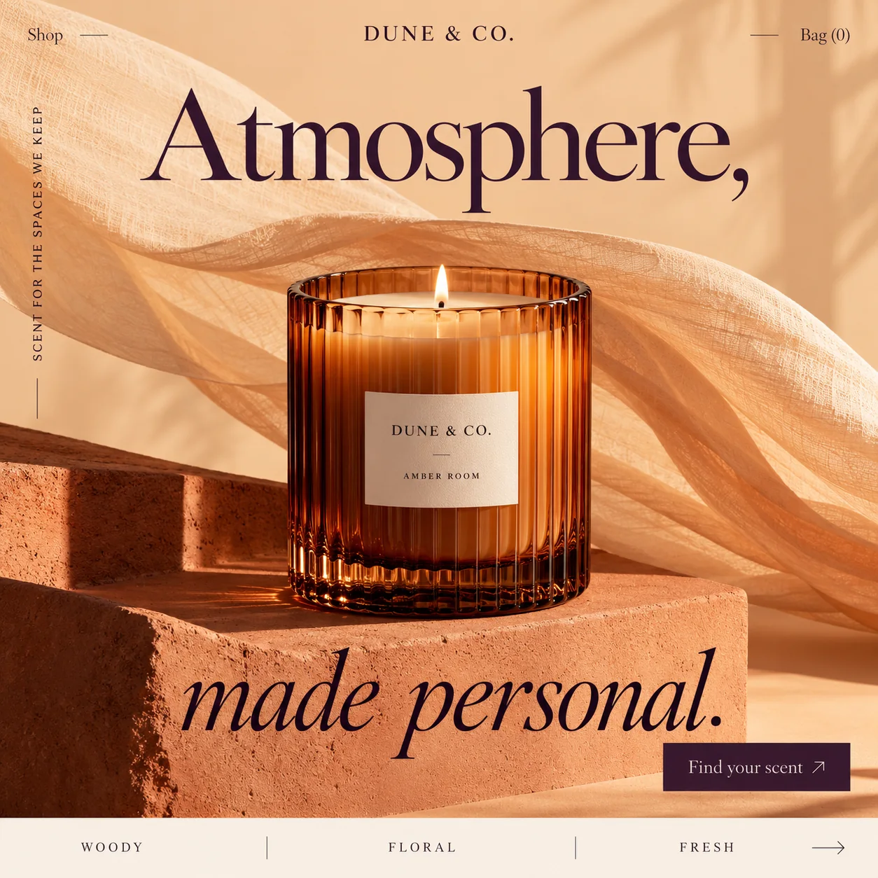
A candle shop homepage that warms the room first, then sorts visitors by scent family.
01 Upright serif. 'Atmosphere,' in a classic old-style serif, its comma holding a pause above the flame.
02 Lit flame. Set on the centre line under the wordmark, the flame is placed to catch the eye first.
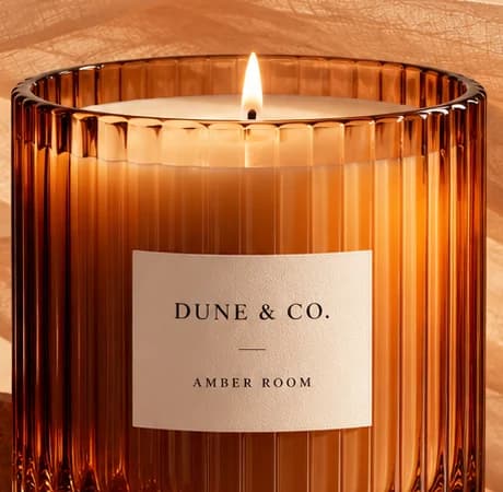
03 Amber Room label. A cream label names the candle after a room, not a list of notes.
04 Vertical line. 'SCENT FOR THE SPACES WE KEEP' runs up the left edge in small spaced capitals.
05 Find your scent. The only solid aubergine block, set just above the scent bar in the bottom right.
06 Scent family bar. Woody, Floral and Fresh on a cream strip, each a door to its own shelf and ad.
- Sector
- Home fragrance
- Year
- 2026
- Work
- Homepage design

- Apricot Haze#F2C599 · Background
- Dusk Aubergine#30122A · Type
- Candle Amber#DD8953 · Accent
- Cream Strip#F7EEE3 · Surface
- Sandstone Rust#8F401D · In the photo
About the project
The full write-up, if you want it. About 4 minutes.
01Brief and idea
The problem, and the one idea that answers it.1 min
The brief
Scent does not travel through a screen, so candle brands sell on mood and on helping people choose. Most visitors arrive from a social ad on a phone, curious but unsure what they like. The homepage has to match the ad's warmth, offer a quick way to pick a scent family, and keep the bag one tap away.
The idea
Light the room before selling anything. The first screen is one candle, flame lit, glowing through ribbed amber glass while sand-coloured gauze drifts behind, so the page feels warm before a word is read. The headline changes voice halfway, upright 'Atmosphere,' then italic 'made personal.', the way a room changes when a candle is lit. Below, three scent families act as doors, and each can be the landing page for its own ad set, so a woody ad opens on woody candles.
02The write-up
The design, decision by decision.6 chapters · 2 min
Designed for visitors from an ad
Dune & Co. is imagined as a home fragrance label, and the visitor this page is designed for arrives from an Instagram ad, on a phone, curious but unsure what they like. Scent cannot travel through a screen, so the homepage design leans on the two things it can control: mood, and a quick way to choose. The design is the first screen they would land on, with 'Shop' and 'Bag (0)' kept small in the top corners so the candle has the stage.
Light the room first
The opening image is one candle, already lit, in a ribbed amber tumbler on a block of rough sandstone. Sheer, open-weave gauze drifts behind it in a long curve, and low sun turns the whole set apricot. The flame sits almost exactly on the page's centre line, directly under the centred wordmark. Before a single product is offered, the page has done what a candle does to a room: it has changed the light.
Upright, then italic
The headline changes voice halfway. 'Atmosphere,' is set upright in a classic old-style serif above the candle, and 'made personal.' follows below it in a flowing italic, as if the sentence relaxes once the wick has caught. Both lines are deep aubergine, the darkest colour on the page. The comma after 'Atmosphere' earns its place: it holds the pause while the eye drops past the flame to the second line.
Woody, floral or fresh
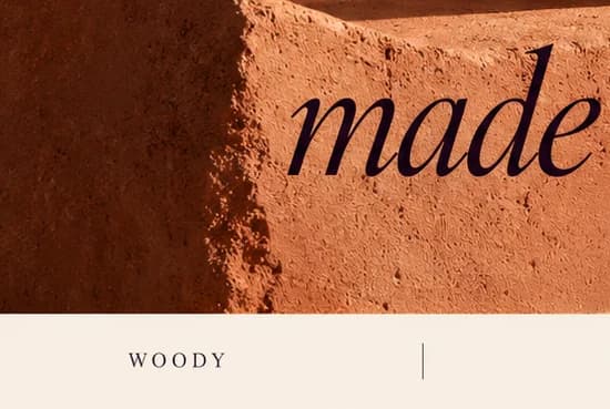
A cream strip across the bottom of the screen holds the scent families, 'WOODY', 'FLORAL' and 'FRESH', split by thin vertical rules and closed by a long arrow. They work as doors rather than filters: each would open a shelf of candles in that family. For a brand that sells through ads, each door could also be the landing page for its own ad set, so someone who tapped a woody ad never starts from a floral shelf.
A label that names a room
On the glass, a cream label carries 'DUNE & CO.' over a short rule, with 'AMBER ROOM' beneath it. Naming a candle after a room rather than its notes fits the headline: the product is a mood for a space, a promise repeated up the left edge in 'SCENT FOR THE SPACES WE KEEP'. The aubergine 'Find your scent' button, bottom right, is the one solid dark block, sitting just above the scent bar.
Where the ads would come in
This screen is meant to lead into an online shop, with payments landing in the brand's own account and one shop page per scent family, ready to serve as an ad's landing page. Every scent would get a written description, so a visitor can choose from words when they cannot smell. On the Run plan, Meta ads would be built and managed monthly, while the ad spend itself goes directly to Meta, never through Hoorax.
03Type and voice
Type, colour, photography and the lines on the page.3 roles
- Display
- Classic old-style serif in deep aubergine: upright for the first line, a flowing italic for the second.
- Labels
- Small serif capitals with generous tracking for the wordmark, the vertical line and the scent bar.
- Body
- The same style of serif at text size, upper and lower case, for the menu and the button.
A classic old-style serif, upright for 'Atmosphere,' and a flowing italic for 'made personal.', both in deep aubergine. Small tracked capitals carry the wordmark, the vertical line 'Scent for the spaces we keep' and the scent bar. The palette is desert at golden hour: apricot, terracotta and amber glass, with a cream strip at the base and one aubergine button for contrast.
Atmosphere, made personal.
SCENT FOR THE SPACES WE KEEP
Find your scent
AMBER ROOM
Hushed and domestic. The words are about rooms and keeping, not ingredients, and the button promises a match rather than a sale. It carries on the warmth an ad would set up before the tap.
04The plan
Grow: up to 6 pages, and what it includes.4 includes
Up to 6 pages, on Grow, AED 4,999 one time. What it includes:
- Customers order online, paid into the brand's own account
- A shop page for each scent family, ready to be an ad's landing page
- Meta ads built and run monthly as a Run extra, budget paid straight to Meta
- Product descriptions for each scent, the first 10 included
A site like this sits on Grow. AED 4,999 one time, with a fixed quote in writing.
WhatsApp us