Arc Reformer
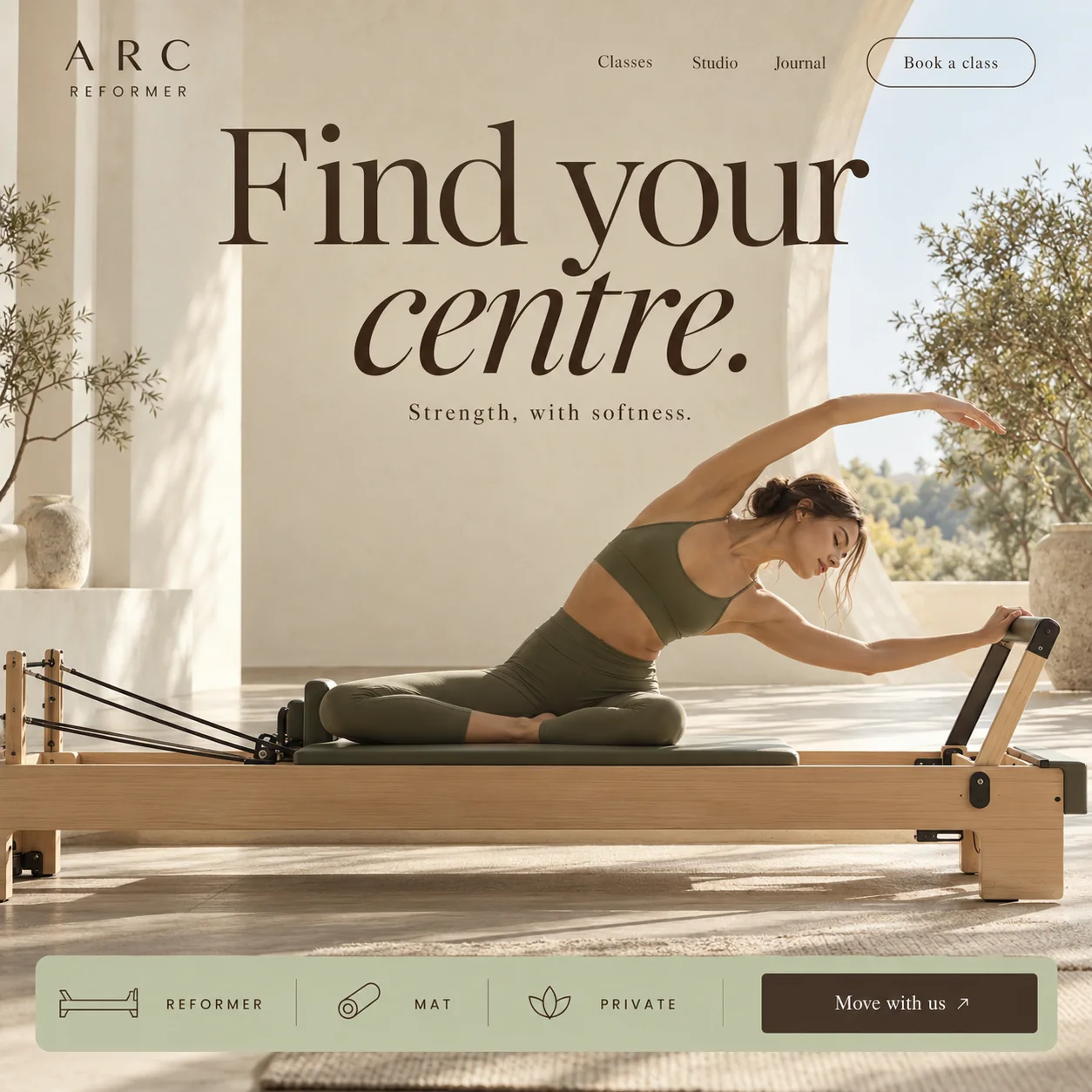
A Pilates studio sold on stillness: one held stretch, a sunlit room, three classes on a sage bar.
01 Outlined booking pill. Book a class sits in a thin espresso outline, a shortcut for members who already know the timetable.
02 Arch and olives. The open arch frames trees and soft daylight, so the room reads as calm before any copy does.
03 Italic centre. The second line tips from upright into italic, so the headline seems to exhale.
04 One held stretch. Legs folded on the carriage, one arm overhead, eyes closed: the class explained without a caption.
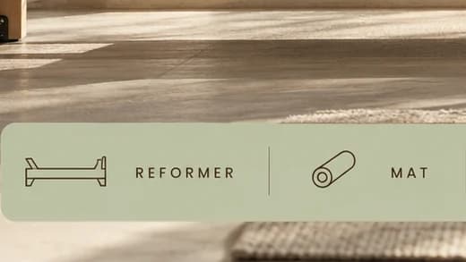
05 Class picker. Line icons and spaced capitals for Reformer, Mat and Private, separated by fine rules on sage.
06 Move with us. Move with us in cream on espresso brown, the darkest block on a pale page, closing the class bar.
- Sector
- Pilates studio
- Year
- 2026
- Work
- Homepage design

- Limewash Sand#C4B69F · Background
- Espresso Ink#382518 · Type
- Sage Mat#BDC0A3 · Accent
- Morning Linen#EAE8E0 · Surface
- Pale Oak#97714C · In the photo
About the project
The full write-up, if you want it. About 4 minutes.
01Brief and idea
The problem, and the one idea that answers it.1 min
The brief
Boutique Pilates sells on atmosphere, yet many studio sites are a booking widget with a logo on top. A newcomer cannot feel the room and still has to message to ask which class suits them. The page must show the space and the pace, explain three class types at a glance, and keep booking one tap away.
The idea
Sell the stillness, not the burn. The headline is set large and soft, with centre tipped into italics as if it has just exhaled. Under it, Strength, with softness answers the two fears newcomers have: that Pilates is too easy, or too hard. The photograph holds a single side stretch on the machine, in a room of limewashed walls and olive trees, and the class picker sits low across the bottom like a mat on the floor.
02The write-up
The design, decision by decision.6 chapters · 2 min
A headline that breathes out
The headline reads Find your centre., and it changes pace halfway. Find your is set upright in a tall, high-contrast serif in espresso brown, wide enough to span most of the wall. The second line then tips into italic for the word centre, as if the type has relaxed into the stretch below it. Underneath, the subline drops to a small serif with generous letter spacing. The shift is deliberate: big and still, then soft, then quiet, so the eye has slowed down by the time it reaches the photograph.
Written for the first-timer
Reformer Pilates puts newcomers off from two directions. Some assume it is gentle stretching and not worth the fee; others picture a machine they will not know how to use. This page is aimed at that hesitant first booking. It skips instructor certificates and class packs. It shows one person holding one stretch, and it settles the doubt in three words under the headline: Strength, with softness.
The room is the proof
A studio's space is half of what it sells, so the photograph is wide. Limewashed walls, a tall arch open to olive branches and a green hillside, a stone urn on a plinth and long, low shadows across the floor. The woman sits with her legs folded on the carriage, one arm arcing overhead, the other hand on the bar, eyes closed. Her olive kit repeats the cushion and sits close to the sage of the class bar, so person, machine and interface share one palette.
Three classes on a strip of sage
Across the foot of the screen runs a rounded sage bar that behaves like a menu. Each class type gets a thin line icon and a spaced capital label: a reformer drawn in outline, a rolled mat, a lotus for private sessions. Fine vertical rules keep them apart, and the bar ends in Move with us, a solid espresso button with a small arrow. A newcomer sees the whole offer without scrolling and picks a starting point by type rather than by timetable.
A quiet wordmark, three words of nav
ARC is set in wide, airy serif capitals with REFORMER beneath in tiny spaced sans, a logo that could be carved over a door. The navigation keeps to three serif words, Classes, Studio and Journal, and an outlined Book a class pill for members who already know when they want to come. Nothing on the top row is filled or coloured, so the headline remains the loudest thing on the page.
What the studio would run itself
The calm front end would sit on practical plumbing. Classes would be booked and paid for online, straight into the studio's own account. The team, not a developer, would keep the timetable and prices up to date, and would write the Journal that the navigation already points to. A Google Maps listing would be set up and submitted where Google allows it, so a search for reformer classes nearby could lead to this door.
03Type and voice
Type, colour, photography and the lines on the page.3 roles
- Display
- A tall, high-contrast serif in espresso brown: upright for the first line, then sloping into italic for the second.
- Supporting
- A small serif, widely spaced in the subline and set normally in the navigation, calm and bookish.
- Labels
- Tiny sans capitals, widely spaced, set beside thin line icons in the class bar and under the wordmark.
A tall, high-contrast serif for the headline, upright for Find your and italic for centre, with a small, spaced serif line beneath. The logo pairs wide-set serif capitals with tiny spaced sans capitals. Colour comes from the room: limewash sand, pale oak, olive and sage, with a deep espresso brown for type and the main button. The light is low and warm, with long soft shadows across the floor.
Find your centre.
Strength, with softness.
Move with us
Book a class
Soft imperatives. Every line invites movement and none of them sets a challenge; pairing strength with softness lets both the anxious and the athletic newcomer feel the class is meant for them.
04The plan
Grow: up to 6 pages, and what it includes.4 includes
Up to 6 pages, on Grow, AED 4,999 one time. What it includes:
- Class booking online, paid into the studio's own account
- A timetable and class prices the studio edits itself
- A Journal the team updates without a developer
- A Google Maps listing set up and submitted, where Google allows it
A site like this sits on Grow. AED 4,999 one time, with a fixed quote in writing.
WhatsApp us