Resonant
A hi-fi showroom homepage whose one job is booking an hour in the listening room.
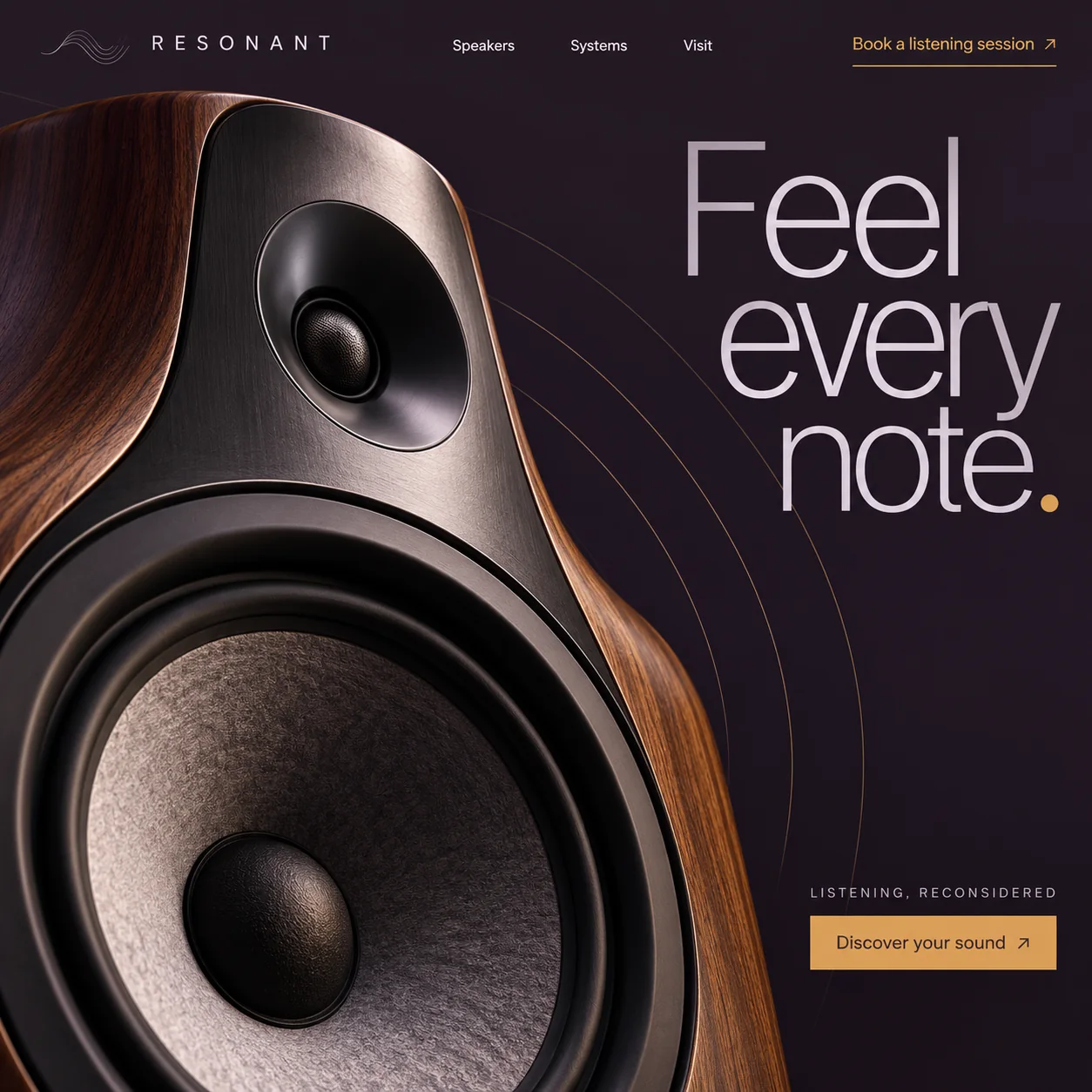
01 Wave-line mark. Fine stacked lines like a sound wave sit before the spaced capitals of the wordmark.
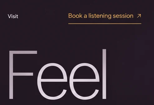
02 Booking in amber. 'Book a listening session' sits apart from the white menu, underlined: the page's main request.
03 Mesh tweeter. A fine mesh dome in a brushed metal baffle, shot close enough to see the texture.
04 Amber arcs. Hairline rings travel from the tweeter towards the headline, the only drawing of sound.
05 Amber full stop. The headline ends in the accent colour, tying the words to the two buttons.
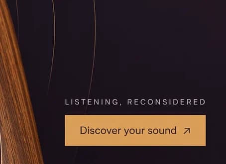
06 Discover your sound. A filled amber button low on the right, under the small line 'LISTENING, RECONSIDERED'.
- Sector
- Hi-fi showroom
- Year
- 2026
- Work
- Homepage design

- Listening Room#211721 · Background
- Pale Silver#D8CCD8 · Type
- Valve Amber#D99E59 · Accent
- Baffle Plum#2D2125 · Surface
- Cabinet Walnut#70442D · In the photo
About the project
The full write-up, if you want it. About 4 minutes.
01Brief and idea
The problem, and the one idea that answers it.1 min
The brief
High-end audio is hard to sell through a screen: the product is a sound, and the price needs a reason. Buyers research for weeks, then want to hear a system in a real room. The page needs to feel as considered as the speakers, and its job is a booked visit, not a basket.
The idea
Sell the visit, not the box. The speaker is cropped so close it becomes architecture, wood grain and cone filling half the frame, while thin amber rings travel from it towards 'Feel every note.' Amber marks the two actions, 'Book a listening session' at the top and 'Discover your sound' below, and appears elsewhere only in those arcs and the full stop. 'Listening, reconsidered' tells serious buyers this is an appointment-led room.
02The write-up
The design, decision by decision.5 chapters · 2 min
A product you cannot hear online
Speakers are bought with the ears, and a web page has none to offer. Resonant is imagined as a showroom, and its homepage design accepts that limit instead of fighting it with spec tables. Buyers of serious audio research for weeks, then want to sit in a quiet room with their own music. So the page has a single goal, a booked visit, and every element on it either builds the wish to listen or points at the booking. Even the headline, 'Feel every note.', describes the listening rather than the hardware. The menu keeps to three words, 'Speakers', 'Systems' and 'Visit', and the last of them is where the page hopes you end up.
Amber marks the way in
Amber is rationed. It appears on 'Book a listening session', set in the top bar apart from the white menu and underlined with a thin rule, and again on the filled 'Discover your sound' button low on the right. The only other amber on the page is the full stop after 'note' and a set of hairline arcs. A visitor scanning the dark screen finds both actions without reading anything else, which is exactly what an appointment-led showroom needs.
Close enough to see the grain
The speaker is cropped so tight that it stops being a product shot and becomes architecture: a curved walnut cabinet, a brushed metal baffle, a tweeter with a fine mesh dome, and a woofer whose cone has a crinkled, felt-like surface. It fills the left half of the page and runs off the bottom and left edges, so the visitor feels near enough to touch it. The materials carry the message a spec sheet would normally try to.
Sound drawn as hairlines
Thin amber arcs spread from the tweeter across the deep plum ground, widening as they travel towards the headline. They are the page's only attempt to picture sound, and they stay faint on purpose, closer to ripples on still water than to a graphic equaliser. They are meant to drift slowly outwards as the visitor scrolls. In the design they do quieter work, leading the eye from the speaker to 'Feel every note.'
Where the buttons lead
The design is the whole of this project; no booking system sits behind it. In the plan, 'Book a listening session' opens a calendar of days and times, and 'Visit', already in the menu, becomes a page with directions and a Google Maps listing set up for the showroom. Enquiries about full systems and room set-ups would come into one inbox, and a booking tool the showroom already uses could be connected as an extra.
03Type and voice
Type, colour, photography and the lines on the page.3 roles
- Display
- Thin grotesque set large and tight in pale lilac silver over three lines, closed by an amber full stop.
- Supporting
- Light sans capitals spaced very wide, beside a fine wave-line mark.
- Labels
- Small tracked capitals in pale silver, placed directly above the main button.
The ground is deep aubergine black, like a darkened listening room. On it, the headline is a thin, tightly set grotesque at large size in pale lilac silver, ending in an amber full stop. A widely spaced sans wordmark sits beside a fine wave-line mark. Walnut, brushed metal and textured cone fabric give the photograph a tactile feel against the flat background.
Feel every note.
Book a listening session
LISTENING, RECONSIDERED
Discover your sound
Calm and sensory. The copy talks about feeling and listening, never watts or drivers, and both actions read as invitations rather than sales prompts. It assumes a visitor who already cares about sound.
04The plan
Grow: up to 6 pages, and what it includes.4 includes
Up to 6 pages, on Grow, AED 4,999 one time. What it includes:
- Listening sessions booked online by day and time
- A Visit page, with a Google Maps listing set up for the showroom
- Every enquiry about systems and rooms in one inbox
- The showroom's existing booking system connected, as an extra
A site like this sits on Grow. AED 4,999 one time, with a fixed quote in writing.
WhatsApp us