Axiom Legal
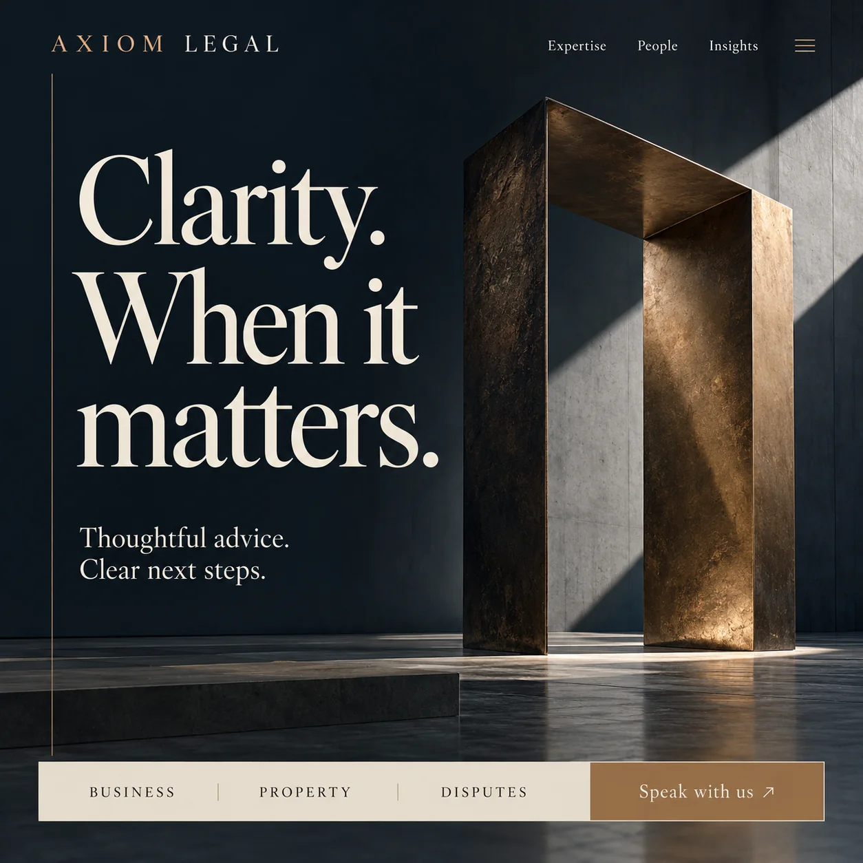
Clarity by subtraction: a law firm page with one bronze portal and one question about the matter.
01 Bronze in the name. AXIOM in bronze, LEGAL in cream, both set in widely spaced serif capitals.
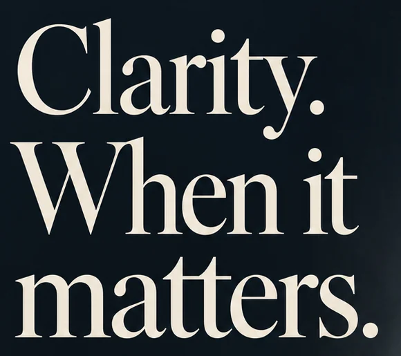
02 Book serif headline. Two sentences broken over three short lines in a high-contrast serif, with no italics or flourish.
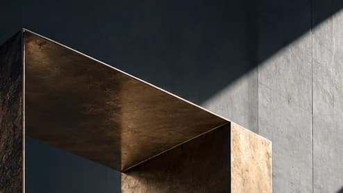
03 Lit bronze portal. Sunlight rakes across the inner face of the frame, turning a heavy object into an open doorway.
04 Next-steps promise. Thoughtful advice. Clear next steps. Set at reading size, the plainest sentence on the page.
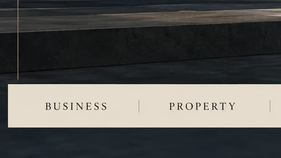
05 Matter picker. Business, Property and Disputes in spaced capitals, split by bronze rules, so each enquiry arrives sorted.
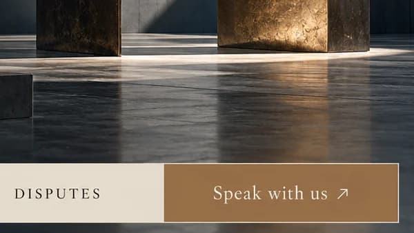
06 Bronze button. Speak with us in cream on solid bronze, where the matter bar ends and the conversation starts.
- Sector
- Law firm
- Year
- 2026
- Work
- Homepage design
- Midnight slate#0E161C · Background
- Parchment cream#F6EEE0 · Type
- Burnished bronze#966E49 · Accent
- Linen bar#E4DCCD · Surface
- Lit patina#78593A · In the photo
About the project
The full write-up, if you want it. About 4 minutes.
01Brief and idea
The problem, and the one idea that answers it.1 min
The brief
People look for a lawyer when something has already gone wrong, and many firm sites answer with a wall of practice areas and partner photos. What a worried visitor needs is a page that feels steady rather than clever, says plainly what the firm handles, and offers one obvious way to start a conversation.
The idea
Clarity is the product, so the page sells it by having almost nothing on it. The portal is the only image: an open frame in a dark room, with sunlight raking across it, which reads as a way through without saying so. Everything else is type and one decision. The bar at the foot asks what kind of matter this is, so the first call starts in the right place instead of with a receptionist guessing.
02The write-up
The design, decision by decision.6 chapters · 2 min
Someone who already has a problem
Nobody browses law firms for pleasure. The person landing here usually has a contract going sour, a disagreement over a property or a company to set up, and little patience for a firm's history. Many legal sites greet them with a grid of practice areas and a row of partner portraits. This design greets them with four words, Clarity. When it matters., and a second line that says what happens next: Thoughtful advice. Clear next steps.
Restraint is the pitch
The page has almost nothing on it, and that is the argument. One headline, one subline, one sculpture, one bar. There are no award badges, no handshake photograph and no paragraph about heritage, because a firm that sells clarity should look as if it has already done the sorting. The navigation keeps to three words, Expertise, People and Insights, in a small serif, with a bronze menu icon holding everything else.
A doorway in raking light
The only image is a bronze portal standing in a dark concrete room. A shaft of sun enters from the upper right, catches the inner face of the frame so it glows a warm gold, and leaves a pale pool on the polished floor beneath. The outer faces stay in shadow, hammered and patinated. Nobody has to explain the metaphor: a heavy, solid way through, with light coming in. A low stone step in the foreground leads the eye towards it.
Sorting the matter before the call
The linen bar at the foot asks the most useful first question a firm can ask: what kind of matter is this? BUSINESS, PROPERTY and DISPUTES sit in widely spaced serif capitals, divided by thin bronze rules, and the bar ends in a solid bronze block reading Speak with us. Someone who picks Property before getting in touch would reach the right lawyer, instead of a receptionist trying to work it out over the phone.
Bronze used like an inlay
A high-contrast book serif does all the talking: large and tightly leaded for the headline, then at reading size for the subline. Spaced serif capitals carry the wordmark, with AXIOM in bronze and LEGAL in cream. Bronze is the only accent and it is used like an inlay: the wordmark, a hairline rule down the left margin, the menu icon, the button and the sculpture itself. Against midnight slate, that small amount is enough to feel considered without any ornament.
Behind Speak with us
Past the first screen, Expertise, People and Insights pages would carry about 1,800 words written for the firm. Each Speak with us enquiry would land in one inbox already tagged as business, property or disputes, so a partner can scan the morning's matters by type. Lawyer profiles and articles would be edited by the firm without a developer, and the whole site could be mirrored in Arabic for clients who prefer it.
03Type and voice
Type, colour, photography and the lines on the page.3 roles
- Display
- A high-contrast book serif in parchment cream, set large and tightly leaded over three short lines.
- Body
- The same serif at reading size, two plain sentences stacked in sentence case.
- Labels
- Widely spaced serif capitals for the wordmark and the practice bar, dark on linen or bronze on slate.
A high-contrast book serif carries the headline at display size and the subline at reading size. The wordmark and practice bar use widely spaced serif capitals, with AXIOM picked out in bronze. The palette stops at midnight slate, parchment and one burnished bronze, which appears in the logo, the left rule, the button and the sculpture itself. The photograph is one object in raking light, so the page reads as serious without any gold leaf.
Clarity. When it matters.
Thoughtful advice. Clear next steps.
Speak with us
Measured and plain. Short declaratives, full stops everywhere, no jargon and no superlatives; it sounds like a senior lawyer who has heard the problem before and is not alarmed by it.
04The plan
Grow: up to 6 pages, and what it includes.4 includes
Up to 6 pages, on Grow, AED 4,999 one time. What it includes:
- Expertise, People and Insights pages, with about 1,800 words written for the firm
- Every Speak with us enquiry landing in one inbox, tagged by matter
- Profiles and articles the firm edits itself, without a developer
- An Arabic version of every page, as an extra
A site like this sits on Grow. AED 4,999 one time, with a fixed quote in writing.
WhatsApp us