Karak Social
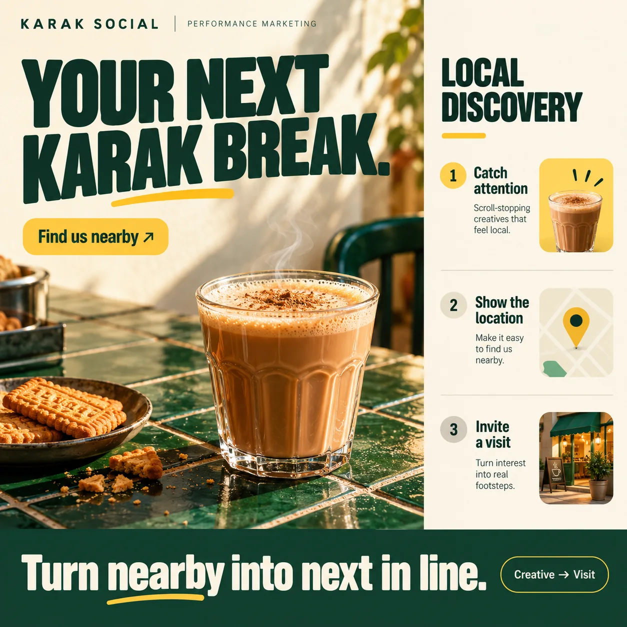
A local ads campaign that plots one route: a hot glass, a map pin, the café door.
01 Brand line. KARAK SOCIAL beside the PERFORMANCE MARKETING line: the canvas says plainly that it is a campaign plan.
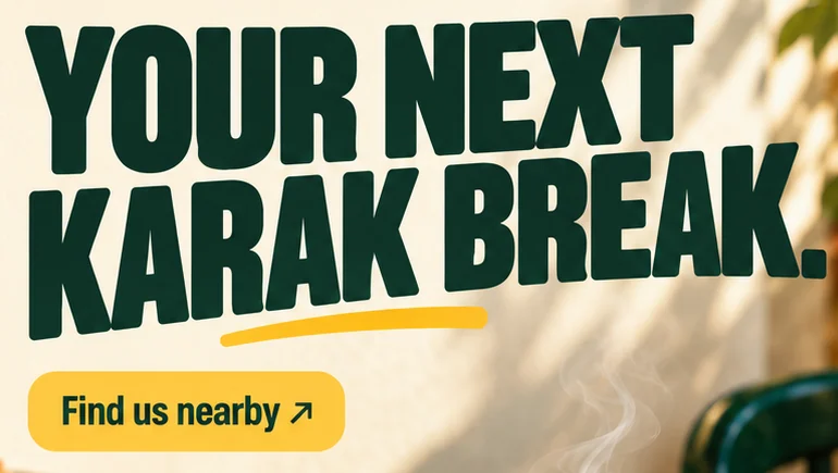
02 Hand-drawn swoosh. A loose yellow stroke under the headline, repeated under nearby in the footer to tie the two together.
03 Find us nearby. The ad's only button, yellow with an arrow, pointing to a map rather than a menu.
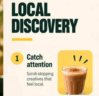
04 Step one, lit. Number one sits in a yellow circle while steps two and three stay beige.
05 Map pin. A plain street grid and a yellow pin: the step where an ad has to answer where.
06 Creative → Visit. An outlined pill in the footer that sums up the whole route in two words.
- Sector
- Local ads campaign
- Year
- 2026
- Work
- Campaign design
- Milk Foam#FBF5E7 · Background
- Awning Green#0E3226 · Type
- Saffron Swoosh#FDC840 · Accent
- Sunlit Plaster#CFB482 · In the photo
- Glazed Tile#405433 · In the photo
About the project
The full write-up, if you want it. About 4 minutes.
01Brief and idea
The problem, and the one idea that answers it.1 min
The brief
Karak is a distance game: people pick the closest good cup, usually on the way somewhere. Social ads can reach everyone within a short walk, but an ad that looks generic gets scrolled past, and one that never says where you are wastes the tap. The landing page must answer where, in one look.
The idea
Put the whole campaign on one screen. The left side is the ad itself: a hot glass on green tiles, a short headline, one button. The right side shows the route each ad is meant to take someone along, from creative to map pin to the café door, so the owner can see what the spend is for. Every ad in the set points here. It suits Karak Social because the brand is about the walk over, not the delivery app.
02The write-up
The design, decision by decision.5 chapters · 2 min
Karak is bought by distance
Few people cross the city for a cup of karak. They take the closest good one, usually on the way to somewhere else, which makes a café like this a neighbourhood business in the most literal sense. Nothing here has been spent on media, but the problem the campaign design takes on is a real one. Targeted social ads can find the people a few streets away, yet an ad that never says where the café is spends the tap and gets nothing back.
Half ad, half plan
The canvas is split in two. On the left is the ad as a stranger would meet it: YOUR NEXT KARAK BREAK. in heavy, slightly squeezed capitals, a hand-drawn yellow swoosh beneath the second line, a glass of karak on green tiles and a single yellow button, Find us nearby. On the right, under the heading LOCAL DISCOVERY, is the plan that ad belongs to, set out for the owner rather than the customer. Seeing both at once makes the point of the design plain: the creative is only the first step of the route.
Three steps, three thumbnails
The right column is a numbered sequence. One, Catch attention: scroll-stopping creatives that feel local, next to a glass on a yellow tile with three small marks of excitement above it. Two, Show the location: make it easy to find us nearby, next to a plain street map and a yellow pin. Three, Invite a visit: turn interest into real footsteps, next to a shopfront with a green awning and a chalkboard sign. Only the first number is set in a yellow circle, as if the sequence has just begun; the other two wait in beige.
Borrowed from the café's own page
The campaign does not invent a new look. Green, cream and saffron come straight from the Karak Social homepage design, and the photograph keeps its warm, late light: leaf shadows on a plaster wall, a dark green café chair, steam lifting off the glass. Even the table repeats an idea: glazed tiles again, deep green here where the homepage used mustard. Someone who taps the ad and lands on the site should feel they have reached the same counter, not a landing page bolted on for the campaign.
What running it would take
Across the foot, a dark green band carries the closing line, Turn nearby into next in line, with the same yellow swoosh under nearby and an outlined pill that sums up the route as Creative → Visit. The plan is a landing page with its copy written, a WhatsApp link that stays in view and counts each tap, and a set of Meta and Google ads that Hoorax builds and manages as an extra on the Run plan, while the café pays the media spend directly. Arabic ads would point to an Arabic page.
03Type and voice
Type, colour, photography and the lines on the page.3 roles
- Display
- A heavy, slightly squeezed sans in capitals with softened corners and tight line spacing.
- Labels
- A light sans in wide-spaced capitals for the brand line across the top.
- Body
- A plain grotesque for the step descriptions, set in short ragged lines.
The headline is a heavy, slightly squeezed uppercase sans, underlined with a hand-drawn yellow swoosh. A wide-tracked sans for the brand line and a plain grotesque for the steps. Green, cream and saffron carry over from the Karak Social homepage, so ad and page feel like one place. The photography is warm late light, leaf shadows on plaster and glazed green tiles: a corner café, not a chain.
YOUR NEXT KARAK BREAK.
Find us nearby
Turn interest into real footsteps.
Turn nearby into next in line.
Two registers on one canvas. The ad nudges a passer-by casually, while the plan talks to the owner in plain numbered steps. Both stay short, local and specific about place.
04The plan
Launch: 1 page, 4 sections, and what it includes.4 includes
1 page, 4 sections, on Launch, AED 1,999 one time. What it includes:
- A landing page for the ads to point at, with the copy written for you
- WhatsApp button on every screen, with the taps counted
- Meta and Google ads built and run for you as a Run extra, budget paid from your own account
- An Arabic version as an extra, so Arabic ads land on an Arabic page
A site like this sits on Launch. AED 1,999 one time, with a fixed quote in writing.
WhatsApp us