Bah
Hot pink, chequered and loud: a smash burger site where the box is the brand.
- Sector
- Smash burger
- Year
- 2026
- Work
- Website design
- Screens
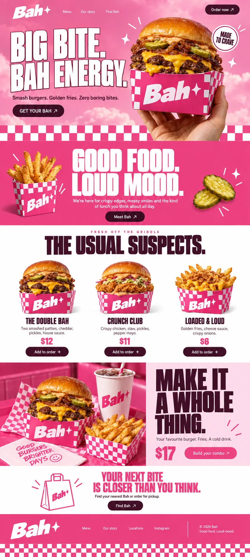
- Two desktop screens and the full homepage
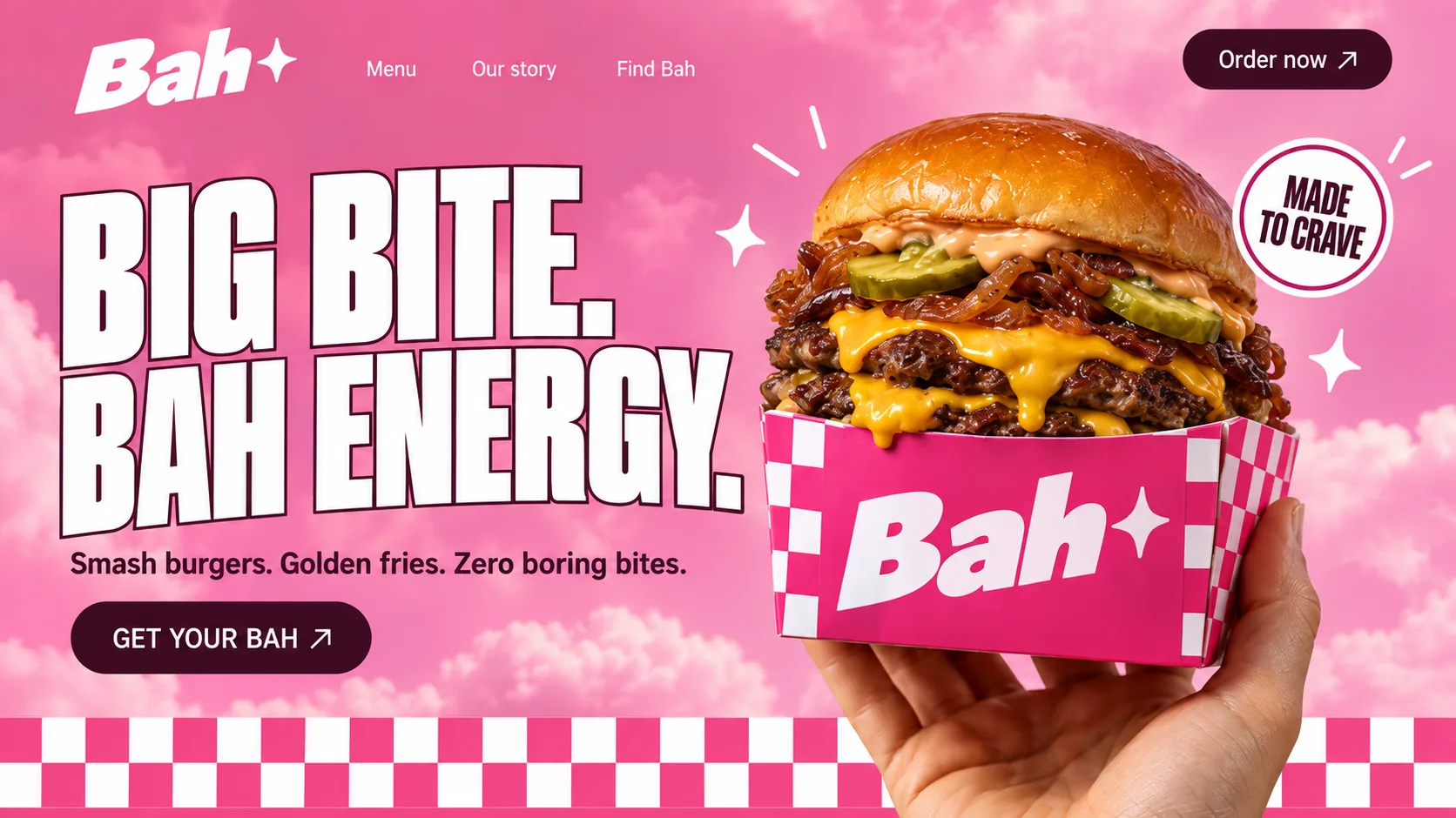
01 Sparkle wordmark. A slanted, heavy wordmark finished with a four-point sparkle; the same mark is printed on every box and cup.
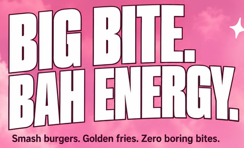
02 Outlined capitals. White condensed capitals traced in plum, so the headline stays legible over pink cloud.
03 The box as billboard. The carton's front panel carries the logo at full size, so the product photo doubles as branding.
04 Made to crave sticker. A round sticker and scattered sparkles turn the photo into something closer to a sticker sheet.
05 Primary button. A plum pill with an arrow; Order now repeats the same action in the top corner.
06 Chequerboard edge. The pattern from the box becomes the border between the hero and the next band.
- Bubblegum Pink#EB4180 · Accent
- Napkin White#FEFEFE · Background
- Plum Ink#3D0A21 · Type
- Strawberry Milk#FDDAE9 · Surface
- Melted Cheddar#FBA907 · In the photo
About the project
The full write-up, if you want it. About 4 minutes.
01Brief and idea
The problem, and the one idea that answers it.1 min
The brief
Most burger sites look alike: a dark background, a glossy patty, an order button. We wanted one that looks like nobody else on the street. The brief we set ourselves: be loud and still do the plain jobs, showing what is in each burger, turning one burger into a combo and sending people to the nearest counter for pickup.
The idea
Make the box the brand. A hot pink carton with chequerboard sides and a sparkle on the logo holds every burger and every portion of fries, and the site wears the same pattern. The hero holds a burger up to the lens against a candyfloss sky. Menu cards show each item in its box, and the combo panel sets burger, fries and a drink on one pink tray. The copy stays short and cheeky (Zero boring bites), so the brand sounds the way it looks.
02The write-up
The design, decision by decision.5 chapters · 2 min
The box is the logo
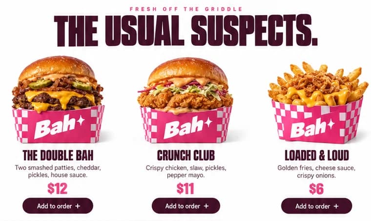
Bah, imagined as a smash burger counter, started from the packaging rather than the page. A hot pink carton with chequerboard sides carries a chunky slanted wordmark and a four-point sparkle, and once that box existed the website only had to keep showing it. It sits in a hand on the first screen, under each of the three menu items, beside a branded paper cup on the combo tray and around the fries in the mood band. Near the end the sparkle wordmark turns up on a line-drawn carry bag, and the footer finishes on a strip of checks.
Held up to the lens
The hero is a hand pushing a double smash burger towards the camera, cheddar running over the rim of the box, against a sky of pink cloud. BIG BITE. BAH ENERGY. stands to the left in white condensed capitals, each letter traced in plum so it holds against the clouds. A round MADE TO CRAVE sticker and a few hand-drawn sparkles give the photo the feel of a sticker sheet. Two plum buttons do the work: Order now in the corner, and GET YOUR BAH under the line Smash burgers. Golden fries. Zero boring bites.
The menu turns the volume down
After two loud pink bands the menu drops to plain white, so the food becomes the loudest colour on the page. A pink kicker in spaced capitals, FRESH OFF THE GRIDDLE, sits over THE USUAL SUSPECTS. in heavy plum. Then three cards and no more: The Double Bah, Crunch Club and Loaded & Loud, each photographed in its own branded box, named in condensed capitals over its ingredients and finished with a plum Add to order pill. Choosing takes a glance, and ordering takes one tap.
The combo, on one tray
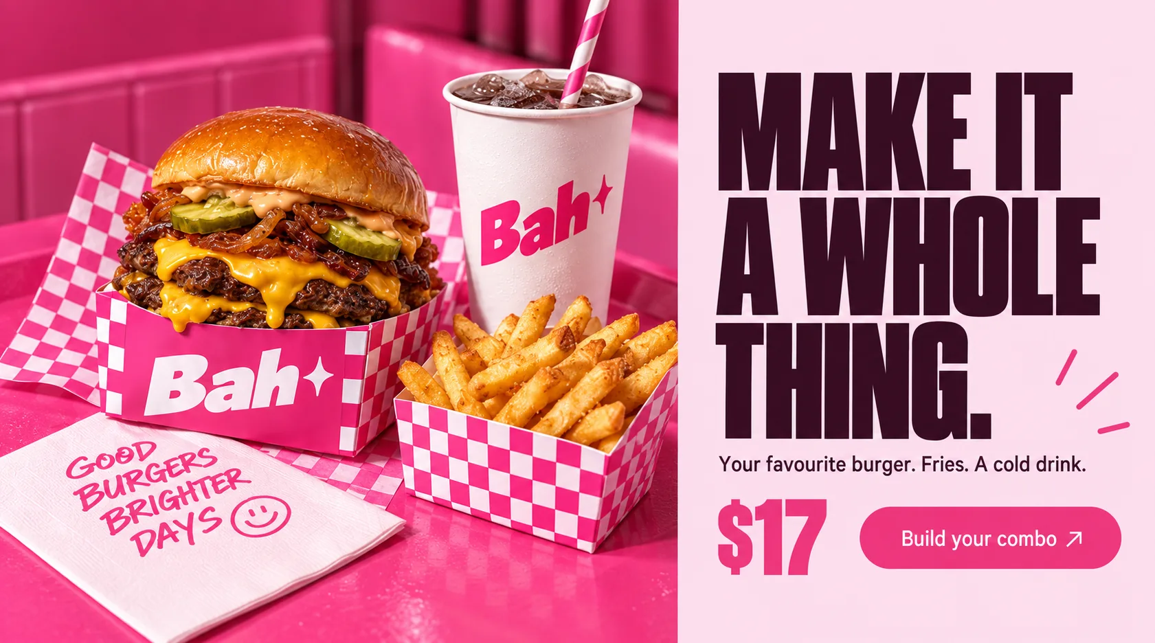
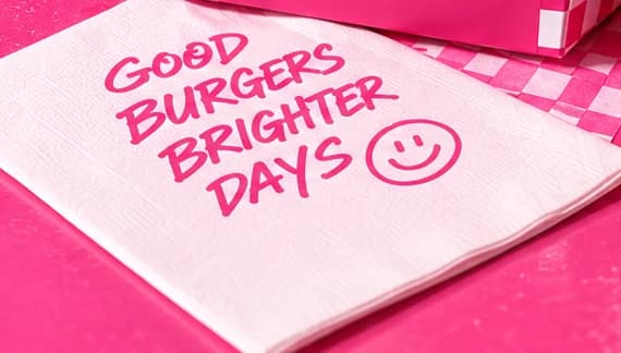
The upsell gets a split panel of its own. On the left, a styled photograph in a pink booth: the burger on checked paper, fries in a chequerboard carton, an iced drink in a Bah cup with a striped straw, and a napkin hand-lettered GOOD BURGERS BRIGHTER DAYS with a smiley. On the right, on strawberry-milk pink, MAKE IT A WHOLE THING. runs over three lines in plum, followed by the offer in one short line, a large price and a hot pink Build your combo button. Burger, fries and drink become a single decision.
Loud band, quiet band
Scrolled top to bottom, the homepage alternates its volume. Pink sky, then a solid pink band where GOOD FOOD. LOUD MOOD. sits between a carton of fries and two floating pickle slices. White for the menu, a split pink panel for the combo, then white again for the last ask: YOUR NEXT BITE IS CLOSER THAN YOU THINK., a line-drawn carry bag and a Find Bah button for the nearest counter or a pickup order. The footer goes back to pink, signs off with Good food. Loud mood. and ends on checks.
03Type and voice
Type, colour, photography and the lines on the page.3 roles
- Display
- Heavy condensed capitals set tight with full stops; white with a plum outline in the hero, solid plum further down.
- Labels
- Small pink capitals with wide letter-spacing, used as a kicker above a section headline.
- Body
- A plain, friendly sans for straplines, ingredients and buttons, in plum or white, never longer than two lines.
Heavy condensed capitals for the headlines, outlined in plum on the hero so the white letters lift off the clouds. A slanted, chunky italic wordmark finished with a four-point sparkle. A clean sans for descriptions and buttons. Colour is hot pink and blush, with deep plum for type and buttons and plain white behind the menu. The photography is shot in the same pink: pink trays, a pink booth, branded boxes and cups. Loud pink bands alternate with calm white ones.
BIG BITE. BAH ENERGY.
Smash burgers. Golden fries. Zero boring bites.
GOOD FOOD. LOUD MOOD.
We're here for crispy edges, messy smiles and the kind of lunch you think about all day.
YOUR NEXT BITE IS CLOSER THAN YOU THINK.
Cheeky and said out loud. Headlines are short bursts closed with full stops, and the name works as noun and adjective (GET YOUR BAH, BAH ENERGY), so the copy is exactly as loud as the pink.
04The plan
Grow: 4 pages, and what it includes.4 includes
4 pages: home, menu, story, find Bah, on Grow, AED 4,999 one time. What it includes:
- Pickup orders and combos, paid into your own account
- Menu, prices and photos you edit yourself, no developer
- Google Maps listing set up and submitted for you, where Google allows it
- WhatsApp button on every screen, with the taps counted
A site like this sits on Grow. AED 4,999 one time, with a fixed quote in writing.
WhatsApp us