Little Palms
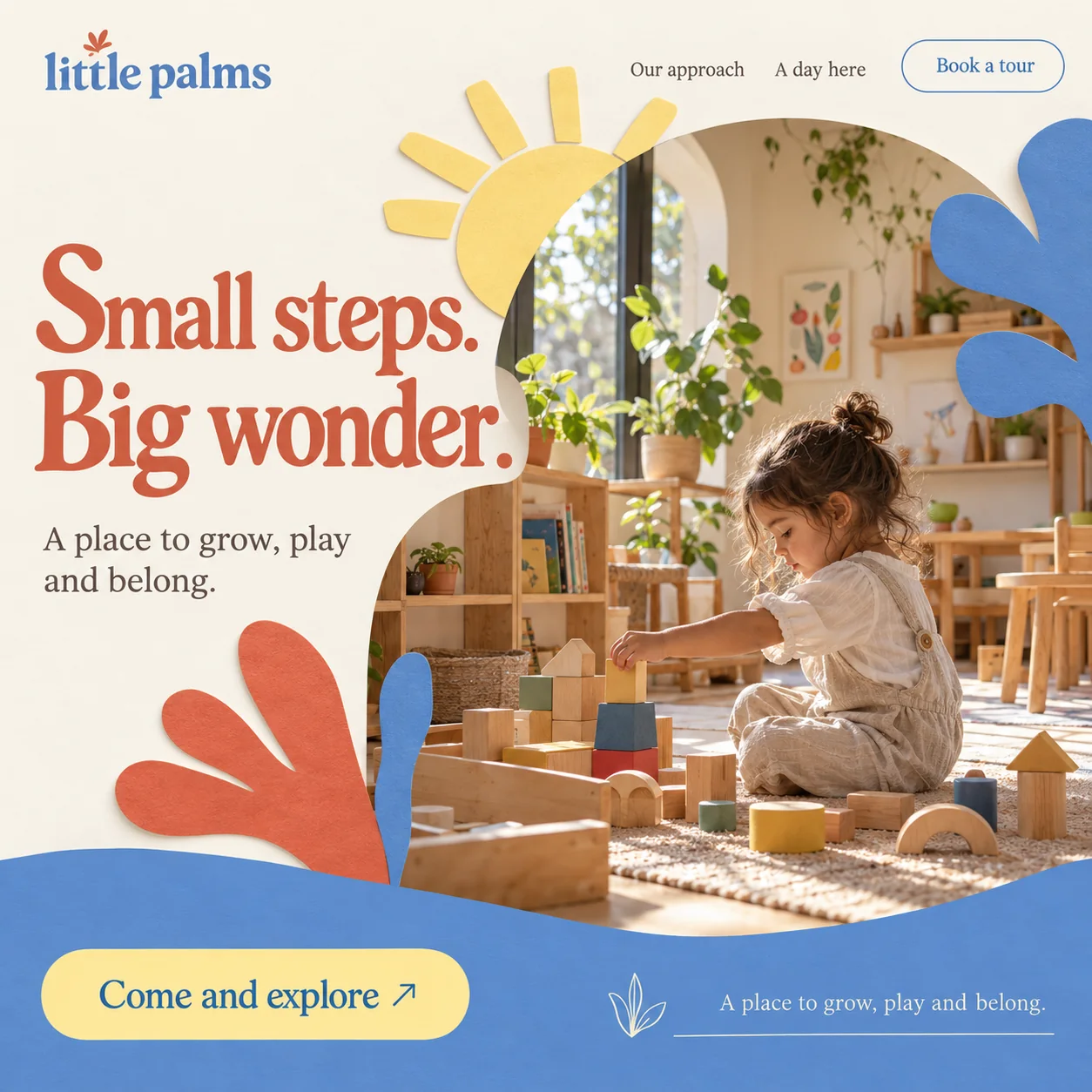
A nursery homepage: a calm classroom framed in cut paper, with a tour to book.
01 Coral sprout. A small cut-paper sprout above the lowercase wordmark, echoing the frond lower down.
02 Paper sun. A butter-yellow sun with five rays, set over the corner of the photograph like a pinned cut-out.
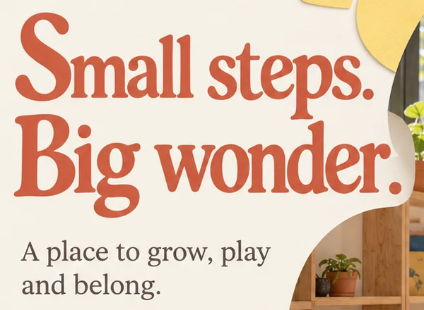
03 Soft serif headline. Small steps. Big wonder. in a chunky terracotta serif with rounded terminals, warm but not babyish.
04 Focal point. A child placing a yellow block on a wooden tower: the calm centre of the page.
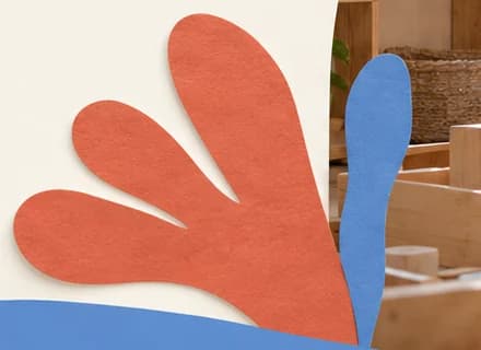
05 Coral frond. Four rounded fingers that read as a palm leaf or a small open hand.
06 Come and explore. A butter-yellow pill riding the blue wave, the larger of the two routes to a tour.
- Sector
- Early years nursery
- Year
- 2026
- Work
- Homepage design

- Paper Cream#F5F1E7 · Background
- Cornflower Wave#5C8ACC · Surface
- Terracotta Leaf#DC6C4F · Accent
- Paper Sun#FADA7F · Accent
- Cocoa Ink#5D4D47 · Type
About the project
The full write-up, if you want it. About 4 minutes.
01Brief and idea
The problem, and the one idea that answers it.1 min
The brief
Nursery websites tend to look either clinical or chaotic, and parents want neither. They want to see the room, understand the approach and book a tour, and their questions about hours, ages and spaces often arrive after the office has closed. The page should feel safe and warm, and no question should wait until morning.
The idea
Make the page feel like the classroom's art wall. Cut-paper shapes sit around a quiet photo of a child building with wooden blocks, so the play is in the frame and the calm is in the room. The headline is short enough for a tired parent to take in at a glance. Behind Book a tour, a WhatsApp assistant would answer the usual questions and offer tour times, then pass anything personal to the nursery team.
02The write-up
The design, decision by decision.6 chapters · 3 min
For a parent choosing a first setting
Little Palms is imagined as a nursery in Mirdif, and this homepage is written for one reader, a parent looking for a toddler's first setting. That parent has seen two kinds of nursery site, the clinical one with policies up front and the chaotic one with every colour at once, and trusts neither. What they want is simple: a look at the room, a sense of the approach and a way to arrange a visit. The page answers in that order, with a photograph, a short promise and a button.
Cut paper around a quiet room
The frame around the photograph borrows from a classroom art wall. A butter-yellow paper sun with five rays rises over the top corner of the photo, a coral frond with four rounded fingers grows up from the bottom left, and cornflower-blue splashes sit at the top right and beside the frond. Each shape has the slight grain and soft shadow of real cut paper rather than flat colour. The coral frond reads as a palm leaf and, just as easily, as a small open hand, which puts the name into a single shape.
The calm is in the photograph
Inside the paper frame the mood changes. A toddler sits on a woven rug, absorbed in placing a yellow block on a small tower of wooden blocks, with arches, cylinders and little house shapes scattered around. Behind are low wooden shelves, potted plants, a botanical print, a tall window and an arched doorway letting in warm sun. Nothing in the room is bright plastic. The busy colour stays at the edges in the paper shapes, so the room itself looks ordered and safe, which is exactly what a parent is checking for.
A serif that stays grown up
Nursery branding often reaches for rounded, childlike lettering. Here the headline is a plump terracotta serif with rounded stroke ends: friendly, but written for the adult reading it. Small steps. Big wonder. is short enough to take in at a glance after a long day. A lighter serif carries the nav links and the line beneath the headline, which promises a place to grow, play and belong. The wordmark sets little palms in lowercase blue serif, crowned by a tiny coral sprout that ties the logo to the frond below.
Two routes to the same tour
There are two ways forward, and both lead to a visit. Book a tour sits at the top right as an outlined blue pill, present from the first second. Lower down, a cornflower wave rolls across the foot of the photograph and carries a large butter-yellow pill, Come and explore, with a thin arrow. To its right, a line-drawn sprout sits beside a ruled line of text. That text repeats the line under the headline word for word, a slot meant for something new, such as tour days or age groups.
Questions that arrive at night
Parents tend to research nurseries once the children are asleep, so questions about opening hours, age groups and spaces often land after the office has shut. The service idea behind this design adds a WhatsApp helper, part of the Run plan. It would answer the common questions, offer open tour slots and leave anything personal for the nursery team to pick up in the morning. The first screen shown here holds no chat window; the assistant would sit behind Book a tour and a WhatsApp button on every screen.
03Type and voice
Type, colour, photography and the lines on the page.3 roles
- Display
- A plump terracotta serif with rounded stroke ends, set large with its two lines packed close together.
- Supporting
- A lighter text serif in warm grey-brown for the supporting line and the nav links.
- Labels
- A blue serif in sentence case for the buttons, matching the colour of the wordmark.
A soft, chunky serif with rounded terminals for the headline in terracotta, and a lighter serif for the supporting line. The lowercase wordmark is set in blue with a small coral sprout above it. The palette is paper cream, cornflower blue, terracotta and butter yellow, each with a slight cut-paper texture. The photograph is warm and sunlit: natural wood, plants and a child absorbed in play.
Small steps. Big wonder.
A place to grow, play and belong.
Come and explore
A day here
Book a tour
Gentle and unhurried. Short sentences, concrete verbs about growing and playing, and invitations rather than instructions. It speaks to the parent while keeping the child at the centre.
04The plan
Launch: 1 page, 6 sections, and what it includes.4 includes
1 page, 6 sections, on Launch, AED 1,999 one time. What it includes:
- Sections for the approach, a day at the nursery and the tour
- A WhatsApp button on every screen for tour requests
- A WhatsApp assistant on the Run plan that answers parents after hours
- An Arabic version as an extra
A site like this sits on Launch. AED 1,999 one time, with a fixed quote in writing.
WhatsApp us