Cacao Lab
A chocolate shop homepage where the method is serious and the colour is not.
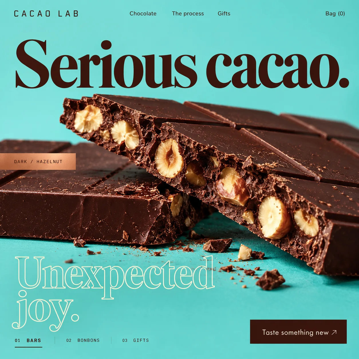
01 Spaced-out wordmark. CACAO LAB in squared, widely spaced capitals, closer to lab equipment than a confectioner's script.
02 Solid serif. Serious cacao. in a tight, high-contrast bold serif, dark chocolate on turquoise.
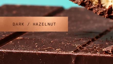
03 Copper foil tag. DARK / HAZELNUT on a copper strip flush with the frame's edge, like a specimen label.
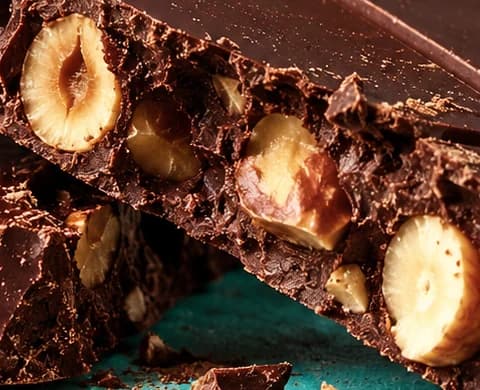
04 Split hazelnuts. Whole nuts halved along the break, the texture standing in for a tasting note.
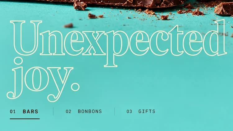
05 Outline serif. Unexpected joy. in a lighter serif, only its outline drawn, like a mould waiting to be filled.
06 Square-cut button. Taste something new in a dark chocolate block with a thin arrow, square-cornered like the tag.
- Sector
- Chocolate maker
- Year
- 2026
- Work
- Homepage design
- Mint Lagoon#73D9D4 · Background
- Dark Ganache#39150D · Type
- Cocoa Butter#F8F3D5 · Type
- Copper Foil#C1764F · Accent
- Broken Bar#552F25 · In the photo
About the project
The full write-up, if you want it. About 4 minutes.
01Brief and idea
The problem, and the one idea that answers it.1 min
The brief
Chocolate gifting here leans on gold boxes that all look alike. A small maker cannot outspend that on packaging, so the website carries the personality and does the selling: show the bar close enough to taste, explain the range in three choices, and get a gift into the bag without a phone call.
The idea
Run the lab straight and let the colour misbehave. The structure is precise: a monospaced wordmark, numbered categories, a foil tag that reads like a specimen label. Then the ground is turquoise, an unusual colour for chocolate, and the second half of the headline is drawn in outline, as if not yet filled in. Brown on turquoise makes the chocolate look darker and richer than it would on cream. The name promises method; the page shows there is fun in the method too.
02The write-up
The design, decision by decision.6 chapters · 3 min
Against a wall of gold boxes
Chocolate gifting in Dubai leans on gold boxes that are hard to tell apart. Cacao Lab is imagined as a small maker with an online shop for bars, bonbons and gifts, too small to outspend the big names on packaging, so this design moves the personality onto the website. Its brief is practical: make the bar look good enough to eat through the screen, sort the range into three clear choices, and let a gift reach the bag without a phone call. Almost everything else on the page follows from one decision about colour.
Why the ground is turquoise
Most chocolate brands sit on cream, black or kraft brown. This one sits on a bright mint turquoise, and the choice is as functional as it is playful. Brown against its near opposite reads deeper and richer than brown against beige, so the snapped bar looks darker and glossier than it would on a safer colour. The turquoise also sets the shop apart from every gold and black gift counter it competes with. A single copper tone, used on the foil tag, keeps a link to the warmth of the product.
A headline in two states
Serious cacao. is set in a tight, high-contrast bold serif, solid dark chocolate, across the full width above the bar. Unexpected joy. sits below the bar in a lighter serif drawn as a hollow cream outline, as if the second half has not been filled in yet. The split carries the brand's whole position without a paragraph: the craft is solid, the fun is lighter. It has a cost worth naming. A thin cream outline on turquoise is low in contrast, so the stroke needs darkening, or the letters filling, before the line passes contrast checks.
Labelled like a sample
The lab half of the name shows up in the small type. The wordmark is CACAO LAB in squared, widely spaced capitals, closer to equipment labelling than a confectioner's script. A copper foil tag sits flush against the left edge of the frame and reads DARK / HAZELNUT in a monospaced face, like a label stuck to a specimen. The same face files the range as 01 BARS, 02 BONBONS and 03 GIFTS, separated by hairline rules, with the active tab underlined. Even the basket is literal: Bag (0).
Photographed just after the snap
The camera sits low and near: two thick slabs, one propped on the other, with whole hazelnuts split clean along the break. Shards and cocoa dust are left where they fell on the turquoise, and the squares run off the right edge of the frame, so the bar feels too big to fit. Nothing is garnished. The broken edge, rough and dense against the smooth moulded top, does the work a tasting note would do, which lets the headline stay short.
Three doors into the shop
The nav keeps the choices few: Chocolate, The process and Gifts, with the bag at the far right. The one filled button, Taste something new, is a block of dark chocolate with cream type and a thin arrow, square-cornered like the copper tag rather than a rounded pill. The plan for the shop adds a bag and a checkout that pays the maker directly, a catalogue the makers update without a developer, the first ten product descriptions written in this voice and, as an extra, an Arabic edition for people buying gifts in Arabic.
03Type and voice
Type, colour, photography and the lines on the page.3 roles
- Display
- A tight, high-contrast bold serif for the solid first line; the second line is a lighter serif in hollow outline.
- Labels
- A monospaced sans in spaced capitals for the foil tag and the numbered tabs, with a squared cousin for the wordmark.
- Supporting
- A clean geometric sans for the nav links and the main button.
Serious cacao. is a tight, high-contrast bold serif; Unexpected joy. repeats it as a hollow outline. A spaced-out monospaced sans for the wordmark, tag and tabs, and a clean geometric sans for the button. Turquoise ground, dark chocolate type, cream for the outline and a single copper accent. The bar is shot low and close, with crumbs and cocoa dust left on the table so it looks just broken, not styled.
Serious cacao.
Unexpected joy.
Taste something new
DARK / HAZELNUT
Bag (0)
Deadpan, then a wink. Labels are terse and technical, the headline makes its promise in two halves, and the button invites curiosity rather than a purchase.
04The plan
Grow: 5 pages, and what it includes.4 includes
5 pages: home, bars, bonbons, gifts, the process, on Grow, AED 4,999 one time. What it includes:
- An online shop with a bag and checkout, paid into your own account
- Products, prices and photos you edit yourself
- First 10 product descriptions written for you
- An Arabic version for gift buyers who shop in Arabic, as an extra
A site like this sits on Grow. AED 4,999 one time, with a fixed quote in writing.
WhatsApp us