Sormeh
A creative agency homepage that has to hold attention first, so it opens on a glossy 3D portrait.
- Sector
- Creative agency
- Year
- 2026
- Work
- Website design
- Screens
- Two desktop screens and the full homepage
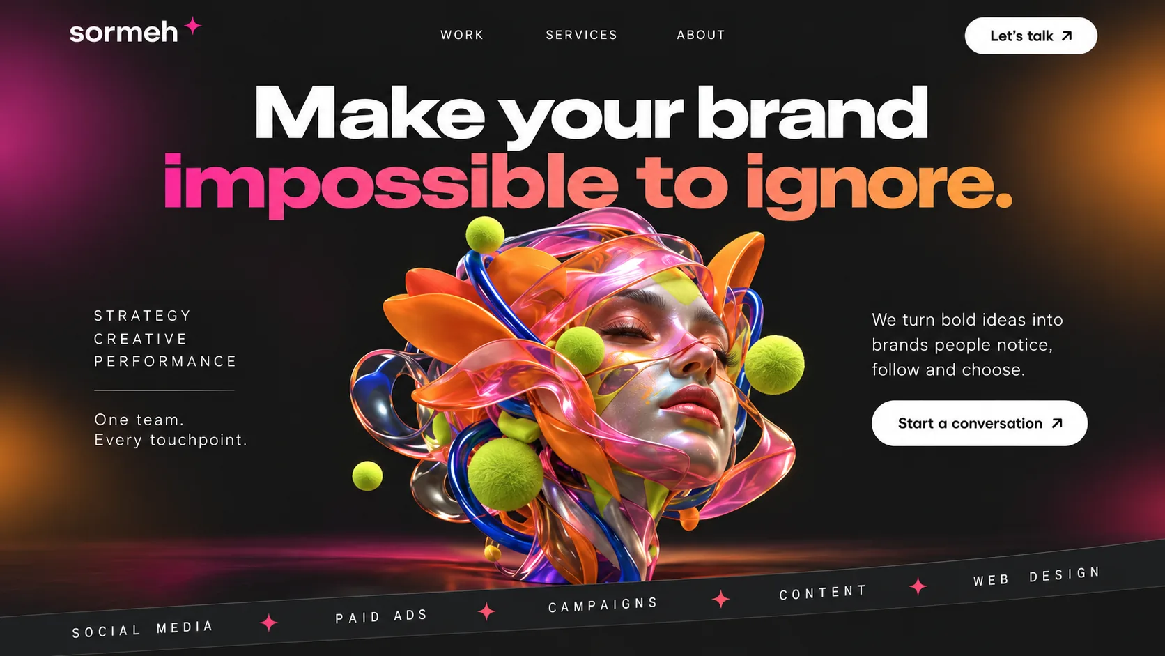
01 Lowercase wordmark. sormeh in a rounded lowercase sans, finished with a small pink four-point star.
02 Gradient promise. The second line shifts from magenta to orange, so the promise outshines the plain white line above it.
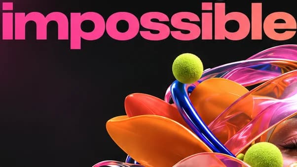
03 3D portrait. A calm face wrapped in glossy ribbons: the hero image is the first proof of craft.
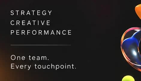
04 Three-word positioning. STRATEGY, CREATIVE, PERFORMANCE in airy spaced capitals, above One team. Every touchpoint.
05 Start a conversation. A white pill under a one-sentence pitch, softer than a contact form.
06 Tilted services band. Five services on a slanted strip, divided by pink stars, like a ticker in mid-scroll.
- Carbon Night#151616 · Background
- Clean White#FDFDFD · Type
- Hot Magenta#FB2F94 · Accent
- Ember Orange#FC9B3F · Accent
- Acid Lime#D2E755 · In the photo
About the project
The full write-up, if you want it. About 4 minutes.
01Brief and idea
The problem, and the one idea that answers it.1 min
The brief
Imagined as an agency in Dubai Media City offering social, content, paid media and web design as one team. The site has to win trust from brand owners who have never heard of it, explain two service lines clearly, show selected work and end every scroll with an easy way to start a conversation.
The idea
Make your brand impossible to ignore. An agency that sells attention has to hold it first, so the hero is a glossy 3D portrait: a calm face wrapped in ribbons of pink, orange and blue, with lime spheres orbiting it. The same material language runs down the page, from floating social posts to a glass bar chart, so strategy and performance look as crafted as the creative. The tone stays short and direct: One team. Every touchpoint.
02The write-up
The design, decision by decision.5 chapters · 2 min
An agency that sells attention
Sormeh is imagined as an agency in Dubai Media City, running social, content, paid ads and web design under one roof. The people landing on its homepage are brand owners meeting the name for the first time, quietly comparing it with other agencies. That sets an unusual bar: an agency that promises attention has to earn it in the first second, before a single case study is read. So the design treats the hero as the first piece of work in the portfolio.
Proof before the pitch
The headline runs across the top in two tones. Make your brand is set in heavy white, and impossible to ignore. switches to a magenta-to-orange gradient, so the promise is the brightest thing in the room. Beneath it, a calm 3D face with closed eyes is wrapped in glossy ribbons of pink, orange and cobalt, with fuzzy lime spheres orbiting it. Soft magenta and orange glows light the charcoal edges. A tilted band along the bottom lists the services in spaced capitals, divided by pink four-point stars.
Two service lines, two spreads
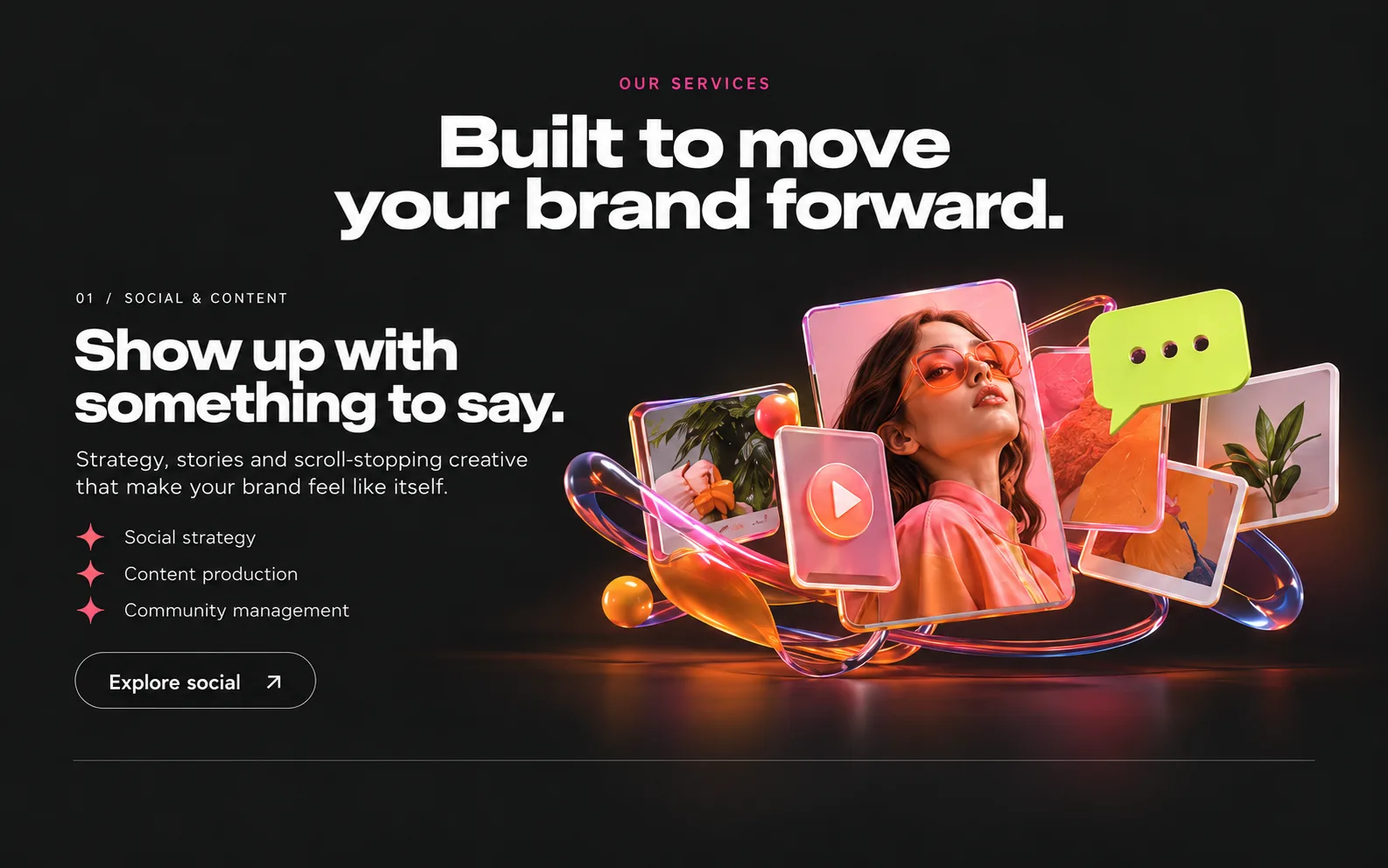
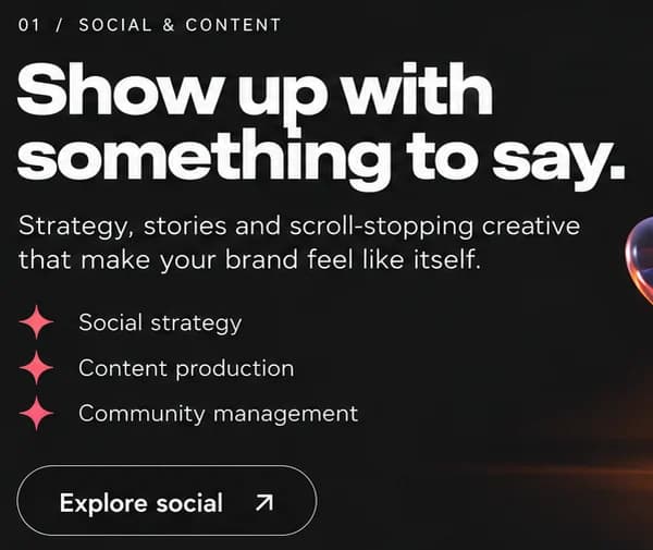
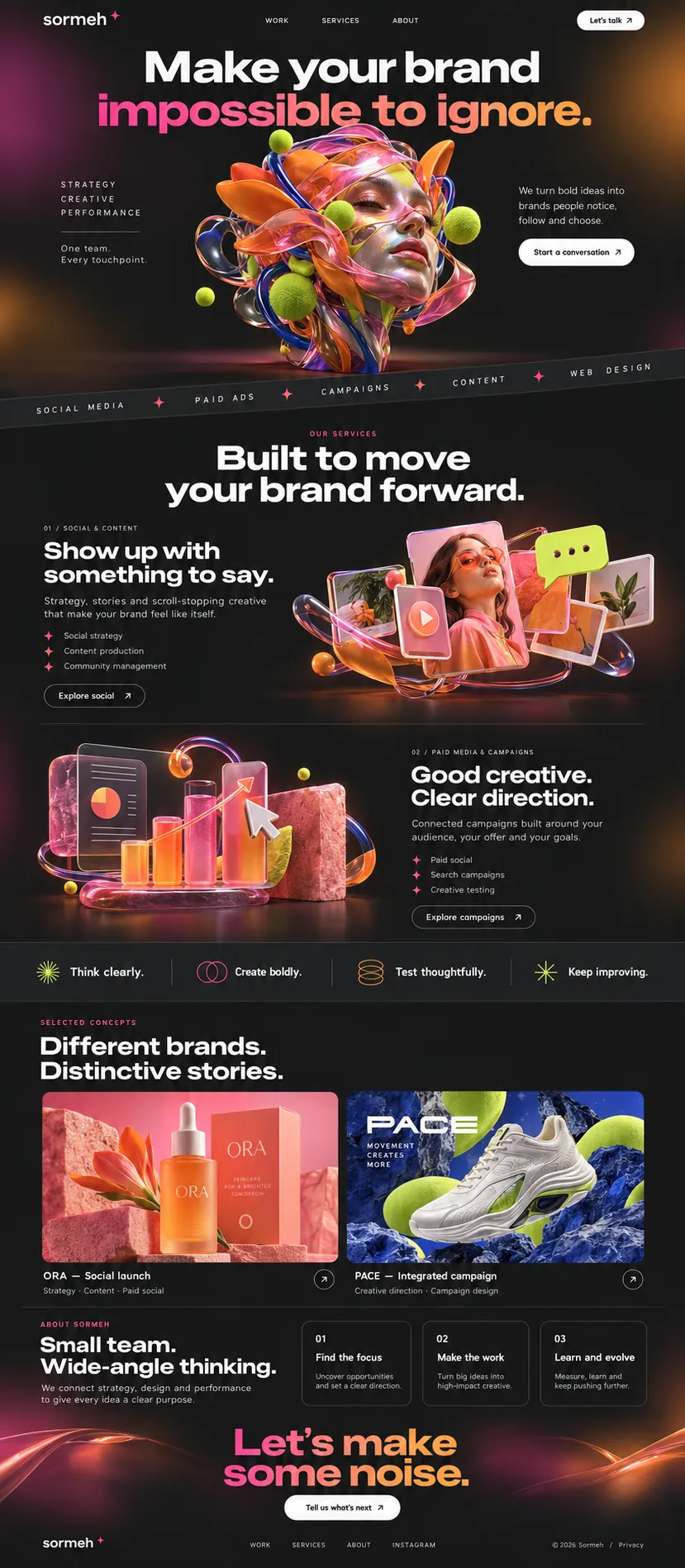
Under OUR SERVICES and Built to move your brand forward., the offer splits into two clear spreads. 01 / SOCIAL & CONTENT pairs Show up with something to say. with floating glass posts, a play button and a lime speech bubble. 02 / PAID MEDIA & CAMPAIGNS flips the layout for Good creative. Clear direction., beside a glass bar chart with a rising arrow and a cursor. Each spread lists three services with pink star bullets and ends on an outlined button, so both read alike and compare easily.
One material, top to bottom
Almost every image on the page is made of the same stuff: glossy ribbon, frosted glass, soft-touch spheres and a little pink stone. Social posts float as glass tiles, performance becomes glass bars, and even the four values strip, Think clearly. Create boldly. Test thoughtfully. Keep improving., gets small line icons in lime, magenta and orange. Keeping one material language means strategy and reporting look as crafted as the creative work, which is the agency's argument in visual form.
Small team, wide angle, then noise
The lower half moves from promise to process. The selected work shows two sample campaigns, a skincare launch and a sneaker campaign, each labelled with the disciplines involved. ABOUT SORMEH follows with Small team. Wide-angle thinking. and three outlined step cards: Find the focus, Make the work, Learn and evolve. Then the gradient returns at full size for the sign-off, Let's make some noise., above a white Tell us what's next pill. The two sample campaigns hold the place of real case studies until they arrive.
03Type and voice
Type, colour, photography and the lines on the page.3 roles
- Display
- Wide, very heavy sans with tight spacing, in white or a magenta-to-orange gradient.
- Labels
- Small capitals with very wide tracking, sometimes in pink, used for section labels and the services band.
- Body
- Light, open sans in sentence case for short pitches and service lists.
Type is a wide, heavy sans for headlines, widely spaced small caps for labels and a light sans for body copy. The base is charcoal black, lit at the edges by soft magenta and orange glows, with lime and cobalt as sharp counterpoints. Imagery is glossy 3D: ribbons, glass, spheres and floating screens. The page moves from hero to two service spreads, a four-value strip, selected work, three working steps and a gradient sign-off.
Make your brand impossible to ignore.
One team. Every touchpoint.
Show up with something to say.
Good creative. Clear direction.
Let's make some noise.
Bold and brisk, but never shouty in the copy itself: the loudness lives in the type and imagery. Lines are two-beat promises, and every section ends with a plain invitation to talk.
04The plan
Grow: up to 6 pages, and what it includes.4 includes
Up to 6 pages, on Grow, AED 4,999 one time. What it includes:
- Up to 6 pages, with about 1,800 words written for you
- Edit your own text and photos to add new work
- Every enquiry lands in one inbox
- Arabic version as an extra
A site like this sits on Grow. AED 4,999 one time, with a fixed quote in writing.
WhatsApp us