Karak Social
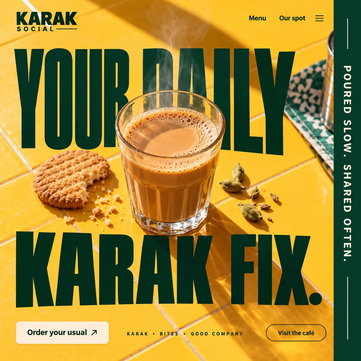
A karak café homepage that treats regulars like regulars: the usual order sits one tap away.
01 Stacked wordmark. KARAK in heavy capitals over a spaced-out SOCIAL, finished with a thin rule.
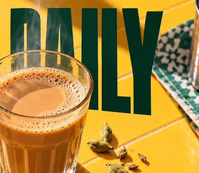
02 Glass over DAILY. The cup is set down in front of the headline, covering the lower half of two letters.
03 Cardamom pods. Scattered beside the glass as a hint of what is brewing in it.
04 Vertical rail. POURED SLOW. SHARED OFTEN. on bottle green: the page's only line of brand story.
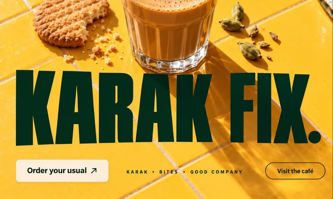
05 Order your usual. The one filled button, cream on mustard, placed where a regular's thumb lands first.
06 Caption strip. KARAK • BITES • GOOD COMPANY in small, wide-spaced capitals between the two buttons.
- Sector
- Karak café
- Year
- 2026
- Work
- Homepage design
- Mustard Tile#FDC536 · Background
- Bottle Green#053222 · Type
- Evaporated Milk#FDEDD9 · Surface
- Karak Amber#D0843F · In the photo
- Shaded Tile#B26D1B · In the photo
About the project
The full write-up, if you want it. About 4 minutes.
01Brief and idea
The problem, and the one idea that answers it.1 min
The brief
A karak café runs on regulars. The same people order the same cup at the same hour, often through a delivery app that takes a cut and keeps the customer. So the homepage should feel like the café, warm and quick, and make ordering direct faster than the app.
The idea
Treat the page like the counter. Regulars do not browse; they nod and the cup arrives. So the site leads with the cup and two choices, order the usual or come by. The headline is so big it becomes part of the table, mustard tiles and hard sun behind it, and the glass stands in front of the words as if someone just set it down. The green rail holds the only line of brand story the page needs.
02The write-up
The design, decision by decision.5 chapters · 2 min
Written for people who skip the menu
Karak Social is imagined as a café in Al Satwa, and the people this design is drawn for already know what they want. They come at the same hour, ask for the same glass and leave. A homepage that walks them through a story would slow down a habit. So the first screen does what a good counter does: it shows the cup, states the pitch in one line and offers one button that skips every question. Everything a newcomer needs waits in the nav, under Menu and Our spot.
A cup set down on the headline
YOUR DAILY KARAK FIX. is set in a condensed bottle-green capital so tall that two lines fill most of the square. The type is not laid over the photograph; it is laid into it. The glass sits in front of DAILY, covering the lower half of the D and the A, while a thread of steam rises through the letters behind it. It reads like a table seen from above, with the headline painted on the tiles and the cup set down on top. On a small screen that costs a little legibility, which is worth testing on real phones, and it buys the page its whole character.
Two buttons, two kinds of visit
The foot of the page offers exactly two actions. Order your usual is a solid cream block and the one filled shape among the buttons, so the eye lands on it first. Visit the café sits at the far end as a thin green outline, there for people who would rather walk over. Between them, a spaced-out line reads KARAK • BITES • GOOD COMPANY, three things the café offers, set small enough not to compete. The plan is for the order button to open WhatsApp with the message already typed, with every tap on it counted.
One line of story, turned on its side
Most café sites spend a paragraph on how the tea is made. This one spends four words. A bottle-green rail runs the full height of the right edge, and POURED SLOW. SHARED OFTEN. runs down it in wide-spaced cream capitals, with a short rule above and below. The rail cuts a steel tumbler clean in half and picks up the green of the patterned cloth beside the glass, so it feels like part of the table rather than a sidebar. On a phone, the same line could become a thin band above the buttons.
Props from a real counter
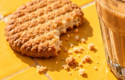
The photograph avoids anything that looks styled for a magazine. Hard afternoon sun throws long diagonal shadows across glazed mustard tiles. A round biscuit has a bite out of it, with crumbs left where they fell. Cardamom pods lie to the right of the glass, a quiet clue to what is in the cup. The glass is the small faceted kind karak is so often served in, filled to just under the rim, its foam still bubbling. None of it is precious, and that is the point: this is a place for a daily habit, not an occasion.
03Type and voice
Type, colour, photography and the lines on the page.3 roles
- Display
- A towering condensed sans in bottle green, all capitals, stretched so two lines fill the frame.
- Labels
- Small capitals with very wide letter spacing, used for the caption strip and the vertical rail.
- Supporting
- A compact, bold sans in plain sentence case, used on Menu, Our spot and both buttons.
A towering, condensed uppercase sans in bottle green, big enough to fill the frame in two lines. Wide-spaced capitals for the strip along the bottom and the vertical rail. Mustard yellow from the glazed tiles, bottle green from the rail and the patterned cloth, cream for the main button. The photograph uses hard afternoon sun, cardamom pods, a bitten biscuit and a steel tumbler: everyday details that make it feel like a corner café.
YOUR DAILY KARAK FIX.
Order your usual
POURED SLOW. SHARED OFTEN.
KARAK • BITES • GOOD COMPANY
Visit the café
Short, familiar and a little proud. It talks to people who already come in, assumes the order is known, and keeps the brand story to four words on the rail.
04The plan
Launch: 1 page, 5 sections, and what it includes.4 includes
1 page, 5 sections, on Launch, AED 1,999 one time. What it includes:
- About 600 words of copy written for you, in this voice
- Order your usual opens WhatsApp with a message already typed
- WhatsApp button on every screen, with the taps counted
- An Arabic version for regulars who order in Arabic, as an extra
A site like this sits on Launch. AED 1,999 one time, with a fixed quote in writing.
WhatsApp us