Fold Studio
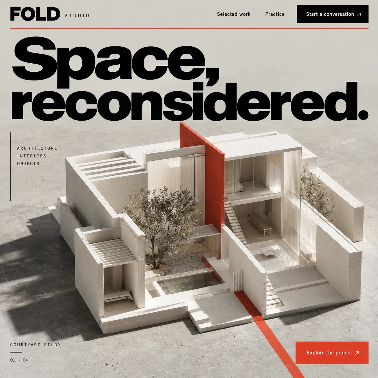
An architecture homepage led by a white model house and one vermilion wall that cuts through it.
01 Bold wordmark. A heavy FOLD beside a small, tracked STUDIO, above a fine vermilion hairline.
02 Slab headline. A heavy, tightly spaced grotesque in pure black, resting over the model like a lintel.
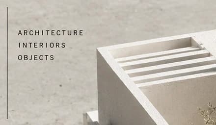
03 Three disciplines. Architecture, interiors and objects in small tracked capitals beside a thin vertical rule.
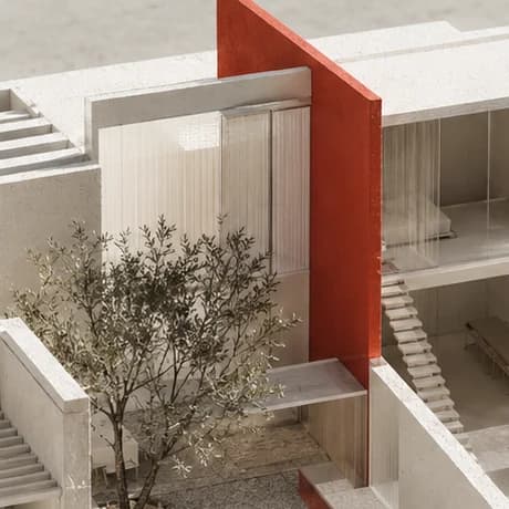
04 Vermilion wall. One red wall splits the white house: the studio's signature move, built into the model.
05 Project counter. COURTYARD STUDY and 01 / 04 mark the first of four projects in the hero.
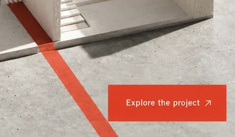
06 Explore the project. The wall carries on as a red floor line that runs down beside this vermilion button.
- Sector
- Architecture studio
- Year
- 2026
- Work
- Homepage design
- Plaster grey#D0CCC5 · Background
- Drafting black#050505 · Type
- Vermilion cut#DC3D25 · Accent
- Card stock#E6E2DC · In the photo
- Courtyard stone#8C7E70 · In the photo
About the project
The full write-up, if you want it. About 4 minutes.
01Brief and idea
The problem, and the one idea that answers it.1 min
The brief
Architecture studios tend to bury their thinking under a grid of tiny thumbnails and a mission statement. A prospective client wants to see how the studio handles light, scale and a plot like theirs. Here, one project comes first, explained in a breath, and starting a conversation feels low stakes.
The idea
Show the thinking, not the render. A physical model reads as work in progress, handled and considered, where a glossy visualisation reads as sales. The vermilion wall is the studio's signature move made literal: one decisive cut through a quiet plan. It does a second job as wayfinding, carrying on past the model as a line across the floor, down towards the Explore the project button. The two-word headline names the attitude and leaves the proof to the model.
02The write-up
The design, decision by decision.5 chapters · 2 min
A model, not a render
The first screen shows one project, and shows it as a physical model: an open-topped white courtyard house, photographed from above in soft daylight with long shadows across a plaster floor. You can look straight into its rooms. There is a long dining table, a stair rising beside the red wall, fluted glass screens, a small olive tree in the courtyard and a narrow pool at its foot. A glossy visualisation says finished and for sale. A model says the studio is still thinking, which is what a villa owner or developer wants to see before hiring one.
Thinking over thumbnails
Fold Studio is imagined as a practice working across architecture, interiors and objects from Al Wasl. Studio websites often bury the work under a grid of small thumbnails and a paragraph of mission statement. A prospective client learns more from one project, explained in a breath, that shows how a studio handles light, scale and a plot not unlike their own. The brief was to lead with that single project and make starting a conversation feel like a small step rather than a commitment.
One vermilion cut
A single vermilion wall splits the house in two, rising above the roofline and dropping through the courtyard. It is the studio's signature move made literal: one decisive cut through a quiet plan. Then it keeps going. Beyond the model the wall becomes a red line on the floor, running down to the foot of the page beside Explore the project, which sits in the same vermilion. The colour appears only four times, as a hairline under the nav, the wall, the floor line and that button, so wherever it shows up it means look here.
Type with weight and air
Space, reconsidered. is set in a heavy, tightly spaced grotesque in pure black, two dense lines resting above the model like a lintel. Everything around it is light. Selected work and Practice sit in a plain sans, and the three disciplines, ARCHITECTURE, INTERIORS and OBJECTS, are stacked in small, widely tracked capitals beside a thin vertical rule. Start a conversation is a solid black box at top right, the one filled shape in the nav. The tight leading pulls the comma after Space close to the i below; that gap wants opening a touch.
Four studies, then the practice
Bottom left, COURTYARD STUDY over a short rule, with 01 / 04 beneath, tells the visitor this is the first of four projects in a cycling hero. The Grow build makes that counter work, then adds Selected work and Practice pages, around 1,800 words in all, written in the studio's voice. The team edits projects, photographs and text itself, and Arabic translations of each page come as an extra. The homepage stays this restrained: one study at a time, one red line to follow, one black button for the conversation.
03Type and voice
Type, colour, photography and the lines on the page.3 roles
- Display
- Heavy, tightly spaced grotesque in pure black, two dense lines with very tight leading.
- Labels
- Light sans in small, widely spaced capitals for the disciplines, captions and counter.
- Body
- Plain, medium-weight sans for menu links and the text on both buttons.
A heavy, tightly spaced grotesque sits like a slab above the model. The wordmark pairs a bold FOLD with a small, tracked STUDIO, and the side labels and captions use a light, widely spaced sans. The ground is warm plaster grey, the type pure black, and the only colour is vermilion: a hairline under the nav, the wall, the floor line and the Explore button. The model is shot in soft daylight with long shadows.
Space, reconsidered.
Start a conversation
Explore the project
COURTYARD STUDY
Spare and confident, like a studio that would rather show than tell. Two words carry the whole philosophy, and the calls to action keep the stakes low: a conversation, not a quote.
04The plan
Grow: up to 6 pages, and what it includes.4 includes
Up to 6 pages, on Grow, AED 4,999 one time. What it includes:
- Selected work and Practice pages, with about 1,800 words written for the studio
- The hero cycling through four studies, with the 01 / 04 counter working
- Projects, text and photos the studio edits itself
- An Arabic version of every page, as an extra
A site like this sits on Grow. AED 4,999 one time, with a fixed quote in writing.
WhatsApp us