Me health
A family clinic homepage that shows who will listen before it lists what they treat.
- Sector
- Family clinic
- Year
- 2026
- Work
- Website design
- Screens
- Two desktop screens and the full homepage
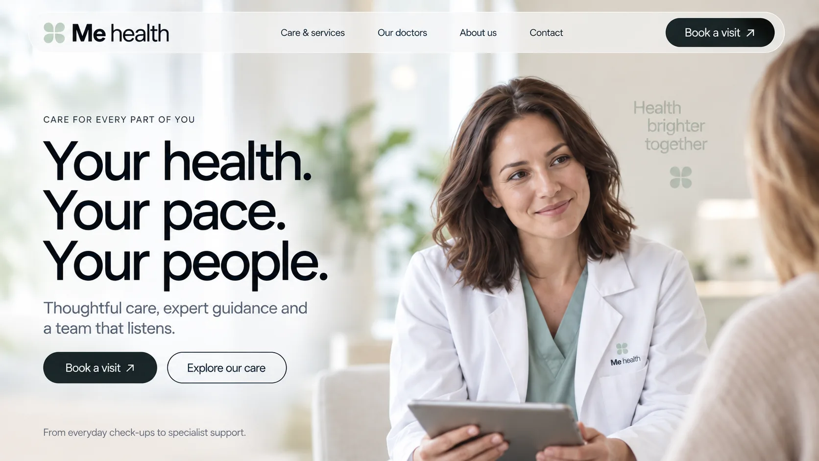
01 Two-weight wordmark. Me in bold, health in regular, beside a four-leaf clover in pale sage.
02 Frosted pill navigation. Four plain links on a translucent bar that lets the clinic photo show through.
03 Booking, always in reach. Book a visit sits in a dark slate capsule at the end of the bar, the only filled shape up there.
04 Three short promises. Your health. Your pace. Your people. Each sentence gets its own line and its own full stop.
05 One filled, one outlined. Book a visit and Explore our care sit side by side: a decision and a browse, clearly ranked.
06 Eye-level listening. The clinician faces a patient seen from behind, so the visitor sits in the patient's place.

- Clinic Linen#FEFEFE · Background
- Deep Slate#1A2628 · Type
- Clover Sage#B1C5B9 · Accent
- Mint Wash#DCE7DF · Surface
- Scrub Green#6C7E72 · In the photo
About the project
The full write-up, if you want it. About 4 minutes.
01Brief and idea
The problem, and the one idea that answers it.1 min
The brief
Design a homepage for a family clinic that feels warm without going soft on expertise. Patients should see who will look after them before they see a service list, find the right starting point in one scan, and be able to book a visit from the first screen and again at the close.
The idea
Lead with the conversation, not the building. Most photos show a clinician mid-conversation with a patient at eye level, and the copy follows suit with short lines like 'Your health. Your pace. Your people.' and 'A real conversation. A clearer next step.' The clover mark stays pale and soft, even at full size in the closing band. Services arrive late and plainly, as a list, and the page ends by asking for a booking with the same quiet confidence it started with.
02The write-up
The design, decision by decision.6 chapters · 3 min
Choosing for the whole family
Me health is imagined as a family clinic in Umm Suqeim, designed here as a desktop homepage. Its visitor is often choosing for more than one person: a parent booking for a child, or someone finding a GP for an older relative. That visitor wants to know who will be in the room before reading about equipment. So the brief was warmth without going soft: show the people, make the right starting point easy to find in one scan, and offer Book a visit in the opening view and once more in the closing band.
Three promises and a listening face
The hero splits down the middle. On the left, a spaced label, CARE FOR EVERY PART OF YOU, sits above three stacked sentences in a tight near-black grotesque: Your health. Your pace. Your people. On the right, a clinician in a white coat and sage scrubs smiles at a patient whose shoulder fills the edge of the frame, so the visitor effectively takes the patient's chair. A frosted pill holds the navigation, with Book a visit in a dark slate capsule at its right end, repeated under the copy beside an outlined Explore our care.
People before departments
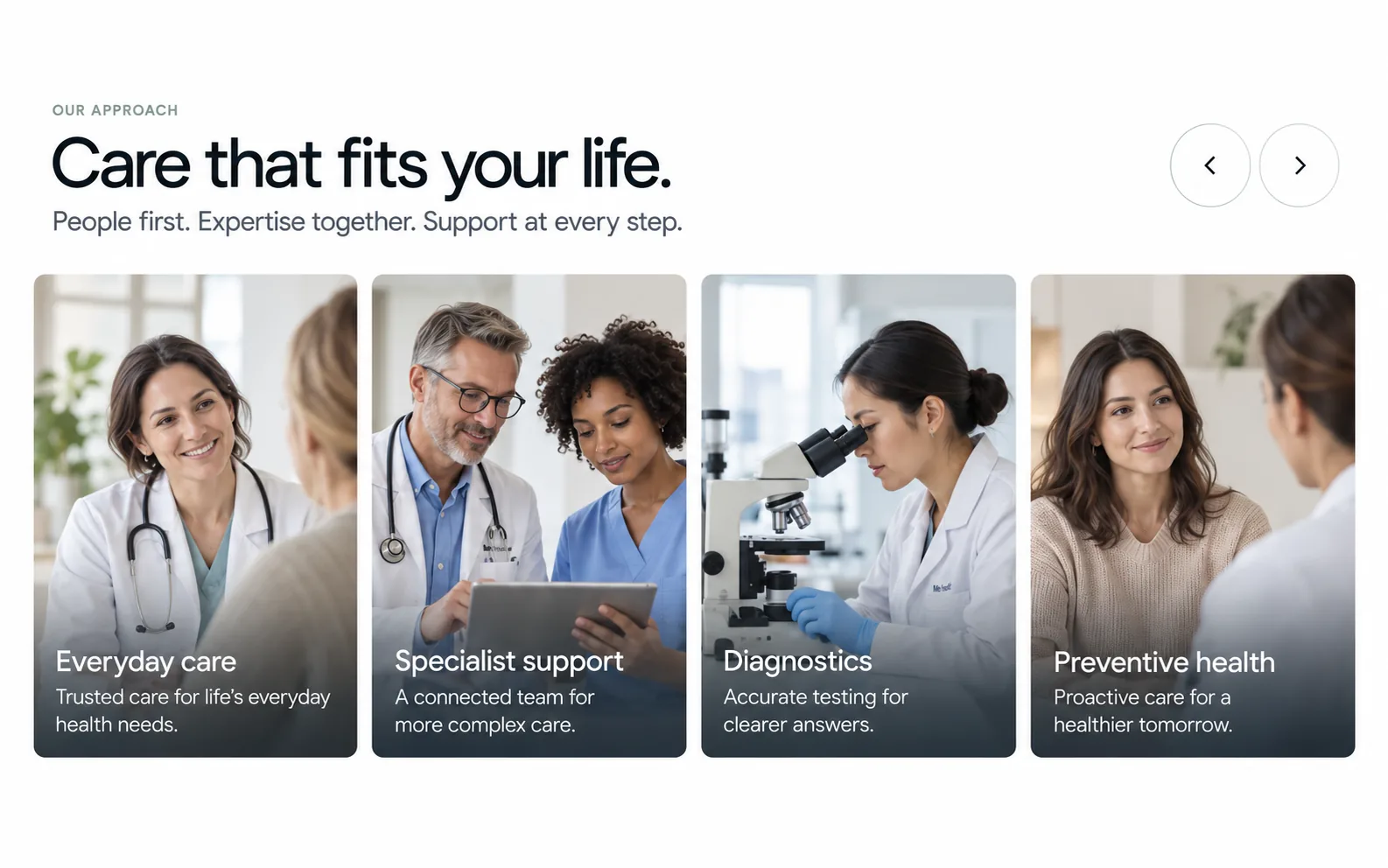
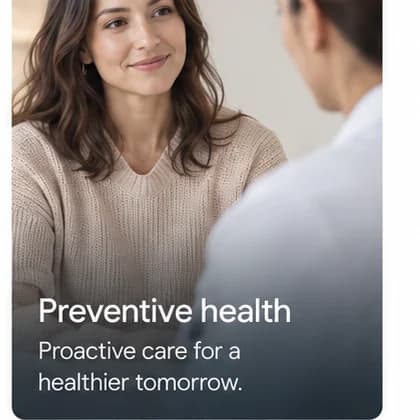
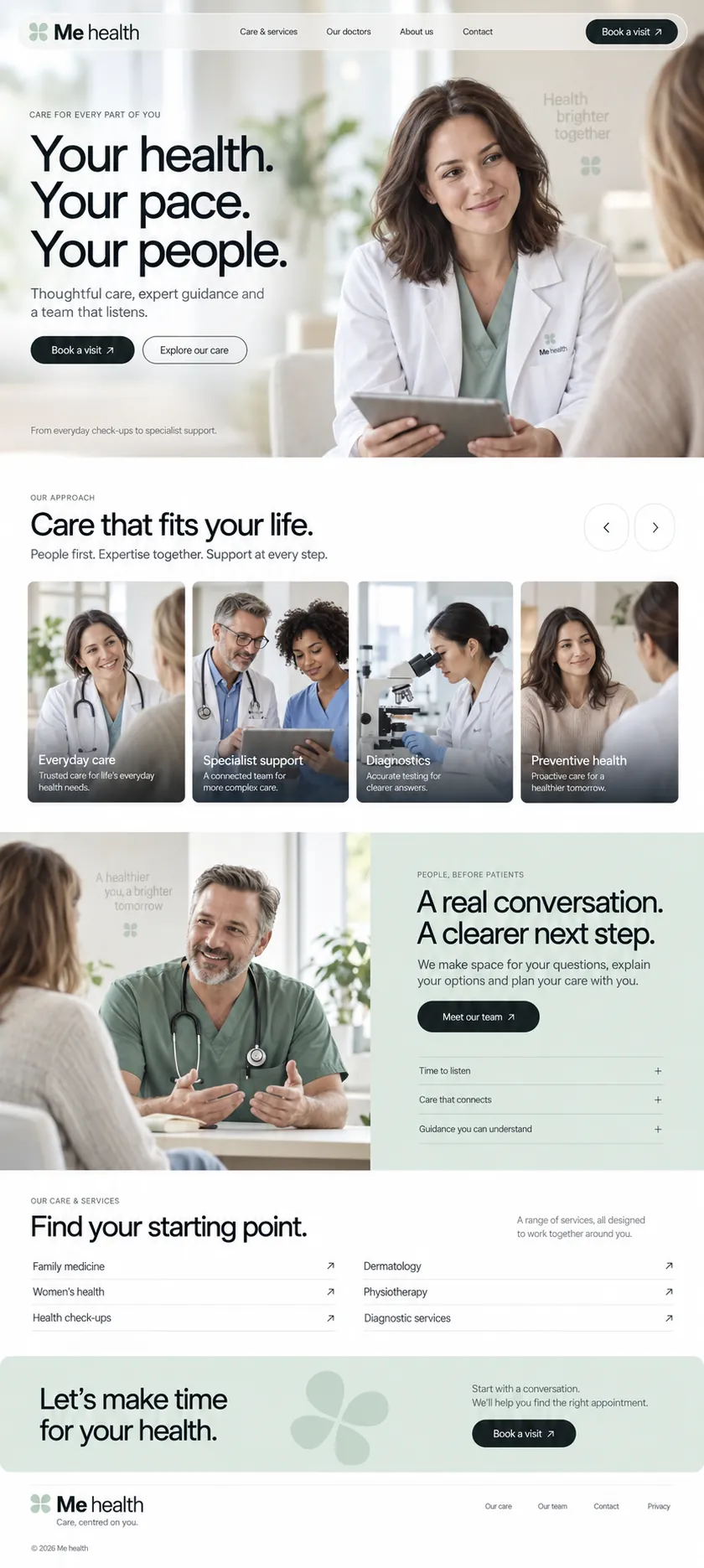
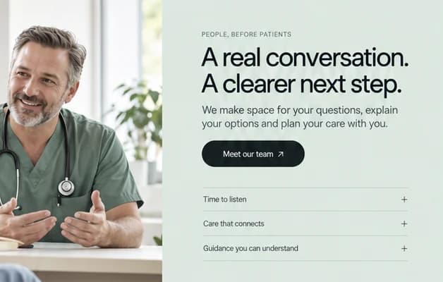
Clinic sites often open with buildings and machines. This one keeps returning to two people talking at eye level. Our approach shows four photo cards, Everyday care, Specialist support, Diagnostics and Preventive health, each with a title and one plain line over a soft dark fade, with round arrow buttons to move through them. Then the page splits: a clinician mid-explanation on the left, a mint panel on the right headed A real conversation. A clearer next step. Three quiet accordion rows, Time to listen, Care that connects and Guidance you can understand, hold the detail.
Six starting points, then a booking
Services arrive late and plainly. Under Find your starting point., six specialties sit in a two-column list with thin rules and small diagonal arrows: Family medicine, Women's health, Health check-ups, Dermatology, Physiotherapy and Diagnostic services. Nobody has to decode a department tree to find the right door. The close is a full-width mint band where the clover grows large and pale beside Let's make time for your health., with one last Book a visit button and a short line promising help to find the right appointment.
Colour that comes from the clothes
The palette is small and taken from the photographs. Sage scrubs under white coats, cream knitwear on patients and bright daylit rooms supply the colours, so the clover mark never has to shout. It turns up beside the wordmark, on a coat pocket, faintly on the walls behind two of the photos, and finally oversized in the closing band. Buttons are dark slate capsules with a small arrow. The wordmark sets Me in bold against a lighter health, which quietly puts the patient first.
Real doctors, real rules, real times
Every face in these images is generated, which suits a design but not a clinic's own site: Our doctors and Meet our team call for the clinic's own doctors, photographed in its own rooms. Service lines such as Accurate testing for clearer answers are to be checked against Dubai Health Authority advertising rules. In the plan, Book a visit opens real appointment times, enquiries land in one inbox, and the clinic edits its own text and photos.
03Type and voice
Type, colour, photography and the lines on the page.3 roles
- Display
- Tight modern grotesque in near-black, set large in sentence case with close spacing and a full stop on every line.
- Body
- Lighter sans in soft grey, used for one or two calm lines under each heading.
- Labels
- Small, widely spaced capitals in grey that open each section.
Headlines use a tight, modern grotesque in near-black, large and in sentence case, with a lighter sans for supporting lines and small spaced capitals for labels. The palette is clinical white warmed by a pale mint panel, a sage clover and dark slate buttons with a small arrow. Photography is soft daylight, cream knitwear and sage scrubs, so the clothes carry the brand colours. The layout breathes: wide margins, a four-card carousel, a split photo and accordion section, then a calm mint call to book.
Your health. Your pace. Your people.
People first. Expertise together. Support at every step.
A real conversation. A clearer next step.
Let's make time for your health.
Care, centred on you.
Calm and plain, closer to a good family doctor than a hospital brochure. Sentences are short and finish on full stops, the promises are about time and attention, and nothing is shouted.
04The plan
Grow: up to 6 pages, and what it includes.4 includes
Up to 6 pages, on Grow, AED 4,999 one time. What it includes:
- Patients book a visit online
- Every enquiry lands in one inbox instead of a WhatsApp thread
- Google Maps listing set up and submitted, where Google allows it
- Edit your own text and photos without a developer
A site like this sits on Grow. AED 4,999 one time, with a fixed quote in writing.
WhatsApp us