Mori Matcha
A matcha bar homepage that sells a slow ingredient to people in a hurry.
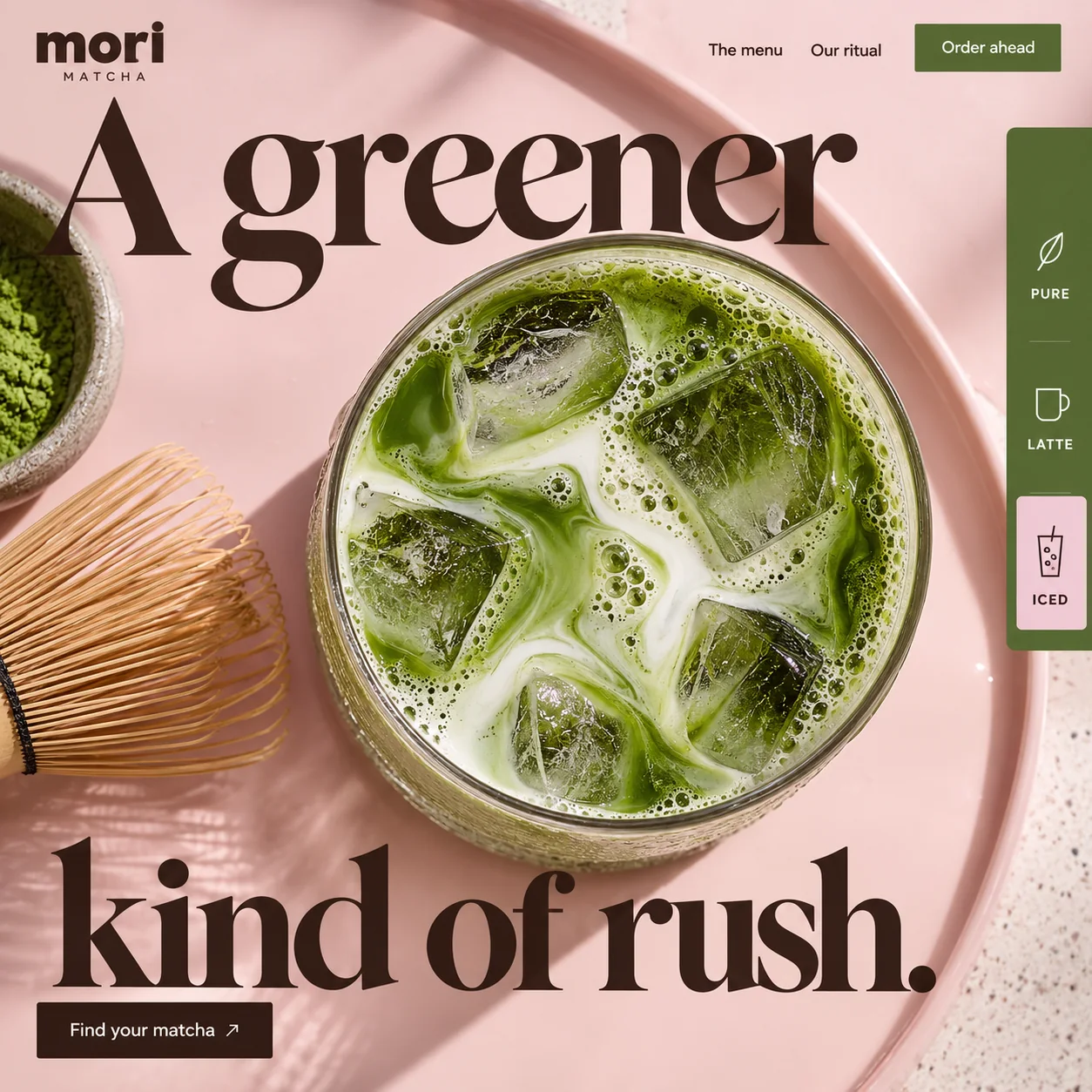
01 Lowercase wordmark. mori in a chunky geometric sans, with MATCHA spaced out beneath it in small capitals.
02 Order ahead. Moss green like the drink rail, and the one solid button across the top.
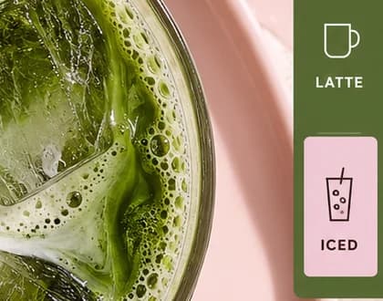
03 Iced, selected. The Iced tab sits on a pink tile, matching the iced latte in the photograph.
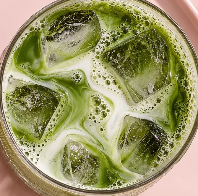
04 Top-down glass. Seen from directly above, the drink becomes a circle of green and white marbling around five ice cubes.
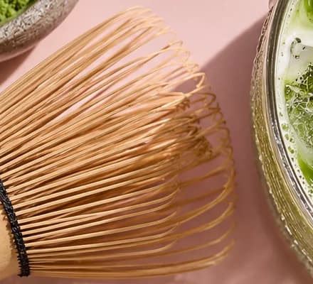
05 Bamboo whisk. Cut off by the edge of the frame: a nod to the tea ceremony, kept to the margin.
06 Find your matcha. A dark espresso button under the headline, the browsing route for anyone not ordering yet.
- Sector
- Matcha bar
- Year
- 2026
- Work
- Homepage design
- Blush Tray#EED2CC · Background
- Espresso Ink#39221A · Type
- Moss Rail#576733 · Accent
- Whisked Matcha#708A16 · In the photo
- Bamboo Tine#BD8256 · In the photo
About the project
The full write-up, if you want it. About 3 minutes.
01Brief and idea
The problem, and the one idea that answers it.1 min
The brief
Matcha has moved from the tea bowl to the takeaway cup, and the people buying it are in a hurry. They want to see the menu, know it comes iced, and skip the queue. A matcha bar's homepage has to look calm and considered, then move as fast as its customers do.
The idea
Take the word ritual and speed it up. Matcha is usually sold as slowness; Mori sells the same ingredient to people with a nine o'clock meeting. So the headline admits the rush, the drink is iced in a glass rather than whisked in a bowl, and the whisk sits at the edge of the frame as a nod to where it came from. The drink selector stays docked on the right, one tap away. Pink against green keeps it soft enough to feel like a treat.
02The write-up
The design, decision by decision.4 chapters · 2 min
Ritual, at office speed
Matcha is usually marketed as slowness: the bowl, the whisk, the quiet. Mori Matcha, imagined as a bar in Barsha Heights, sells the same drink to people with a meeting at nine. The headline says so openly, calling the drink A greener kind of rush, and the nav puts Order ahead in the only solid button at the top of the page. The page does not pretend its customers will linger. Its job is to make the drink they grab on the way in feel considered, and to let them claim it before they leave the desk.
A glass that becomes a circle
Shot straight down, an iced matcha latte stops looking like a drink and becomes a shape: a ring of ribbed glass around green and white marbling, five cubes of ice and a scatter of bubbles at the rim. It sits on a blush pink tray whose raised edge sweeps around it in a wide curve. At the left edge, a bamboo whisk and a bowl of powder are cut off by the frame, a nod to where the drink comes from without making a ceremony of it. A strip of speckled terrazzo shows at the right.
A selector that matches the photo
Docked flush against the right edge is a moss green rail with three choices, each drawn as a simple line icon: a leaf for Pure, a mug for Latte and a tall cup with a straw for Iced. Iced is selected, lifted onto a pink tile, and it matches the drink in the photograph, so the interface and the image tell the same story. In a working version that rail becomes the order-ahead flow, paid into the bar's own account, with a menu the team edits whenever a new drink arrives.
A fine serif, set in espresso
The headline is a fine, high-contrast serif whose thinnest strokes are almost wire, printed in deep espresso brown rather than black, which keeps it soft against the pink. It splits around the glass, A greener above and kind of rush. below, so the drink sits inside the sentence. The wordmark goes the other way: mori in heavy, round lowercase letters with MATCHA spaced out beneath it. Under the headline, a dark button reads Find your matcha, the gentler of the page's two invitations.
03Type and voice
Type, colour, photography and the lines on the page.3 roles
- Display
- A fine, high-contrast serif with wire-thin strokes, set large in espresso brown and split around the glass.
- Supporting
- A heavy, round lowercase sans for the wordmark, with MATCHA in small spaced capitals beneath it.
- Labels
- Small bold capitals under simple line icons in the drink rail.
The headline uses a refined, high-contrast serif with sharp hairlines, in deep brown rather than black. A chunky lowercase geometric sans for the mori wordmark, with MATCHA spaced out beneath. Blush pink, moss green and espresso brown. The photograph is a flat lay in soft daylight, terrazzo at one corner, and the matcha swirl does the colour work so nothing else needs to be bright.
A greener kind of rush.
Order ahead
Find your matcha
Our ritual
Calm on the surface, quick underneath. It borrows the vocabulary of ritual, then admits the customer is in a hurry and offers to help.
04The plan
Grow: 3 pages, and what it includes.4 includes
3 pages: home, the menu, our ritual, on Grow, AED 4,999 one time. What it includes:
- Order ahead for pickup, paid into your own account
- Menu and prices you edit yourself when a new drink arrives
- Copy written for you, from the drink notes to the ritual page
- A Google Maps listing submitted for you, where Google allows it
A site like this sits on Grow. AED 4,999 one time, with a fixed quote in writing.
WhatsApp us