Flight Burger
A smash burger site that turns every step of ordering into an airport announcement.
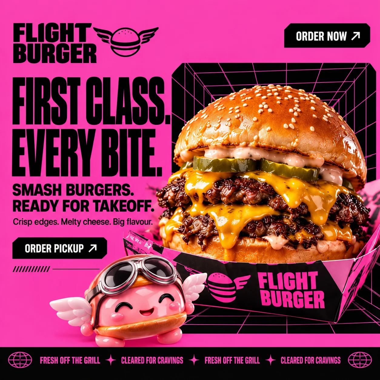
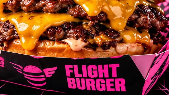
01 Winged lockup. FLIGHT stacked over BURGER beside a winged burger, a mark reused on wrappers, cups and the footer.
02 Condensed headline. Tall black capitals in two short lines, set tight enough to fill half the frame.
03 Runway grid. A pink wireframe tunnel on black frames the burger like a lit runway, and repeats behind every food photo.
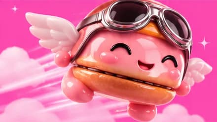
04 Pilot mascot. A glossy winged burger in goggles and a flying cap, the brand's face beyond the logo.
05 Clipped-corner button. Black buttons with cut corners, like a ticket stub; ORDER PICKUP arrives before any menu.
06 Departures ticker. FRESH OFF THE GRILL and CLEARED FOR CRAVINGS loop between globe icons, like a departures board.
- Sector
- Aviation-themed burger
- Year
- 2026
- Work
- Website design
- Screens
- Two desktop screens and the full homepage
- Afterburner Pink#FB43A7 · Background
- Night Runway#070607 · Type
- Cabin Blush#FDE1EF · Surface
- Cheddar Gold#FEA601 · In the photo
- Toasted Bun#F26707 · In the photo
About the project
The full write-up, if you want it. About 4 minutes.
01Brief and idea
The problem, and the one idea that answers it.1 min
The brief
A burger kitchen by the airport feeds people in a hurry: shift workers, travellers, office lunches. The brief we set ourselves: get from menu to pickup order in about a minute, and find one hook that makes a smash burger feel like an occasion without slowing anyone down.
The idea
Turn the order into a flight. Every line borrows from the airport: Ready for takeoff, Cleared for cravings, Choose your flight, Upgrade your layover, No delays, Your next stop. The jokes do real work, because each one labels a step on the way to ordering. A winged burger mascot in pilot goggles gives the brand a face beyond the logo, and a black ticker under the hero keeps the announcements rolling.
02The write-up
The design, decision by decision.5 chapters · 2 min
Food for people on a clock
Flight Burger is imagined as a kitchen in Al Garhoud, a few minutes from the runway, so the people it is designed to feed are rarely relaxed: cabin crew between rotations, airport and hotel staff on shifts, travellers with a bag at their feet. The whole design answers that hurry. The first button under the headline is ORDER PICKUP, the corner button says ORDER NOW, and the menu offers three burgers rather than a long board. Speed is part of the service, so nobody has to dig for the order.
Airport language as signage
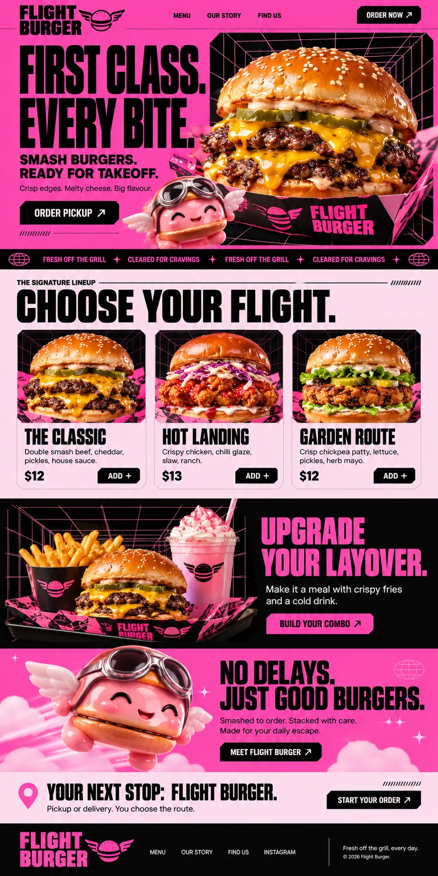
Every headline borrows a phrase from the terminal, and each one marks a step towards the order. FIRST CLASS. EVERY BITE. opens the page, with READY FOR TAKEOFF. underneath. CHOOSE YOUR FLIGHT. heads the menu. UPGRADE YOUR LAYOVER. sells the combo, NO DELAYS. JUST GOOD BURGERS. makes the promise, and YOUR NEXT STOP: FLIGHT BURGER. closes with a map pin and START YOUR ORDER. Even the ticker under the hero reads like a departures board, looping FRESH OFF THE GRILL and CLEARED FOR CRAVINGS. The running joke doubles as wayfinding.
A runway grid behind the food
The visual system grows from one device: a black panel filled with a pink wireframe tunnel that recedes to a vanishing point, somewhere between a flight simulator and a lit runway at night. The hero burger sits inside it, and so does every burger on the menu cards and the combo tray. Buttons and cards have clipped corners instead of round ones, which gives each frame the look of a ticket stub or a cockpit display. Short rows of diagonal hatching repeat the idea at label size.
A mascot in pilot goggles
A glossy pink burger with small white wings, round goggles and a leather flying cap gives the brand a face beyond its logo. On the first screen it pops up between the ORDER PICKUP button and the burger box, grinning. Further down it takes over a whole band, flying through pink cloud with speed lines behind it, beside the promise of no delays and a MEET FLIGHT BURGER button. The wordmark carries the same idea in flat black: FLIGHT stacked over BURGER beside a burger with wings.
A lineup named like routes
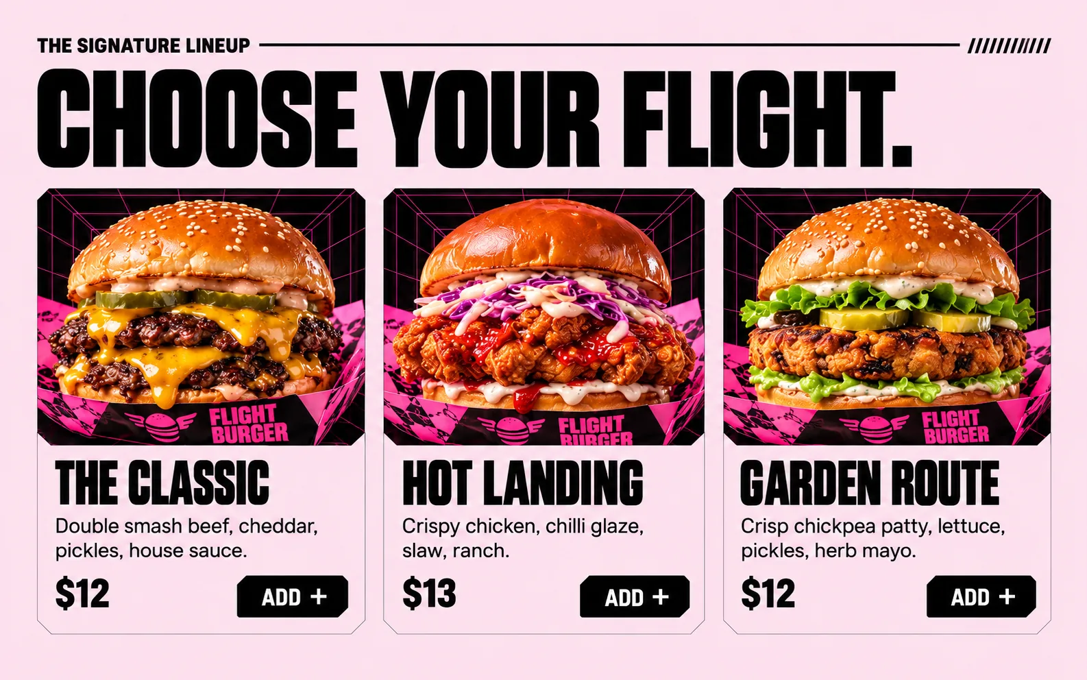
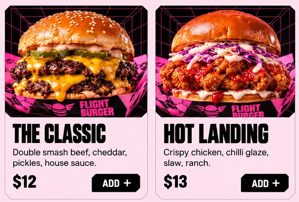
The menu sits on blush pink under a small label, THE SIGNATURE LINEUP, followed by a long rule and a row of hatch marks. Three cards follow, each a framed photograph in the runway grid above a pale panel: The Classic, a double smash with cheddar and pickles; Hot Landing, crispy chicken with chilli glaze and slaw; Garden Route, a crisp chickpea patty with herb mayo. Two names carry the pun and one stays plain, and every card ends on the same black ADD + button.
03Type and voice
Type, colour, photography and the lines on the page.3 roles
- Display
- Tall, tightly condensed black capitals with full stops, big enough to fill half the hero in two lines.
- Supporting
- A heavy, wide grotesque in capitals for subheads, the steadier voice under the condensed headline.
- Labels
- Small bold capitals beside a thin rule and diagonal hatch marks, used like signage at a gate.
Tall, condensed black capitals for the headlines, a heavy grotesque for subheads and a plain sans for descriptions. The wordmark stacks FLIGHT over BURGER beside a burger with wings. Colour is hot magenta and black, with blush pink behind the menu and white kept for button text. A black wireframe grid sits behind every food photo, like a flight simulator. Buttons and menu cards have clipped corners instead of round ones. Pink and black bands alternate down the page.
SMASH BURGERS. READY FOR TAKEOFF.
CLEARED FOR CRAVINGS
UPGRADE YOUR LAYOVER.
NO DELAYS. JUST GOOD BURGERS.
Pickup or delivery. You choose the route.
A captain's announcement with a grin. Each line borrows from boarding and flying, and each one also says what to do next, so the pun never stands between a hungry person and the order.
04The plan
Grow: 4 pages, and what it includes.4 includes
4 pages: home, menu, story, find us, on Grow, AED 4,999 one time. What it includes:
- Pickup orders and combos, paid into your own account
- Menu, prices and photos you edit yourself, no developer
- Google Maps listing set up and submitted for you, where Google allows it
- Arabic version of the menu and the order flow, as an add-on
A site like this sits on Grow. AED 4,999 one time, with a fixed quote in writing.
WhatsApp us