Offbeat
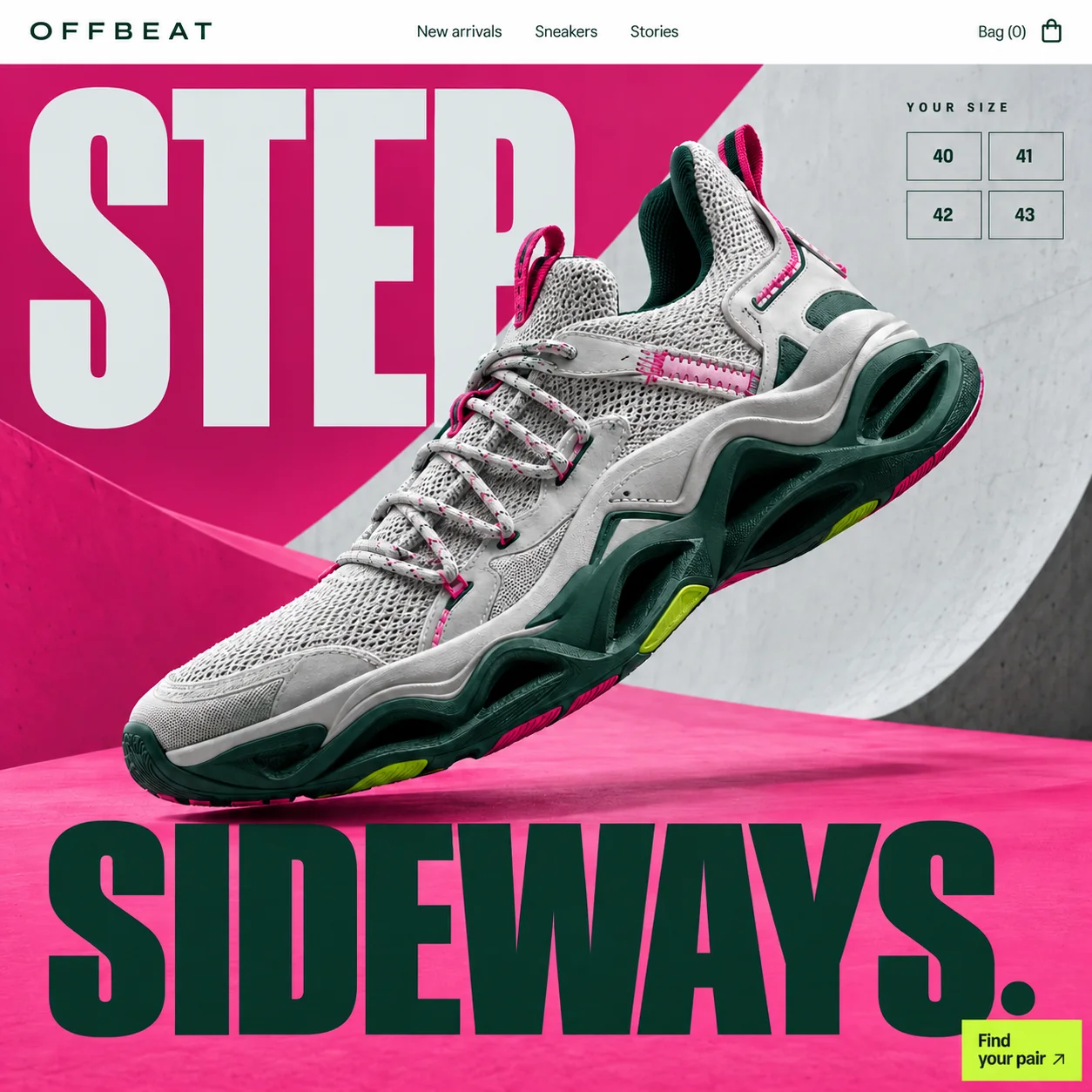
A sneaker drop homepage that asks for your size before it asks you to scroll.
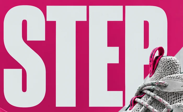
01 Condensed slogan. 'STEP' fills the top left in pale grey on pink, the first half of a two-word dare.
02 Loop under the P. The tongue's pink pull loop tucks under the bowl of the letter, tying the shoe into the type.
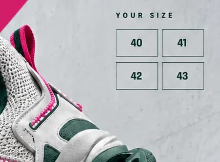
03 Size grid. Sizes 40 to 43 in outlined boxes, answered on the first screen before any scrolling.
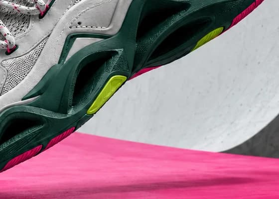
04 Lime sole pod. Where the button colour comes from: small lime pods set into the green sole.
05 Forest green base. 'SIDEWAYS.' in the sole's green closes the frame along the bottom edge.
06 Find your pair. The only lime block on the page, tucked into the bottom corner just under the full stop.
- Sector
- Sneaker brand
- Year
- 2026
- Work
- Homepage design
- Drop Pink#EC3E87 · Background
- Court Green#062C22 · Type
- Highlighter Lime#C6F63C · Accent
- Bowl Concrete#CDD1D2 · Surface
- Deep Magenta#C3125D · In the photo
About the project
The full write-up, if you want it. About 3 minutes.
01Brief and idea
The problem, and the one idea that answers it.1 min
The brief
Sneaker buyers decide fast and leave faster when their size is gone. Small brand sites tend to bury sizes three clicks deep, under the photos. A drop homepage has to show the shoe big, say something with attitude, and let a buyer check their size before the moment passes.
The idea
Turn the slogan into the layout. 'Step sideways.' is set so large that it frames the page top and bottom, and the shoe is tilted mid-step across the gap, its heel cutting into the top word. The size grid sits in the corner like a tag on a shelf, so the first thing a buyer asks is answered on the first screen. Every colour comes from the shoe's own materials, which makes the product and the page feel like one object.
02The write-up
The design, decision by decision.5 chapters · 2 min
Where small shops lose the sale
On many small sneaker sites the shoe gets a big photograph and the sizes end up under it, a few taps deep. For a drop that order is backwards: buyers want to know their size is still there before they fall for the colourway. Offbeat's homepage design starts from that fact. The first screen is arranged so that the question every buyer has, is there a 42 left, is answered without moving.
A size grid like a shelf tag
Top right, under 'YOUR SIZE' in spaced capitals, four outlined boxes hold 40, 41, 42 and 43 in a bold sans. They sit on the grey concrete, clear of the shoe, the way a tag hangs from the edge of a shop shelf. Each box is meant to be tied to live stock: tap a size and the bag fills, while sold-out sizes fade. Its position is the decision that counts.
Two words hold the page
'STEP' and 'SIDEWAYS.' are set in a very heavy, tightly condensed sans, big enough to act as the top and bottom edges of the page. Pale grey on pink above, forest green below. Between them the shoe tilts mid-step, toe down, the pink pull loop on its tongue tucked in under the bowl of the P. The slogan is a dare, and the type behaves like one: 'SIDEWAYS.' runs almost from edge to edge.
Colours taken off the shoe
Nothing on the page wears a colour the shoe does not. Hot pink comes from the flecks in the laces, the loops and the side tab, forest green from the sculpted sole cage, raw grey from the knit upper, and the lime of 'Find your pair' from the small pods set into the sole. The backdrop is pink plaster meeting a curve of grey concrete, like the lip of a skate bowl, so product and set read as a single object.
How it holds on a phone
Drops tend to be shopped on phones, so the layout is planned to stack rather than shrink. The slogan keeps its split, 'STEP' above the shoe and 'SIDEWAYS.' below, with the four size boxes moving into a single row directly under the product. The lime button stays pinned to the bottom of the screen within reach of a thumb, because during a drop the second tap matters as much as the first. That is the plan the design implies.
03Type and voice
Type, colour, photography and the lines on the page.3 roles
- Display
- Very heavy, tightly condensed capitals, large enough for two words to frame the whole page.
- Labels
- Widely spaced sans capitals in forest green for the wordmark and the size label.
- Body
- Plain grotesque: regular weight for the menu, bold for the size numbers and the button.
A very heavy, tightly condensed sans for the headline; a widely spaced sans wordmark; a plain grotesque for the menu and sizes. Hot pink planes meet raw grey concrete curves, like the wall of a skate bowl. Forest green carries the bottom word and the sole. Lime appears only on the button and the sole pods, so the action stands out. The shoe floats low over its own soft shadow.
STEP SIDEWAYS.
YOUR SIZE
Find your pair
New arrivals
Imperative and brief. The headline is a dare, the button an instruction, and the size label speaks straight to the buyer. No product jargon and no adjectives; the attitude comes from scale and colour.
04The plan
Grow: up to 6 pages, and what it includes.4 includes
Up to 6 pages, on Grow, AED 4,999 one time. What it includes:
- Customers order by size online, paid into the brand's own account
- Drops, prices and photos the team updates itself
- An online shop for 31 to 100 products, as an extra once the range grows
- A WhatsApp button on every screen for size questions
A site like this sits on Grow. AED 4,999 one time, with a fixed quote in writing.
WhatsApp us