Serein House
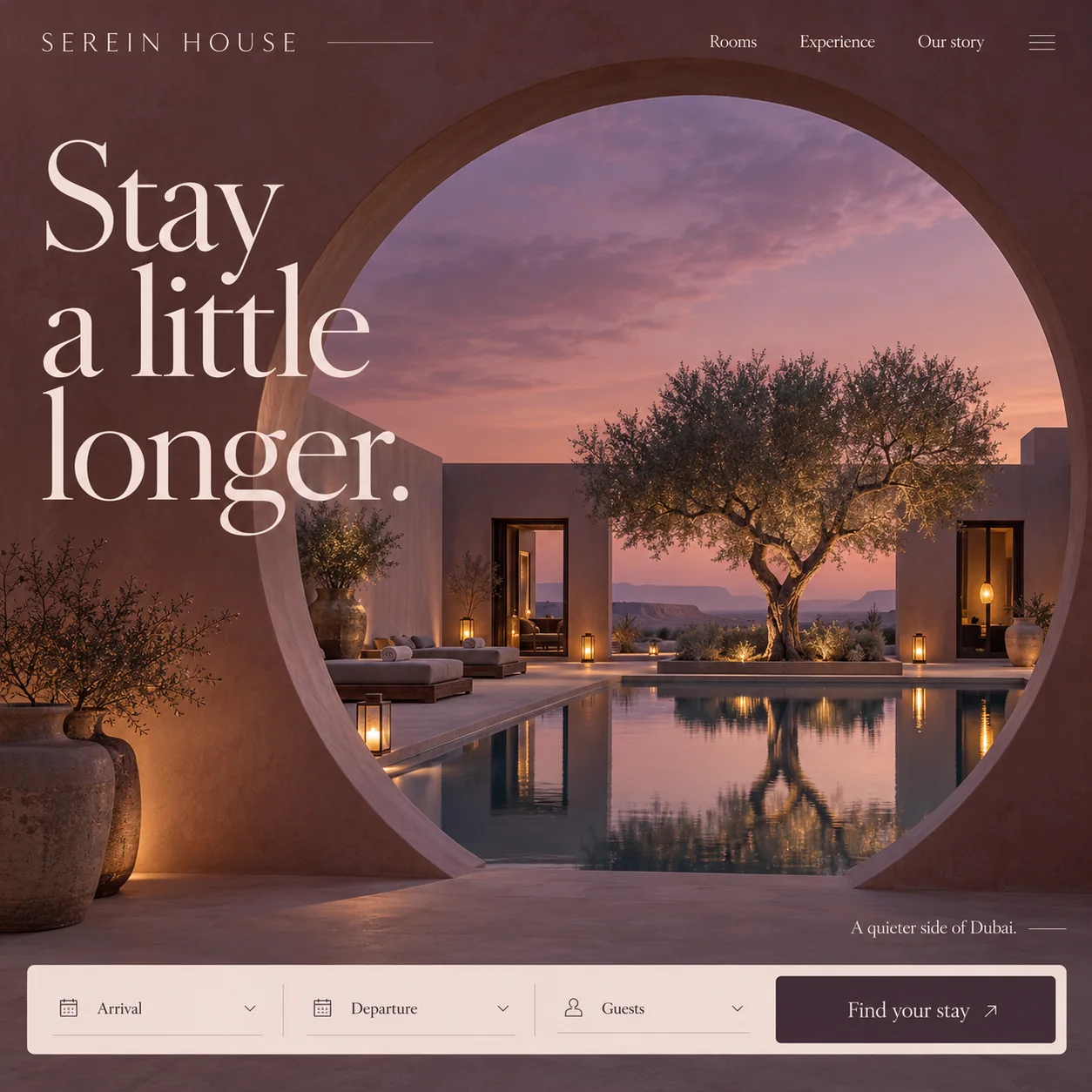
A desert hotel homepage that opens on the hour of arrival, seen through a round clay doorway.
01 Spaced wordmark. Thin, widely tracked capitals and a hairline rule: the quietest possible way to sign the page.
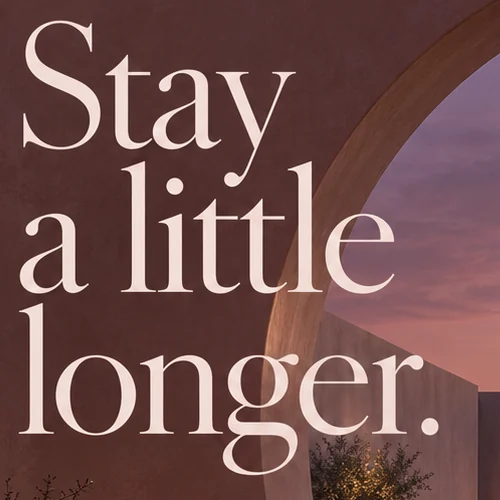
02 Three-line headline. A high-contrast serif stacked on the plaster, its last word reaching across the rim of the arch.
03 Round opening. The wall is the frame: one circle cut through clay puts the viewer on the threshold.
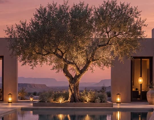
04 Lit olive tree. Uplit from its planter, the tree is the focal point and doubles in the still pool below.
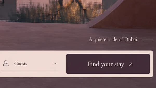
05 Positioning line. A quieter side of Dubai. trails a short hairline: the only positioning line on the page.
06 Fig-dark button. Find your stay is the one dark block inside the pale bar, so it needs no bright colour.
- Sector
- Boutique hotel
- Year
- 2026
- Work
- Homepage design
- Rammed Earth#4B2D2C · Background
- Petal Cream#F3DED9 · Type
- Fig Skin#412C37 · Accent
- Rose Plaster#EFD9D3 · Surface
- Desert Afterglow#D78776 · In the photo
About the project
The full write-up, if you want it. About 4 minutes.
01Brief and idea
The problem, and the one idea that answers it.1 min
The brief
Small hotels compete with the big booking sites, where every property sits in the same grid of thumbnails. A guest who finds the hotel's own site needs a reason to book direct: a sense of the place in one look, and a way to check dates without losing that feeling.
The idea
One view, seen from a doorway. The round arch puts you on the threshold, looking in at the pool and the lit olive tree as the sky turns pink. Everything else steps back. The menu is three quiet links, the headline is an invitation rather than a sales line, and the booking bar is the only solid block on the page. It sells the hour of arrival instead of a list of amenities, which suits a retreat whose whole promise is slowing down.
02The write-up
The design, decision by decision.6 chapters · 3 min
A reason to book direct
On the big booking sites a small hotel is one thumbnail among hundreds, sorted by price and a star count. Serein House is imagined as a retreat on the quiet edge of Dubai near Al Qudra, and its own homepage has to do what a listing cannot: make the place felt before any dates are chosen. The brief was short. One look should explain the stay, and checking availability should never pull the guest out of that mood.
Standing in the doorway
The page is a clay wall with one round opening cut through it, and the viewer stands on the near side. Through the circle sit a long still pool, low daybeds with rolled towels, lanterns along the edge and an old olive tree lit from below as the sky turns from lavender to rose. Nothing is labelled. There are no room cards, no amenity icons and no gallery arrows, because the arch already answers the one question that matters at this stage: what does it feel like to arrive here at dusk?
A headline read at walking pace
Stay a little longer. is set in a large, high-contrast serif and stacked over three lines, so it is read slowly rather than scanned. It sits on the plaster to the left of the arch, and the word longer reaches across the rim towards the courtyard. The wordmark takes the opposite approach: SEREIN HOUSE in thin, widely spaced capitals, followed by a hairline rule. Rooms, Experience and Our story are the only links, set in the same serif as the headline, with a three-line menu icon holding the rest.
One solid block on the page
Everything above the fold is soft: plaster, haze, reflections. The booking bar is the exception, a pale rose panel running almost the full width, with Arrival, Departure and Guests as three underlined fields, each with a small line icon and a chevron. At its right end, Find your stay is the one dark block set into all that pale rose, so the eye finds it without any colour having to shout. Just above, A quieter side of Dubai. trails off into a short hairline, the page's single line of positioning.
A palette sampled from dusk
Every colour in the interface could be picked straight out of the photograph. The walls are rammed earth plum, the type is petal cream, the bar is rose plaster and the button takes the dark purple of a fig skin. The warm notes are all lamplight: lanterns along the pool, small uplights at the foot of the olive tree and a glow across the clay urns by the wall, much of it doubled in the water. Keeping the controls inside the picture's own palette is what stops the booking bar looking bolted on. It reads as one more surface in the courtyard, lit by the same evening.
Beyond the first screen
This design is one screen. On the Grow plan the full site stretches to six pages at most: rooms with their own photographs and rates, the experience, and the story of the house, all edited by the hotel team without a developer. Bookings are paid into the hotel's own account, or its current booking system is connected behind the same bar. An Arabic version sits alongside the English, and a WhatsApp chat stays one tap away for guests who would rather ask a person than fill in fields.
03Type and voice
Type, colour, photography and the lines on the page.3 roles
- Display
- Large, high-contrast serif with fine hairlines, set in cream and stacked close over three lines.
- Labels
- Thin capitals with very wide tracking, used only for the wordmark and trailed by a hairline rule.
- Supporting
- The same refined serif, set small, for the menu, the positioning line and the booking button.
A high-contrast serif carries the headline and the menu, with the SEREIN HOUSE wordmark in thin, widely spaced capitals. Colour comes from the hour: clay plum walls, a lavender and rose sky, warm lantern light, a pale rose plaster bar and a deep fig button. The photograph is a twilight courtyard with a still pool doubling the tree and lanterns, framed by the arch so the wall becomes the page.
Stay a little longer.
A quieter side of Dubai.
Find your stay
Our story
Unhurried and hospitable. Every line is an invitation rather than a sales claim, and none mentions price, stars or amenities. The words slow the visitor to the pace of the stay itself.
04The plan
Grow: up to 6 pages, and what it includes.4 includes
Up to 6 pages, on Grow, AED 4,999 one time. What it includes:
- Room bookings paid into the hotel's own account, or its current booking system connected as an extra
- Room photos, rates and text the team edits without a developer
- An Arabic version for guests who would rather book in Arabic, as an extra
- A WhatsApp chat one tap away for guests with a question
A site like this sits on Grow. AED 4,999 one time, with a fixed quote in writing.
WhatsApp us