Aurelle
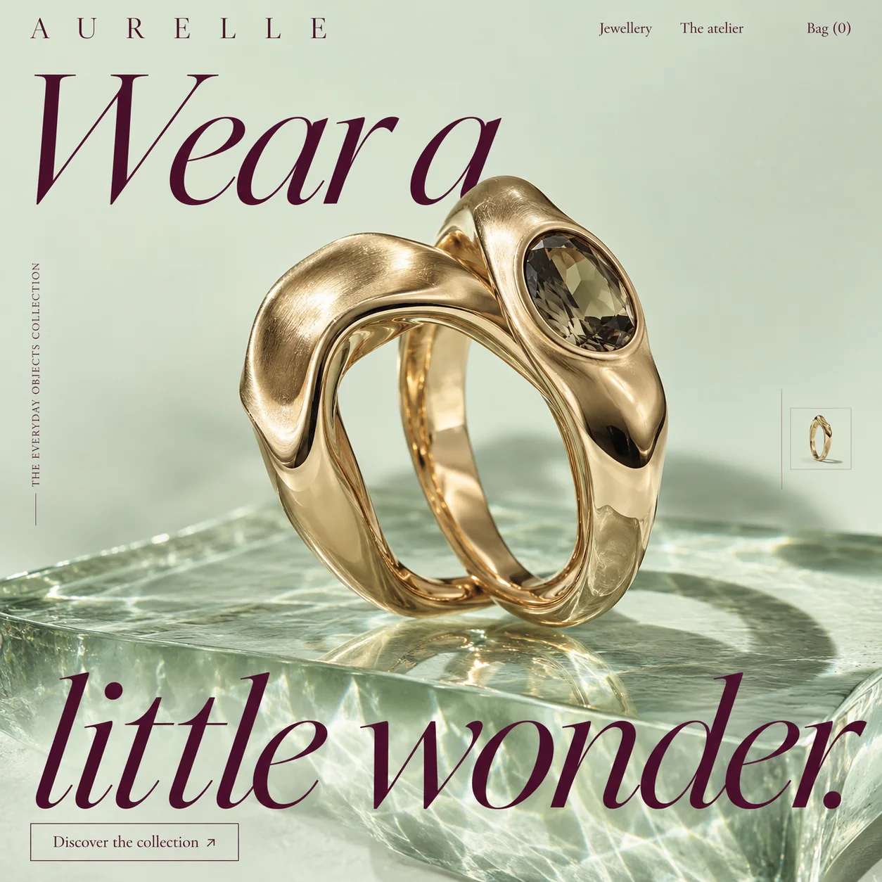
A jewellery homepage that shows two gold rings the way a museum shows one object.
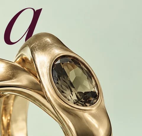
01 Ring breaks the line. The stone-set ring rises into the final 'a', so the object cuts into the headline.
02 Smoky oval stone. Faceted deep in a smooth bezel, shown large enough to judge the cut.
03 Brushed crest. The wavy band is brushed on top and polished on the sides: two finishes in one frame.
04 Collection line. 'THE EVERYDAY OBJECTS COLLECTION' runs up the edge, framing the rings as pieces for daily wear.
05 Next piece. A framed thumbnail of a slimmer band, the cue that a slider continues the range.
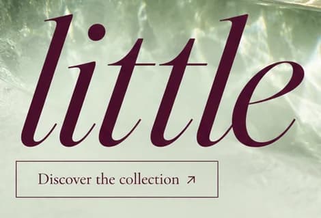
06 Outlined button. A thin plum outline keeps 'Discover the collection' light against the rippling glass.
- Sector
- Fine jewellery
- Year
- 2026
- Work
- Homepage design

- Celadon Mist#D6DFCD · Background
- Plum Ink#481028 · Type
- Brushed Gold#C8AA78 · In the photo
- Sage Glass#A9B59B · Surface
- Smoky Quartz#6E6745 · Accent
About the project
The full write-up, if you want it. About 4 minutes.
01Brief and idea
The problem, and the one idea that answers it.1 min
The brief
Fine jewellery is bought on detail: the finish, the setting, how a ring sits on a hand. Small ateliers often show pieces as tiny shots on white, which makes handmade work look mass-made. So the first screen must make the craft visible at a glance, then lead calmly to the collection.
The idea
The homepage works like a museum plinth. Two wavy gold rings, one set with a smoky stone, stand on a block of glass, close enough to see where the metal is brushed and where it is polished. 'Wear a little wonder.' wraps them top and bottom, so the rings sit inside the sentence. The vertical line 'The Everyday Objects Collection' frames them as things to wear daily, which suits a brand that wants gold to feel personal rather than formal.
02The write-up
The design, decision by decision.6 chapters · 2 min
A plinth instead of a grid
Aurelle is imagined as an atelier, and its homepage design skips the usual rows of small product shots. The first screen gives the whole stage to one pair of rings standing on a thick block of glass, with light rippling through the block like water on the floor of a pool. It is how a museum treats a single piece: raised, isolated, close enough to study. The collection itself waits one click away.
Two finishes, one close look
The rings are shot large enough to read the work in them. The wavy band in front is brushed along its crest and polished on its sides, so one surface goes soft while the next throws a hard highlight. Beside it, the second ring holds an oval smoky stone in a smooth bezel, its facets catching small points of light. At this scale a visitor can judge the finish much as they would across a counter.
Rings set inside the sentence
'Wear a little wonder.' is split above and below the rings in a sharp, high-contrast italic serif. The top of the stone-set ring rises into the last 'a' of the first line, so the object breaks into the type instead of sitting politely beneath it. The second line runs across the glass block near the bottom, where the rippling light shows through the open counters of the letters. The rings become the pause in the middle of the line.
Why pale green, not white
Jewellery is usually shot on white, which can flatten warm gold into a yellow outline. Here the ground is a pale celadon, and against it the gold reads deeper and richer. Every word on the page shares one deep plum, from the wordmark to the outline of the button, so the only bright warm tone on screen belongs to the metal. The colour does the job a velvet tray does in a jeweller's window: it quietly makes the gold look like gold.
Small signs of more to come
Two quiet devices tell the visitor this is the start of a range. Up the left edge, 'THE EVERYDAY OBJECTS COLLECTION' runs vertically in small spaced serif capitals rising from a short rule. At the right edge, a framed thumbnail of a slimmer twisted band stands beside a thin vertical line, the cue for a slider to the next piece. Neither competes with the rings, and the word 'everyday' does quiet work of its own: these are pieces to wear, not to keep in a box.
From the plinth to a shop
In the plan, 'Discover the collection' opens an online shop paid into the atelier's own account, with a page and a written description for every piece. Commission requests and ring sizing questions arrive in one inbox instead of scattered messages, and an Arabic version can follow as an extra. 'The atelier' in the menu tells the story of the bench behind the brushed finishes.
03Type and voice
Type, colour, photography and the lines on the page.3 roles
- Display
- Sharp, high-contrast italic serif in deep plum, set very large and split above and below the rings.
- Supporting
- Roman serif capitals spaced so wide that each letter stands on its own.
- Labels
- Small serif capitals with open tracking, rising vertically from a short rule in the left margin.
Deep plum carries every word: a sharp, high-contrast italic serif for the headline, and a roman serif, widely spaced for the wordmark and set normally for the menu and button. The ground is pale celadon green, which makes the warm gold read richer than it would on white. The image is a single still life with water-like light rippling through glass, and a slim outlined button keeps the action light.
Wear a little wonder.
THE EVERYDAY OBJECTS COLLECTION
Discover the collection
The atelier
Gentle and personal. 'A little wonder' keeps luxury small enough to wear on an ordinary Tuesday, and 'The atelier' points to hands at a bench rather than a name on a billboard.
04The plan
Grow: up to 6 pages, and what it includes.4 includes
Up to 6 pages, on Grow, AED 4,999 one time. What it includes:
- An online shop for the collection, paid into the atelier's own account
- Commission and ring sizing enquiries landing in one inbox
- Product descriptions for each piece, the first 10 included
- An Arabic version, as an extra
A site like this sits on Grow. AED 4,999 one time, with a fixed quote in writing.
WhatsApp us