Suba
A clay coffee cup in trainers leads this café homepage, and cobalt marks every action.
- Sector
- Neighbourhood café
- Year
- 2026
- Work
- Website design
- Screens
- One desktop screen and the full homepage
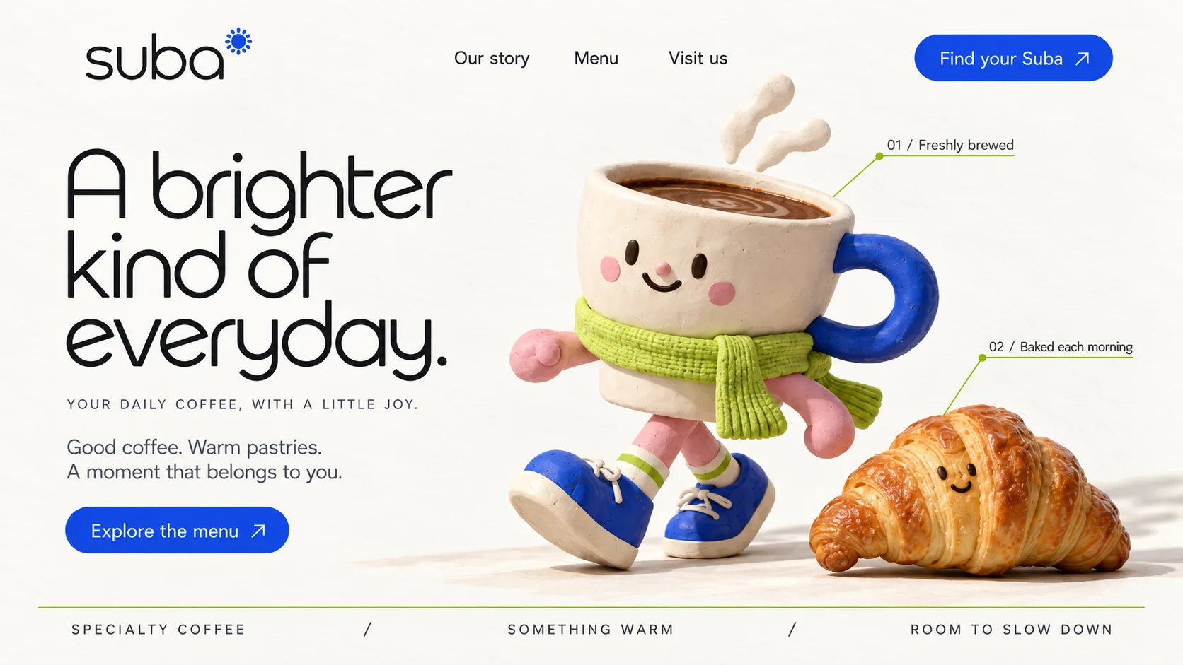
01 Sunburst wordmark. A small cobalt sun tops the lowercase wordmark, and returns on a cup and the shopfront further down.
02 Rounded display face. Soft, open letterforms in near-black, with a single-storey a and a looping y.
03 Clay cup character. A clay coffee cup in a lime knitted scarf and cobalt trainers, caught mid-stride.
04 Numbered callout. A lime leader line labels the cup 01 / Freshly brewed, like a product diagram.
05 Shy croissant. A croissant with a small smile keeps the cup company and sells the pastry.
06 Cobalt button. Every action is cobalt, matching the handle and trainers, so the eye learns what can be pressed.
- Oat Paper#F9F8F4 · Background
- Morning Ink#1D1E20 · Type
- Cobalt Glaze#1348E2 · Accent
- Lime Scarf#CFE875 · Surface
- Clay Blush#F6B8B9 · In the photo
About the project
The full write-up, if you want it. About 4 minutes.
01Brief and idea
The problem, and the one idea that answers it.1 min
The brief
Design a homepage for a neighbourhood café that feels like the best part of a morning. It had to sell three things quickly: the coffee, the pastries and the room itself. The page ends on hours and directions, so the last thing a visitor reads is how to get there.
The idea
Make the café's mood a character. Instead of a stock latte, the hero is a clay coffee cup in a knitted lime scarf and cobalt trainers, mid-stride beside a croissant with a shy smile. It turns 'a little joy' from a tagline into something you can see. The rest of the page stays calm so the character can be loud: a sunlit interior, three menu favourites, a lime band that asks you to stay a while, and a shopfront photo that answers the only question left, which is where.
02The write-up
The design, decision by decision.5 chapters · 2 min
A mascot instead of latte art
Café homepages usually open on a latte photographed from above. Suba's homepage, imagined for a neighbourhood café in Jumeirah Village Circle, gives its first screen to a character instead: a clay coffee cup with rosy cheeks, a knitted lime scarf, pink arms and cobalt trainers over striped socks, caught mid-stride with steam curling off the top like a rolled ribbon. Beside it a croissant lies on the ground with a small, shy smile. The figures look modelled by hand, soft and slightly lumpy, which makes the strapline's promise of a little joy something you can see.
Cobalt for actions, lime for lines
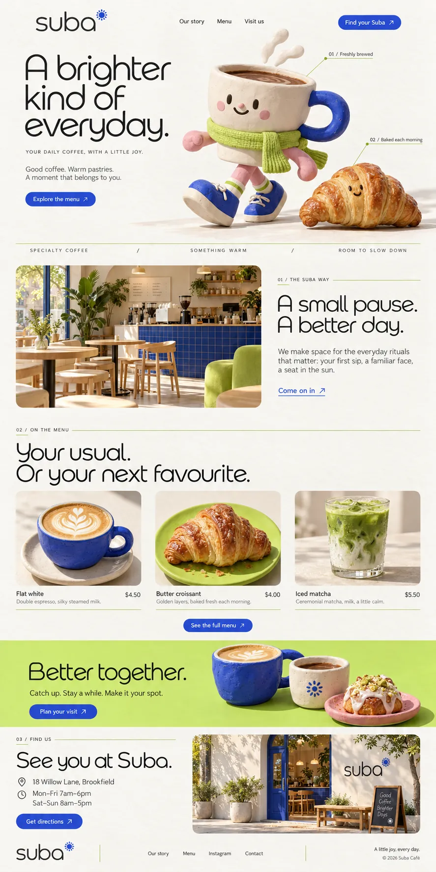
The mascot sets the colour rules. Its handle and trainers are cobalt, and so is everything you can press: Find your Suba, Explore the menu, See the full menu, Plan your visit, Get directions, and the underlined Come on in link. Lime from the scarf becomes the hairlines, from the rule above the strip under the hero to the short strokes under each section number and the leader lines of the callouts, before it fills one full-width band near the end. Oat paper sits behind it all, and a small cobalt sunburst tops the wordmark.
Labelled like a product diagram
Two thin lime leader lines run from the characters to small labels: 01 / Freshly brewed at the rim of the cup, 02 / Baked each morning at the croissant. It is a device borrowed from technical drawings and applied to something soft, and it does a real job, telling the visitor what the café sells without a paragraph of copy. The numbering then carries on down the page as section labels, 01 / THE SUBA WAY, 02 / ON THE MENU and 03 / FIND US, each paired with a hairline, so the homepage reads as one annotated sequence.
The room before the menu
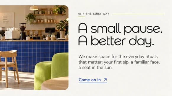
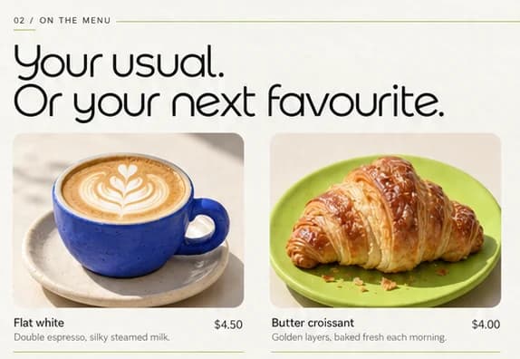
Below the hero, a strip of three spaced phrases leads into the room. A sunlit interior shows a cobalt tiled counter, pale wooden stools and a lime armchair, so the brand colours live in the space as well as on screen, beside A small pause. A better day. and a Come on in link. Then Your usual. Or your next favourite. heads the menu: a flat white in a cobalt cup, a butter croissant on a lime plate and an iced matcha, each with a short description, a price and a hairline beneath.
Ending on where to find it
The last third of the page answers the practical questions. A lime band reads Better together. over Catch up. Stay a while. Make it your spot., beside a cobalt cup, a speckled cream cup stamped with the sunburst and an iced pastry on a pink plate, with Plan your visit underneath. Then comes 03 / FIND US: See you at Suba., the hours beside small line icons, a Get directions button and a photograph of a white shopfront with a cobalt door. The footer signs off with A little joy, every day.
03Type and voice
Type, colour, photography and the lines on the page.3 roles
- Display
- A rounded geometric face with soft, open curves, a single-storey a and looping descenders, set in near-black sentence case.
- Labels
- Tiny tracked-out capitals that number each section, 01 to 03, with a short lime stroke under the number and a long rule after.
- Body
- A clean, neutral sans in short sentences, never more than two lines under a headline.
A rounded geometric display face with open, softly drawn curves sets the headlines, with a plain sans for body copy and widely spaced capitals for labels. The palette is warm oat paper, a strong cobalt for every button and the cup's handle, and lime for the scarf, the hairline rules and one full-width band. Photography is warm and sunlit, matched to the clay figures so the page never changes mood. Each section follows the same beat: a numbered label, a hairline, one headline, one action.
A brighter kind of everyday.
YOUR DAILY COFFEE, WITH A LITTLE JOY.
A small pause. A better day.
Your usual. Or your next favourite.
Catch up. Stay a while. Make it your spot.
Cheerful without raising its voice. Sentences are short and kind, built from small everyday words like pause, usual and spot, and the copy promises a better morning rather than better coffee science.
04The plan
Launch: 1 page, 6 sections, and what it includes.4 includes
1 page, 6 sections, on Launch, AED 1,999 one time. What it includes:
- One page of up to 6 sections, with the copy written for you
- WhatsApp button on every screen, with the taps counted
- The full menu added as an extra page
- Arabic version available as an extra
A site like this sits on Launch. AED 1,999 one time, with a fixed quote in writing.
WhatsApp us