Ugain
Plant protein sold in a sunlit meadow and in lowercase: a shop design with no gym in sight.
- Sector
- Plant protein shop
- Year
- 2026
- Work
- Website design
- Screens
- Two desktop screens and the full homepage
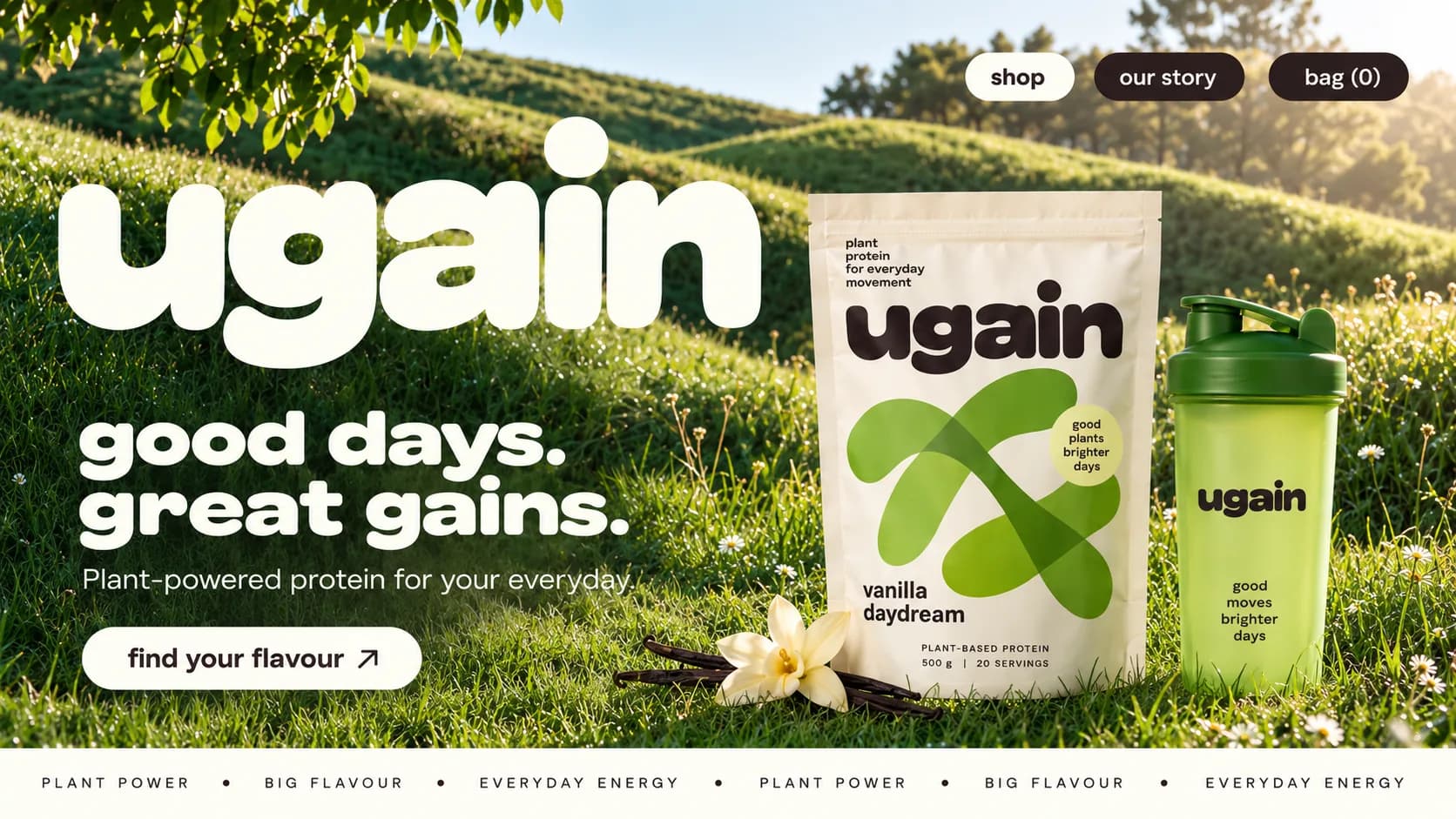
01 Puffed wordmark. The brand name in soft, rounded cream letters, laid across the meadow at poster size.
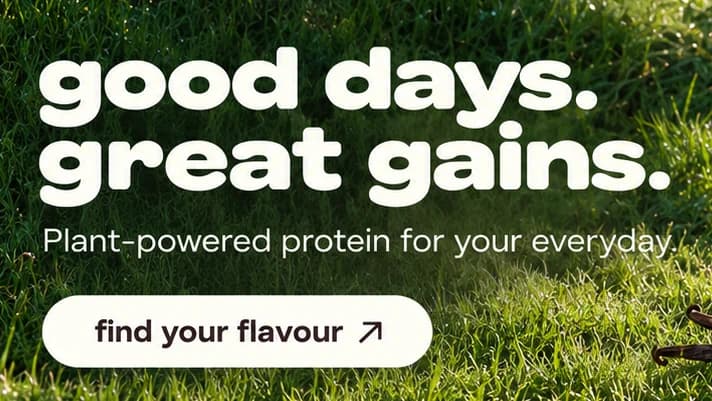
02 Lowercase headline. good days. great gains. in a heavy, wide lowercase sans, friendly where protein brands usually shout.
03 Pouch sticker. A round sticker reading good plants brighter days, the first of several slogans on the products.
04 Lime shaker. A translucent green shaker printed good moves brighter days, standing in the grass beside the pouch.
05 Cream pill button. find your flavour points the visitor to the shelf of three pouches below.
06 Bag counter. Three pills for shop, our story and bag (0): the shop is never more than a tap away.
- Oat Cream#FEFEF4 · Background
- Cocoa Bean#2A1D1C · Type
- Meadow Leaf#97B549 · Accent
- Deep Meadow#386628 · Surface
- Strawberry Glow#FD7770 · In the photo
About the project
The full write-up, if you want it. About 4 minutes.
01Brief and idea
The problem, and the one idea that answers it.1 min
The brief
Design a shop homepage for a plant protein brand that does not look like sports nutrition. No gym, no shouting, no tubs. The page had to show three flavours clearly, make adding one to the bag a single tap, and give a first-time buyer an easy way in through a starter kit.
The idea
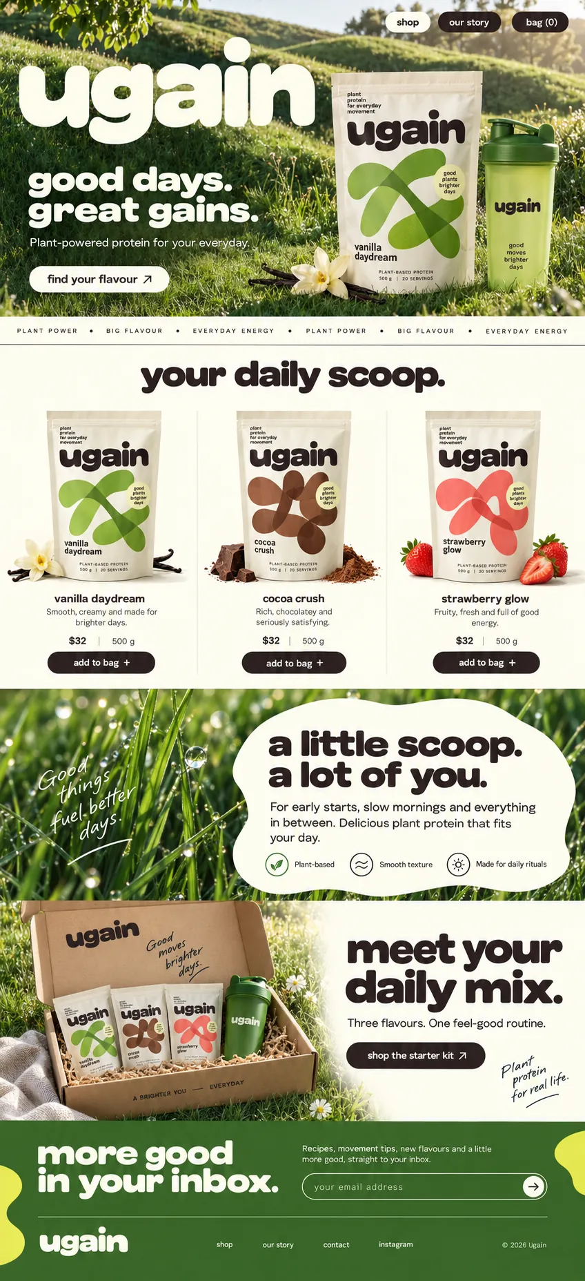
Put the protein outdoors. The hero is a sunlit hillside in low morning light, with the pouch and a lime shaker standing in the grass, and the brand name runs across it at poster size. From there the page lowers its voice: a cream shelf of three flavours, each pouch beside its own ingredient, a soft cloud of copy over wet grass about fitting into your day, and a kraft box that bundles everything for people who cannot choose.
02The write-up
The design, decision by decision.5 chapters · 2 min
Protein without the gym floor
Ugain is imagined as a plant protein brand, and the aim was to sell it without any of the visual habits of sports nutrition: no black tubs, no flexing, no capitals shouting about grams. The person in mind wants a shake with breakfast or after a walk, not a training plan. So the design trades the gym for a hillside and the hard sell for a lowercase voice. Even the navigation keeps the job small: three pills in the top corner, shop in cream, then our story and a bag counter in cocoa.
A wordmark the size of a hill
The hero opens on a meadow in low morning sun, with leaves hanging in from the top corner and wooded hills behind. Across the left half, ugain is set huge in cream, its letters puffed and rounded until they look soft enough to press. Underneath, good days. great gains. repeats the shape at a smaller size, followed by one plain line and a cream pill, find your flavour. On the right, the vanilla pouch and a lime shaker stand in the grass beside a vanilla flower and a few dark vanilla pods.
One pouch, three colours
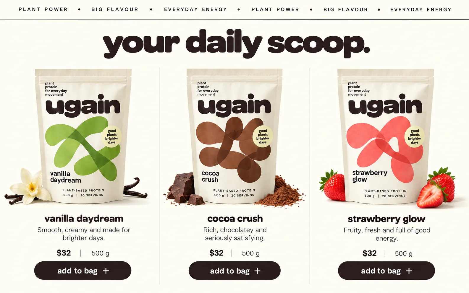
The packaging is designed as a system, and the page shows it off. Every pouch is the same cream bag with small stacked text in the corner, plant protein for everyday movement, the wordmark in cocoa brown and a round pale sticker reading good plants brighter days. What changes is a loose, overlapping looped shape across the middle: green for vanilla daydream, brown for cocoa crush, coral for strawberry glow. The shaker carries good moves brighter days, so every surface shares one slogan pattern.
A shelf you choose by colour
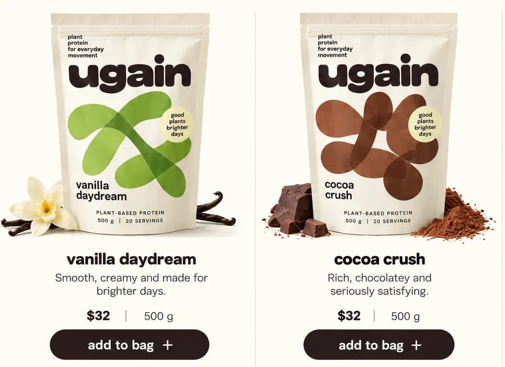
Under a marquee of spaced capitals, your daily scoop. heads the shop in heavy cocoa lowercase. Three columns follow, divided by hairline vertical rules. Each pouch is photographed with its own ingredient at its feet: a vanilla flower and pods, broken chocolate and a heap of cocoa powder, halved strawberries. Below come the flavour name, a line of tasting notes such as Rich, chocolatey and seriously satisfying., a price beside the weight, and a dark add to bag + button. A visitor chooses by colour and taste, and adds it in one tap.
A starter kit for the undecided
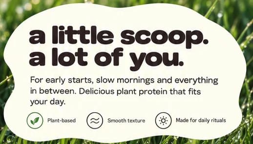
Everything after the shelf is for people who are not sure yet. Over a close-up of wet grass, a cream cloud of copy reads a little scoop. a lot of you. with three small icons: Plant-based, Smooth texture and Made for daily rituals. Next, a kraft box holds all three flavours in mini pouches with a green shaker, beside meet your daily mix. and a shop the starter kit button. The deep green footer asks for an email under more good in your inbox., with lime shapes bleeding in from both edges.
03Type and voice
Type, colour, photography and the lines on the page.3 roles
- Display
- Heavy, wide lowercase letters ending in full stops, puffed into soft rounded shapes for the hero wordmark.
- Supporting
- A loose handwritten script for asides, set at an angle over grass or beside the photos.
- Labels
- Thin spaced capitals separated by bullet dots, running as a marquee strip under the hero.
Headlines use a heavy, wide sans in lowercase, puffed into soft rounded letters for the hero wordmark, so big statements feel friendly. Body copy is a clean sans and the marquee runs in spaced capitals. The palette is cream, cocoa brown for type and buttons, and greens that run from pouch leaf to a deep meadow footer, with lime blobs at the footer's edges. Photography is low morning sun on grass, with product shot on cream for the shelf. The rhythm alternates full-bleed nature with calm cream panels.
good days. great gains.
Plant-powered protein for your everyday.
a little scoop. a lot of you.
Three flavours. One feel-good routine.
more good in your inbox.
Soft and sunny. Lowercase headlines and small everyday words keep it far from gym talk, and the copy keeps returning to days, mornings and routines instead of reps or results.
04The plan
Grow: up to 6 pages, and what it includes.4 includes
Up to 6 pages, on Grow, AED 4,999 one time. What it includes:
- Customers order online, paid into your own account
- Edit your own text, prices and photos without a developer
- Product descriptions written for the first 10 products
- Every enquiry lands in one inbox instead of a WhatsApp thread
A site like this sits on Grow. AED 4,999 one time, with a fixed quote in writing.
WhatsApp us