Elsewhere
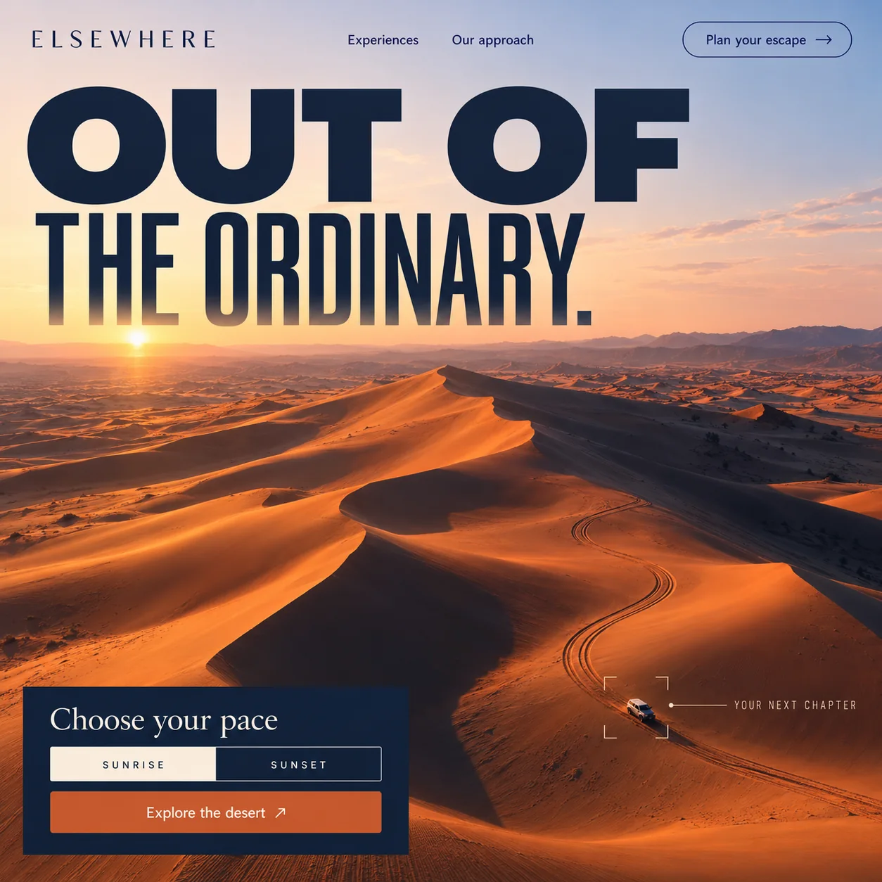
A desert trip page built like an ad's second frame: one loud line, one choice, one button.
01 Outlined escape pill. Plan your escape sits in a thin navy outline, a second route for visitors who want to talk first.
02 Wide, heavy cut. OUT OF spans most of the sky in a broad, heavy sans set in midnight navy.
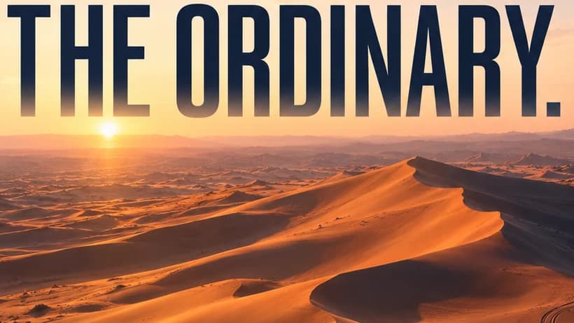
03 Condensed, fading. THE ORDINARY turns tall and narrow, the bottom of each letter dissolving into the haze.
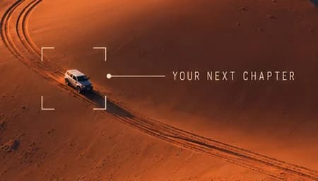
04 Viewfinder on the 4x4. Corner brackets frame one vehicle on its tracks, giving the dunes scale and the visitor a role.
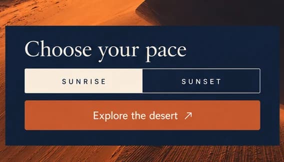
05 Sunrise or sunset. One toggle replaces the package grid, with sunrise selected in cream.
06 Burnt orange button. Explore the desert runs the full width of the panel: the page's main action.
- Sector
- Desert experiences
- Year
- 2026
- Work
- Homepage design
- Dawn Haze#F1DBC4 · Background
- Midnight Ink#15233B · Type
- Ember Orange#C5582D · Accent
- Sand Cream#F9EBDB · Surface
- Lit Dune#DA733E · In the photo
About the project
The full write-up, if you want it. About 4 minutes.
01Brief and idea
The problem, and the one idea that answers it.1 min
The brief
Desert trips are sold everywhere in Dubai, and most offers look the same: the camel, the buffet, the long list of inclusions. A visitor tapping an ad decides in seconds whether to stay. The page has to look like nothing else in the feed and bring them to one simple decision.
The idea
Treat the homepage as the second frame of the ad. The headline is one loud line broken in two, wide then narrow, and its letters dissolve into the haze above the dunes, so type and landscape read as a single picture. Instead of a menu of packages, the visitor makes one decision, sunrise or sunset, and presses one button. The small viewfinder on the 4x4 quietly casts them as the person in that car.
02The write-up
The design, decision by decision.5 chapters · 2 min
Arriving from an ad
Many people who land on a desert tour page have just tapped an ad on their phone, and they give it a few seconds. Elsewhere, imagined as a desert trip brand, is designed for exactly that moment. Operators around Lahbab tend to sell the same evening, with the camel ride, the buffet and a long list of inclusions. So this page does not compete on inclusions at all. It carries on the picture and the tone of the ad, and asks for one decision before anything else.
One line, two widths
The headline is a single sentence broken into two very different shapes. OUT OF is set in a wide, heavy sans that spans most of the sky. THE ORDINARY drops into a tall, condensed cut directly below, and the lower edge of its letters fades into the haze above the dunes. Both are in midnight navy, the same ink that fills the decision panel lower down. The effect is closer to a campaign poster than to a heading on a web page, which is the register of the ad that sent the visitor here.
Casting the visitor
Down in the dunes, a single white 4x4 follows its own tyre tracks across a sloping dune face. Four corner brackets frame it like a camera viewfinder, and a hairline runs out to a small label in tracked, condensed capitals: YOUR NEXT CHAPTER. The device is quiet but has a clear job. In all that sand there is one vehicle, and the frame suggests the visitor could be the one inside it. The vehicle also gives the dunes their scale, something an empty aerial shot never quite manages on its own.
Sunrise or sunset, then go
Instead of a grid of packages, a navy panel in the lower left offers a single toggle. SUNRISE and SUNSET sit side by side in small spaced capitals, sunrise selected in cream, under the prompt Choose your pace in a soft serif. Below, a burnt orange Explore the desert button runs the full width of the panel. The prompt could be sharper, since the toggle picks a time of day rather than a pace, but the principle holds: one easy choice, then one tap.
What the Launch build covers
This one is scoped as a single page of six sections on the Launch plan, because ad traffic rarely needs more. It would carry around 600 words written in the same voice as the ads, a WhatsApp shortcut never more than a thumb away, with each tap counted, and an Arabic version for visitors from across the Gulf. On the Run plan Hoorax would also build and run the Meta and Google campaigns that feed it, with the ad budget paid straight to the platforms rather than through the studio.
03Type and voice
Type, colour, photography and the lines on the page.3 roles
- Display
- Two sans cuts in one line: a wide, heavy face above a tall, condensed one, both in midnight navy.
- Supporting
- Soft, classical serif for the panel prompt, warm cream against the navy ground.
- Labels
- Small capitals, widely spaced, for the toggle; a condensed version labels the viewfinder.
Two sans serifs share the headline: a wide, heavy cut for OUT OF and a tall, condensed one for THE ORDINARY, both in midnight navy. The ELSEWHERE wordmark is a light serif in spaced capitals, and a soft serif sets Choose your pace. The palette follows the light: peach and lavender sky, burnt orange dunes, navy shadow. One aerial photograph of dunes at sunrise, with a single vehicle for scale.
OUT OF THE ORDINARY.
Plan your escape
Choose your pace
Explore the desert
Loud at the top, plain underneath. The headline talks like a campaign poster, then the buttons drop to short, direct verbs. It promises an escape without listing a single inclusion.
04The plan
Launch: 1 page, 6 sections, and what it includes.4 includes
1 page, 6 sections, on Launch, AED 1,999 one time. What it includes:
- About 600 words of copy, written in the same voice as the ads
- A WhatsApp button on every screen, with each tap counted
- An Arabic version for visitors from across the Gulf, as an extra
- Ads built and run as a Run extra, with the budget paid straight to Meta or Google
A site like this sits on Launch. AED 1,999 one time, with a fixed quote in writing.
WhatsApp us