Crunch Club
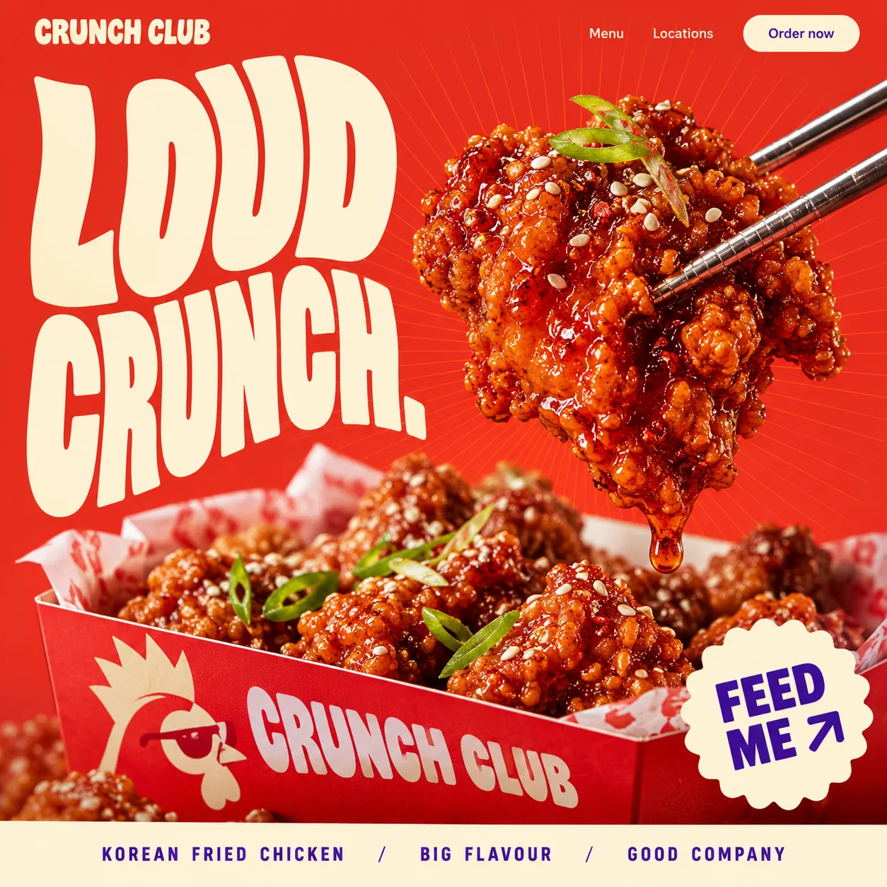
A Korean fried chicken homepage that shouts, shows one glazed bite and keeps ordering in reach.
01 Wordmark. CRUNCH CLUB in a chunky rounded face, a calmer cousin of the warped headline.
02 Warped headline. LOUD in warped cream capitals on tomato red, strokes bowing and counters stretched into slots.
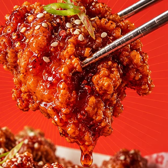
03 Sauce drip. A bead of glaze about to fall: the detail that makes the piece look freshly lifted.
04 Order now. A cream pill with violet text: the first route to ordering, with the FEED ME sticker as the second.
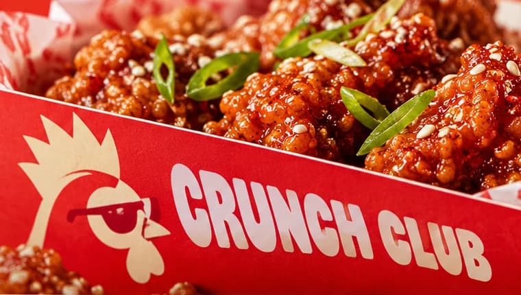
05 Rooster mascot. A rooster in red sunglasses printed on the box, giving the brand a face.
06 FEED ME sticker. A scalloped cream badge in violet capitals with an arrow, placed where a thumb rests.
- Sector
- Korean fried chicken
- Year
- 2026
- Work
- Homepage design
- Sauce Red#E32C1D · Background
- Radish White#FDF4D6 · Type
- Grape Soda#3F0E93 · Accent
- Crisp Batter#CC5833 · In the photo
- Gochujang Glaze#70130F · In the photo
About the project
The full write-up, if you want it. About 4 minutes.
01Brief and idea
The problem, and the one idea that answers it.1 min
The brief
Fried chicken is an impulse buy. People decide in seconds, on a phone, hungry, with a delivery app one tap away. A chicken shop's own site needs to look more appetising than a thumbnail in that app, then make ordering direct feel just as quick.
The idea
Turn the volume up. The headline does not sit on straight lines; it wobbles, as if the type heard the crunch. One piece of chicken gets the spotlight on a red sunburst, close enough to count the sesame, and everything else is a route to ordering: the nav pill, the FEED ME sticker, the box itself. Crunch Club has no long story to tell before the food, so the page leads with the food and a two-word slogan.
02The write-up
The design, decision by decision.4 chapters · 2 min
Decided in seconds, on a phone
Fried chicken is rarely planned. Someone is hungry, a phone is in their hand and a delivery app is a tap away, full of thumbnails that all look alike. Crunch Club is imagined as a Korean fried chicken shop in JLT, and its homepage has to look more appetising than any of those thumbnails while making a direct order feel just as quick. That rules out a slow introduction or an origin story. The design spends its whole first screen on two things only: noise and food.
Letters that bend with the bite
LOUD CRUNCH. is a chunky, rounded display face pulled out of shape. Its strokes bow and lean, the counters of the O and D stretch into tall, narrow slots, and the second line climbs from left to right towards its full stop, so the words seem to shake with the noise they describe. Cream on tomato red keeps the warped shapes easy to read, and a full stop at the end of a wobbling line is half the joke. A steadier chunky face, without the warp, carries the wordmark at the top left, and the box repeats the name in heavy cream capitals.
One piece in the spotlight
The photograph does one job. Steel chopsticks lift a single glazed piece against a burst of fine red rays, near enough that every sesame seed stands apart, with strips of spring onion on top and a bead of sauce about to drop. The box below holds the rest of the order, lined with printed paper and stamped with a rooster in red sunglasses beside a chunky CRUNCH CLUB. Everything is shot glossy and warm against the same red as the page, so the chicken reads as part of the brand rather than a picture dropped in.
Violet, used three times
Red and cream do most of the work, leaving a third colour to mark what matters. An electric grape violet appears in three places: the words Order now in the cream pill at the top right, the FEED ME sticker at the bottom right, and the strip along the foot that reads KOREAN FRIED CHICKEN / BIG FLAVOUR / GOOD COMPANY. Two of those are routes to ordering and the third names the food, so violet leads the eye to the point. The plan has the two buttons lead to online ordering with payment landing in the restaurant's account, a menu staff can change without a developer, and an Arabic version of the order flow.
03Type and voice
Type, colour, photography and the lines on the page.3 roles
- Display
- Chunky rounded capitals pulled out of shape, strokes bowing and both lines tilting upwards towards the right.
- Labels
- Bold violet capitals with very wide spacing, divided by slashes, for the strip along the foot.
- Supporting
- A friendly rounded sans, much quieter than the headline, for Menu, Locations and the Order now pill.
A fat, rounded display face, warped into a wave so the letters swell and shrink. Wide-tracked caps for the strip along the bottom, a friendly rounded sans for the nav. Tomato red does most of the work, cream does the talking, and an electric violet picks out Order now, the FEED ME sticker and the bottom strip. The food is shot tight, glossy and saturated against the same red, so the chicken looks like part of the brand.
LOUD CRUNCH.
FEED ME
Order now
KOREAN FRIED CHICKEN / BIG FLAVOUR / GOOD COMPANY
Loud, blunt and hungry. Two-word lines in capitals, no claims about quality, and a sticker that speaks in the customer's own voice. It sounds like the queue, not the kitchen.
04The plan
Grow: 4 pages, and what it includes.4 includes
4 pages: home, menu, locations, order, on Grow, AED 4,999 one time. What it includes:
- Online ordering, paid into your own account
- Menu, prices and photos you edit yourself, no developer
- Google Maps listing set up and submitted for you, where Google allows it
- An Arabic version of the menu and the order flow, as an extra
A site like this sits on Grow. AED 4,999 one time, with a fixed quote in writing.
WhatsApp us