Thread Atelier
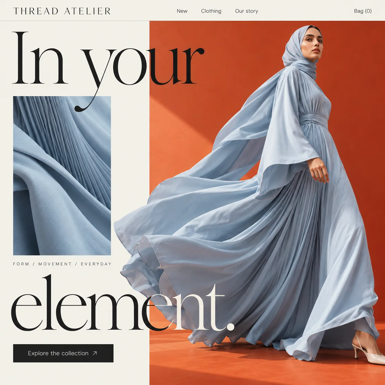
A modest fashion homepage where one powder blue dress, caught mid-stride, does the talking.
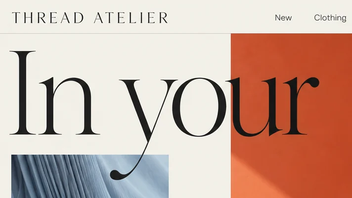
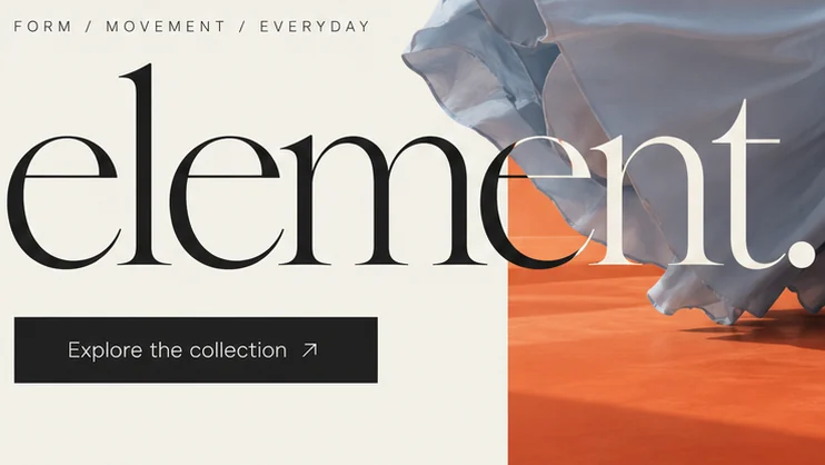
01 Split serif headline. 'In your' hangs from the top bar and 'element.' waits near the bottom, with the dress filling the gap.
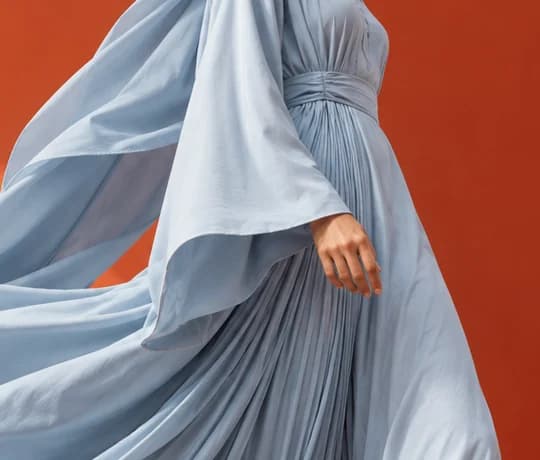
02 Fabric close-up. A tall crop of the pleats, the boutique gesture of lifting a sleeve to look closer.
03 Skirt mid-swing. Caught mid-stride, the flying skirt carries the one cool colour on a warm page.
04 Three-word tagline. 'FORM / MOVEMENT / EVERYDAY' in small spaced capitals, placing the clothes in ordinary days.
05 Colour switch. Where the word meets the orange wall, its letters turn from black to cream mid-word.
06 One black button. 'Explore the collection' is the only filled block on the page, so the next step is easy to find.
- Sector
- Modest fashion
- Year
- 2026
- Work
- Homepage design
- Linen Cream#F3F1E9 · Background
- Kohl Black#212020 · Type
- Kiln Orange#B54123 · Surface
- Powder Blue#C8D2DC · In the photo
- Sunlit Clay#D96137 · Accent
About the project
The full write-up, if you want it. About 3 minutes.
01Brief and idea
The problem, and the one idea that answers it.1 min
The brief
Modest fashion sells on drape, weight and length, and a flat product grid hides all three. Many shoppers find a label on Instagram, then ask about sizing on WhatsApp. The homepage has to show how a piece moves, carry the label's tone in a few words, and reach the collection in one tap.
The idea
Movement is the product, so the hero is one figure mid-stride with the abaya catching the air. The headline, 'In your element.', is cut in two: 'In your' above, 'element.' below, and the dress fills the space between. A close crop of the pleated fabric sits on the cream side as a second look, the way you would lift a sleeve in a boutique. The small line 'Form / Movement / Everyday' says these are clothes for real days, not only occasions.
02The write-up
The design, decision by decision.5 chapters · 2 min
Who wears it
Thread Atelier is imagined as a label for women who wear abayas and long dresses from the school run to a late dinner, and who judge a piece by how it falls when they walk. Many of them meet a label on Instagram, then send a message to ask about length. This homepage design has no shop behind it, so it concentrates on one task: make the weight and swing of the cloth obvious on a single screen, with the way into the collection never far from the eye.
A headline cut in two
'In your element.' is set in a high-contrast display serif so large that each half takes a line of its own, and the halves sit at opposite ends of the page. 'In your' hangs just under the top bar; 'element.' rests above the button. Between them sit the fabric crop and the flying skirt, so the dress is read as the middle of the sentence. The tail of the 'y' even drops into the fabric panel below, a small hook that ties the type to the photograph.
The swatch panel
Left of the model, a tall crop shows the same powder blue at close range: fine pleats fanning out, a broad fold of the outer layer, the slight crinkle of a crepe-like weave. It plays the part of a hand lifting a sleeve in a boutique, the second look a shopper takes before deciding. Under it, 'FORM / MOVEMENT / EVERYDAY' is set in small spaced capitals with slashes between, three words that place these clothes in ordinary days as much as occasions.
Warm ground, one cool colour
The page divides into linen cream and a burnt-orange studio wall, with a pale wash of sun falling across the orange. Every surface is warm except the dress, so the eye finds powder blue first and stays with it. Where 'element.' crosses from cream onto the wall, its letters switch from black to cream partway through the word, while 'In your' stays black over the orange. The one solid black block left on the page is the button.
Where the shop begins
The plan, on Grow, is a site of up to six pages where shoppers order online and pay into the label's own account, with WhatsApp one tap away on each screen for questions about sizing and length. Text, prices and photos stay in the team's own hands, no developer needed, and every page can gain an Arabic twin as an extra. The 'Bag (0)' already sitting in the top bar is where that shop begins.
03Type and voice
Type, colour, photography and the lines on the page.3 roles
- Display
- High-contrast serif with hairline thins and heavy stems, set very large and split across the top and bottom of the page.
- Supporting
- Widely spaced light serif capitals in the wordmark, calm and couture-like.
- Labels
- Small sans capitals spaced wide, with slashes between the words.
A high-contrast display serif at very large size for the headline, a widely tracked serif wordmark, and a clean sans for the menu and button. The page splits into warm cream and a burnt-orange studio wall; powder blue fabric is the only cool colour, so the eye goes straight to it. One black button, 'Explore the collection', keeps the action quiet and clear.
In your element.
FORM / MOVEMENT / EVERYDAY
Explore the collection
Our story
Short and assured. The headline speaks to the wearer rather than about the garment, and the menu keeps to plain words. No adjectives do the selling; the photograph carries the description.
04The plan
Grow: up to 6 pages, and what it includes.4 includes
Up to 6 pages, on Grow, AED 4,999 one time. What it includes:
- Customers order online, paid into the label's own account
- A WhatsApp button on every screen for sizing and length questions
- Text, prices and photos the team edits without a developer
- An Arabic version of every page, as an extra
A site like this sits on Grow. AED 4,999 one time, with a fixed quote in writing.
WhatsApp us