Us Taco
A taco restaurant site that sells the company around the table before it sells the tacos.
- Sector
- Taco restaurant
- Year
- 2026
- Work
- Website design
- Screens
- Two desktop screens and the full homepage
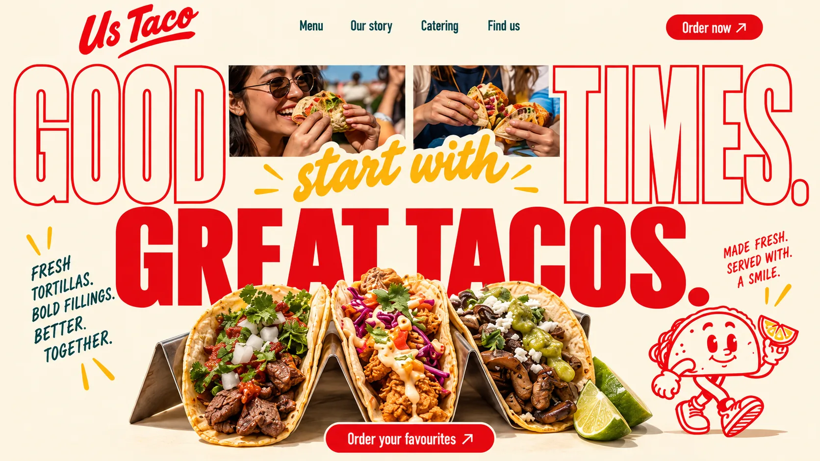
01 Script wordmark. A brushy red script with a swash underline, the only joined-up letters in the header.
02 Outlined capitals. GOOD and TIMES are drawn as hollow red outlines, so the cream shows through and the photos lead.
03 Photos in the type. Two candid photos, a woman mid-bite and hands full of tacos, sit inside the headline and sell the company first.
04 Yellow brush script. start with joins the two lines in a looser hand, so one sentence reads across three styles.
05 Margin notes. Teal hand-lettered capitals between tick marks, like notes scribbled on a printed menu.
06 Walking taco. A line-drawn taco in trainers carrying citrus; it walks back in later beside the party button.
- Salsa Red#E50911 · Accent
- Tortilla Cream#FCF4E1 · Background
- Agave Teal#0B4147 · Type
- Mango Yellow#FCD444 · Surface
- Marigold Script#FBAF09 · Accent
About the project
The full write-up, if you want it. About 4 minutes.
01Brief and idea
The problem, and the one idea that answers it.1 min
The brief
Taco places live on groups and repeat visits. We wanted a site that sells the occasion, not just the plate. The brief we set ourselves: cover pickup, delivery and catering for an office or a birthday, and keep the menu short enough to choose from at a glance, with everything else one tap away.
The idea
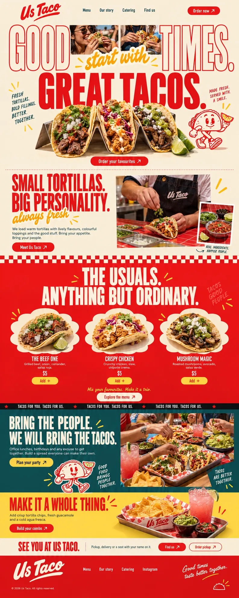
Sell the company, then the food. The hero sets huge outlined capitals around two photos of people mid-bite, and hand-lettered notes in the margins keep the tone warm. The menu is three tacos, not thirty. A teal band speaks to office lunches and birthdays with a Plan your party button, a yellow band adds chips, guacamole and agua fresca to the order, and the close offers pickup, delivery or a seat.
02The write-up
The design, decision by decision.6 chapters · 3 min
Tacos are a group order
Tacos are rarely a solo order, so this design writes for the table. Us Taco is imagined as a restaurant in DIFC, and the people it pictures are colleagues splitting lunch, friends after work and a birthday that needs feeding. That decided the name, the photography and the order of the page. It has to sell a mood that only exists with other people in it, while still letting one person order three tacos for pickup in a couple of taps. Nearly every band after the hero finds another reason to bring somebody.
People inside the headline
The hero is typographic first. GOOD and TIMES are drawn as huge red outlines, hollow letters with the cream showing through, and two candid photographs sit in the gap between them: a woman mid-bite in sunglasses, and hands closing round two loaded tacos. A yellow brush script, start with, crosses beneath the photos, and GREAT TACOS. lands underneath in solid red, so a single sentence travels through three styles. Below it three tacos stand in a steel rack with lime wedges, and Order your favourites sits in a red pill at the bottom of the hero.
Notes in the margins
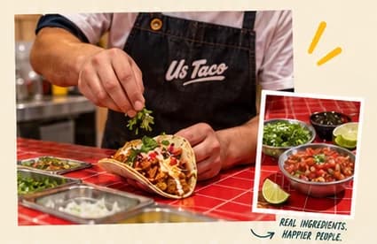
Hand-lettered asides make the page sound written by a person rather than a brand team. Left of the tacos, teal capitals list FRESH TORTILLAS. BOLD FILLINGS. BETTER. TOGETHER. between yellow tick marks. On the right, red lettering promises tacos made fresh and served with a smile, and a line-drawn taco mascot strolls past in trainers, holding up a slice of citrus. Further down the same hand writes REAL INGREDIENTS. HAPPIER PEOPLE. beside a photo of the counter, and the last line of the footer is written in looping script.
Three tacos, not thirty
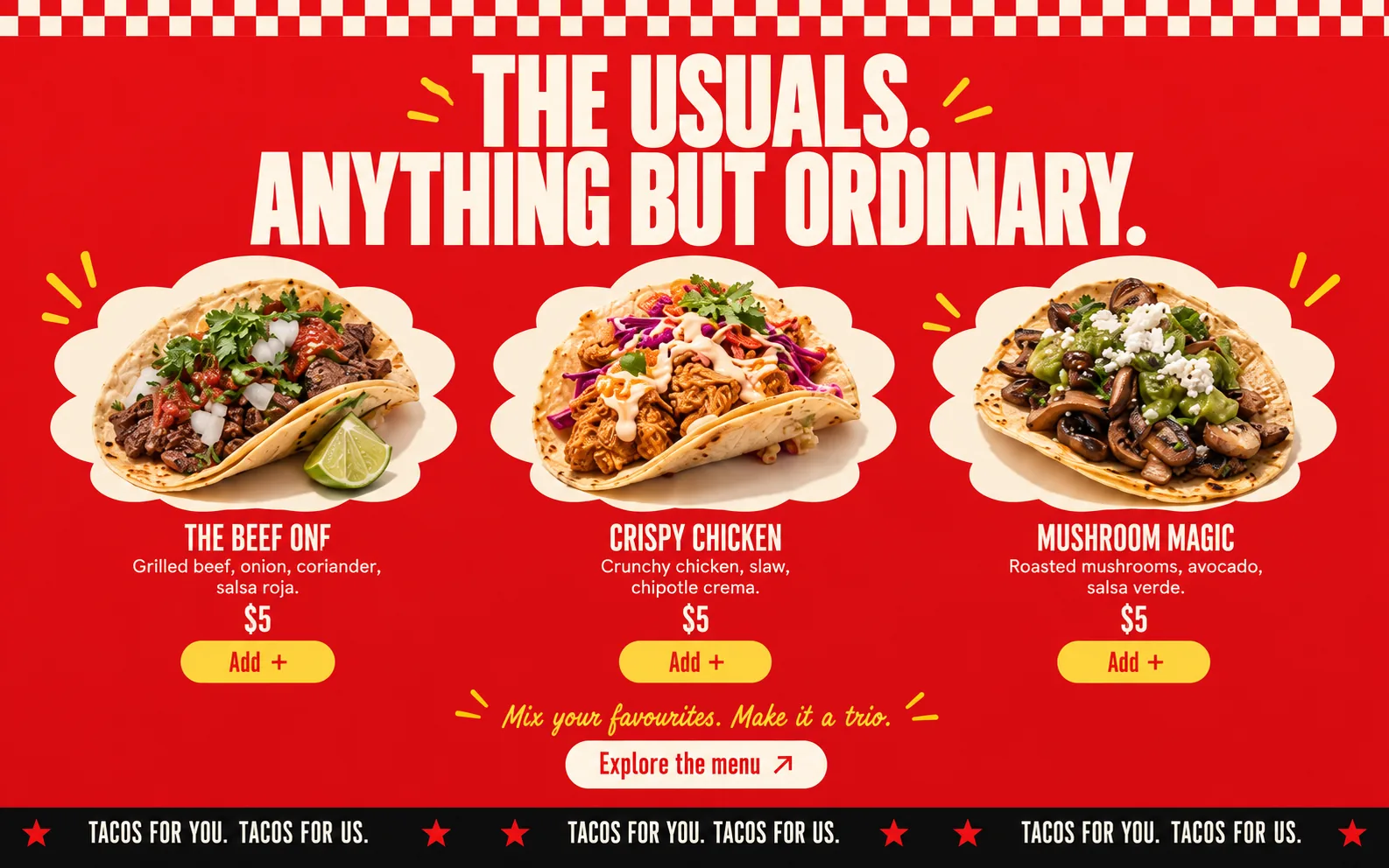
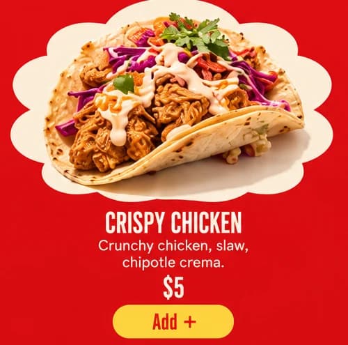
The menu band switches to solid salsa red under a row of red and cream checks. THE USUALS. ANYTHING BUT ORDINARY. runs in cream capitals between yellow burst marks, and three tacos sit on cream cloud cut-outs: The Beef One with salsa roja, Crispy Chicken with chipotle crema, Mushroom Magic with salsa verde. Each gets a name, a short list of fillings, a price and a yellow Add + pill. A yellow script line suggests mixing a trio, a single Explore the menu button covers everything else, and a black ticker repeats TACOS FOR YOU. TACOS FOR US.
Catering as a main path
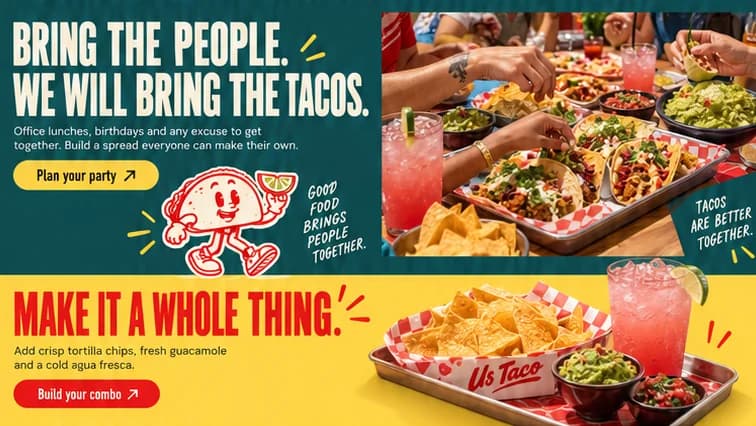
The teal band is where the name pays off. BRING THE PEOPLE. WE WILL BRING THE TACOS. speaks straight to office lunches and birthdays, with a yellow Plan your party button and the walking mascot underneath. Beside it a photograph looks down on a crowded table: trays of tacos on checked paper, guacamole, chips, pink agua fresca and several hands reaching in at once. Catering is given a full band of its own and a clear button, instead of a form tucked away in the footer.
Closing on pickup, delivery or a seat
The last two bands close the sale. A mango yellow band adds chips, guacamole and a cold agua fresca to the order with Build your combo, shown on a steel tray with the chips in a branded paper boat. Then a cream strip, SEE YOU AT US TACO., offers pickup, delivery or a seat with your name on it, with Find us and Order pickup side by side. The red footer repeats the script logo and ends on a handwritten Good times taste better together.
03Type and voice
Type, colour, photography and the lines on the page.3 roles
- Display
- Tall condensed capitals used two ways: hollow red outlines in the hero, solid red or cream everywhere else.
- Supporting
- A loose yellow brush script for asides and connecting words, never for anything that has to be read twice.
- Labels
- Hand-lettered capitals in teal or red, slightly uneven, written into the margins like notes on a menu.
Tall condensed capitals in two modes: outlined red in the hero, solid red or cream everywhere else. A brushy script wordmark with a swash underline, a yellow brush script for asides, and hand-lettered teal notes in the margins. Colour is salsa red on tortilla cream, with deep agave teal and mango yellow as section grounds. Photography is warm, close and social, with hands reaching across a crowded table. Chequerboard edging and a black ticker strip keep the diner feel.
BRING THE PEOPLE. WE WILL BRING THE TACOS.
TACOS FOR YOU. TACOS FOR US.
Bring your appetite. Bring your people.
Pickup, delivery or a seat with your name on it.
Good times taste better together.
Warm and plural. The copy keeps saying us, people and together, and pairs almost every food line with a social one, so ordering tacos reads like making plans.
04The plan
Grow: 5 pages, and what it includes.4 includes
5 pages: home, menu, story, catering, find us, on Grow, AED 4,999 one time. What it includes:
- Pickup orders and combos, paid into your own account
- Catering enquiries landing in one inbox instead of a WhatsApp thread
- Menu, prices and photos you edit yourself, no developer
- Google Maps listing set up and submitted for you, where Google allows it
A site like this sits on Grow. AED 4,999 one time, with a fixed quote in writing.
WhatsApp us