01The story
From the brief to the live site.6 chapters · 3 min
A brand with no shop of its own
Every product in the range is packaged: corndogs, Korean fried chicken, topokki cups and trays, rappokki, dumplings, Tubez snacks, Icy-U drinks and gochujang. It reaches people through quick-commerce apps and grocery shelves, so the site has no checkout of its own. Hoorax designed and built a homepage and nine product pages with one job between them: make each pack look worth ordering, explain how it cooks, then hand the shopper to Blinkit, Swiggy Instamart, BigBasket, Amazon or a store nearby.
Packs in orbit
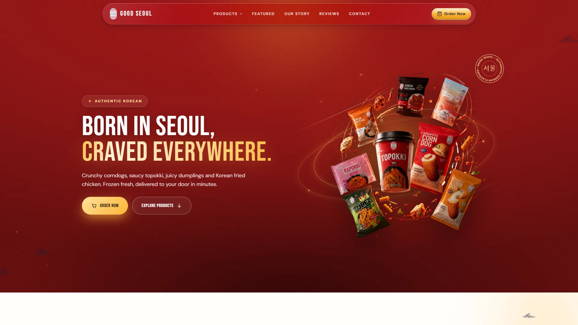
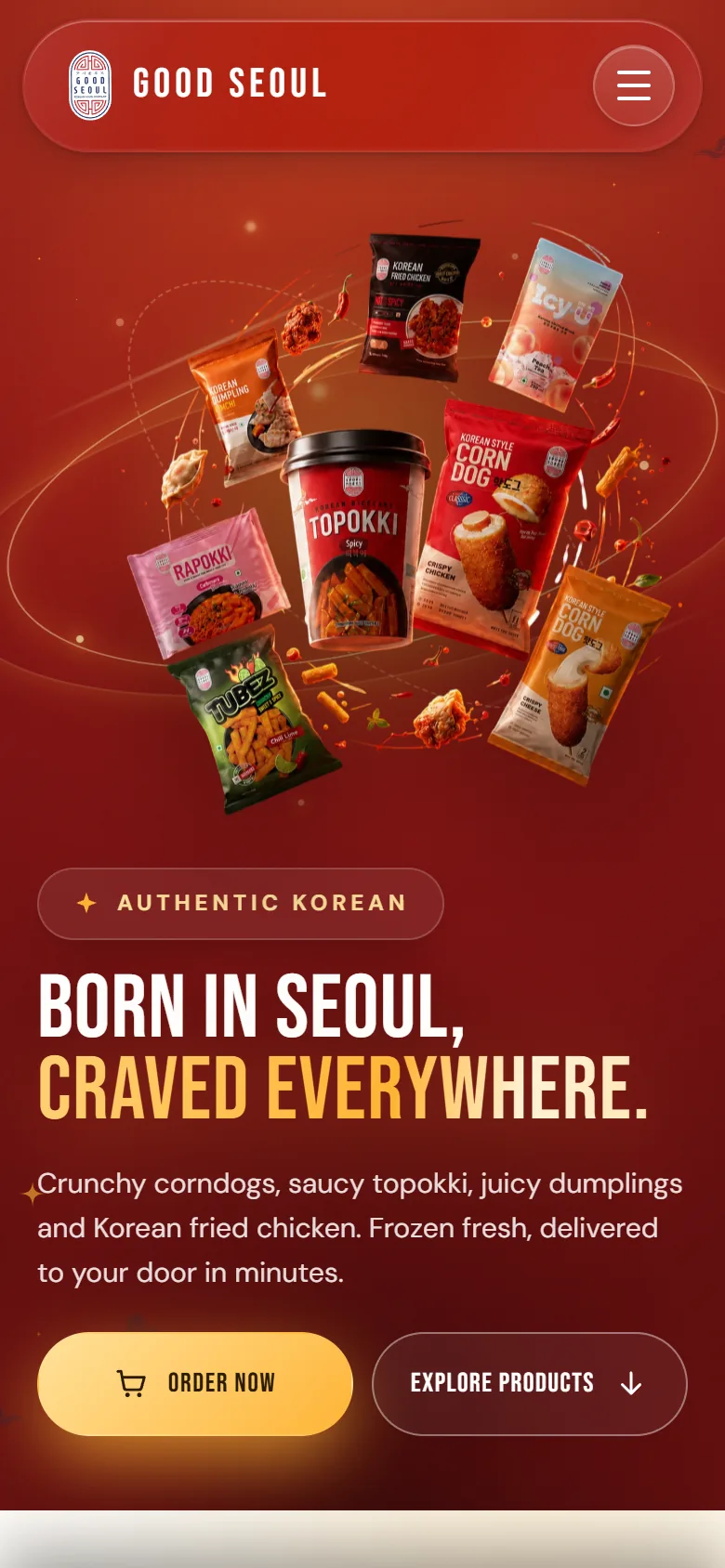
The homepage opens on deep red. BORN IN SEOUL, is set in white condensed capitals, and CRAVED EVERYWHERE. follows underneath in a warm gold gradient. On the right, seven packs circle the Topokki cup on a thin elliptical ring, with chillies, a dumpling, rice cakes and pieces of fried chicken caught in mid-air around them. A round stamp with 서울 at its centre sits in the top corner like a customs seal. Two buttons share the first screen: a glowing gold Order Now and an outlined Explore Products.
Four apps, one tap each
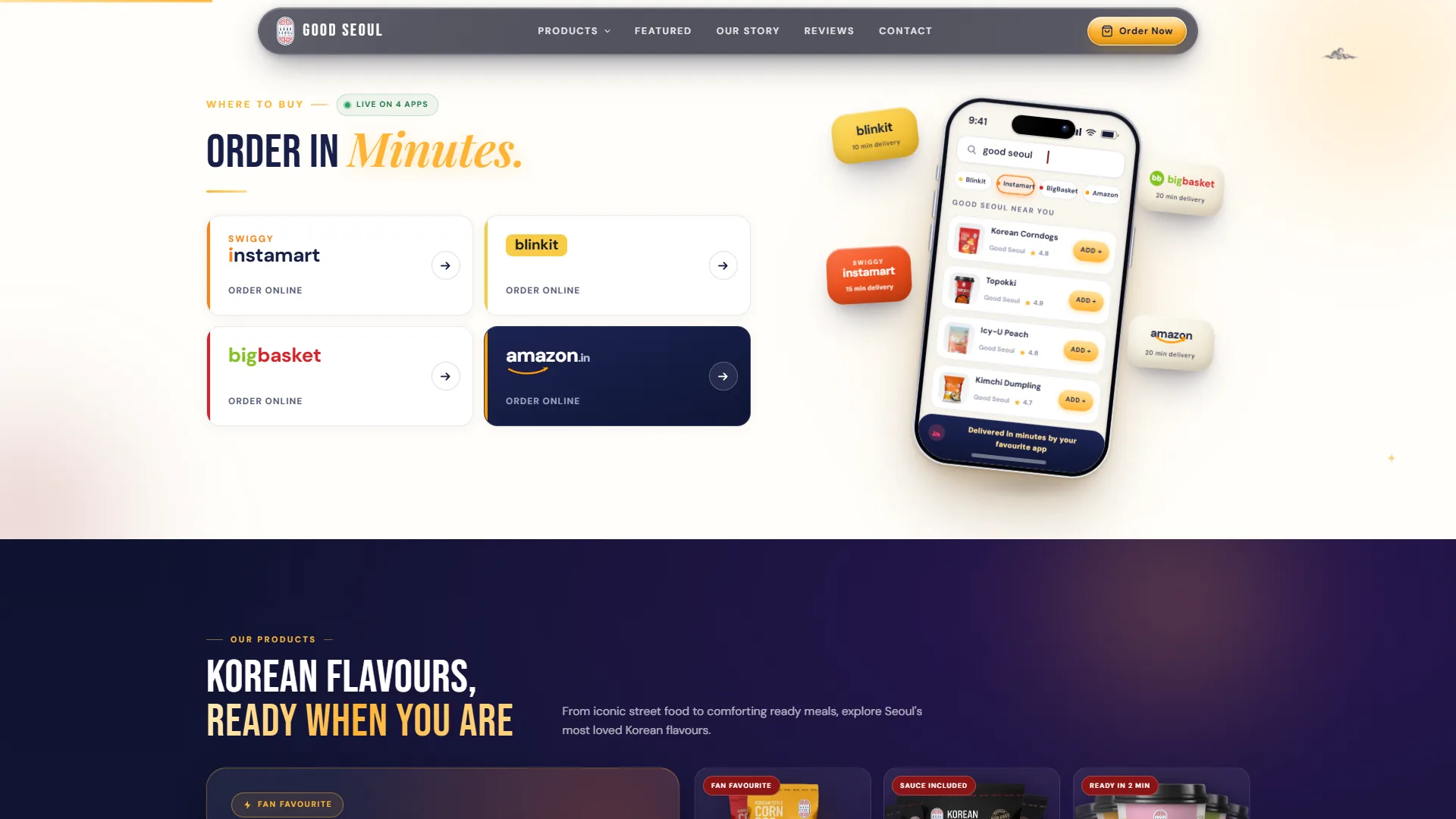
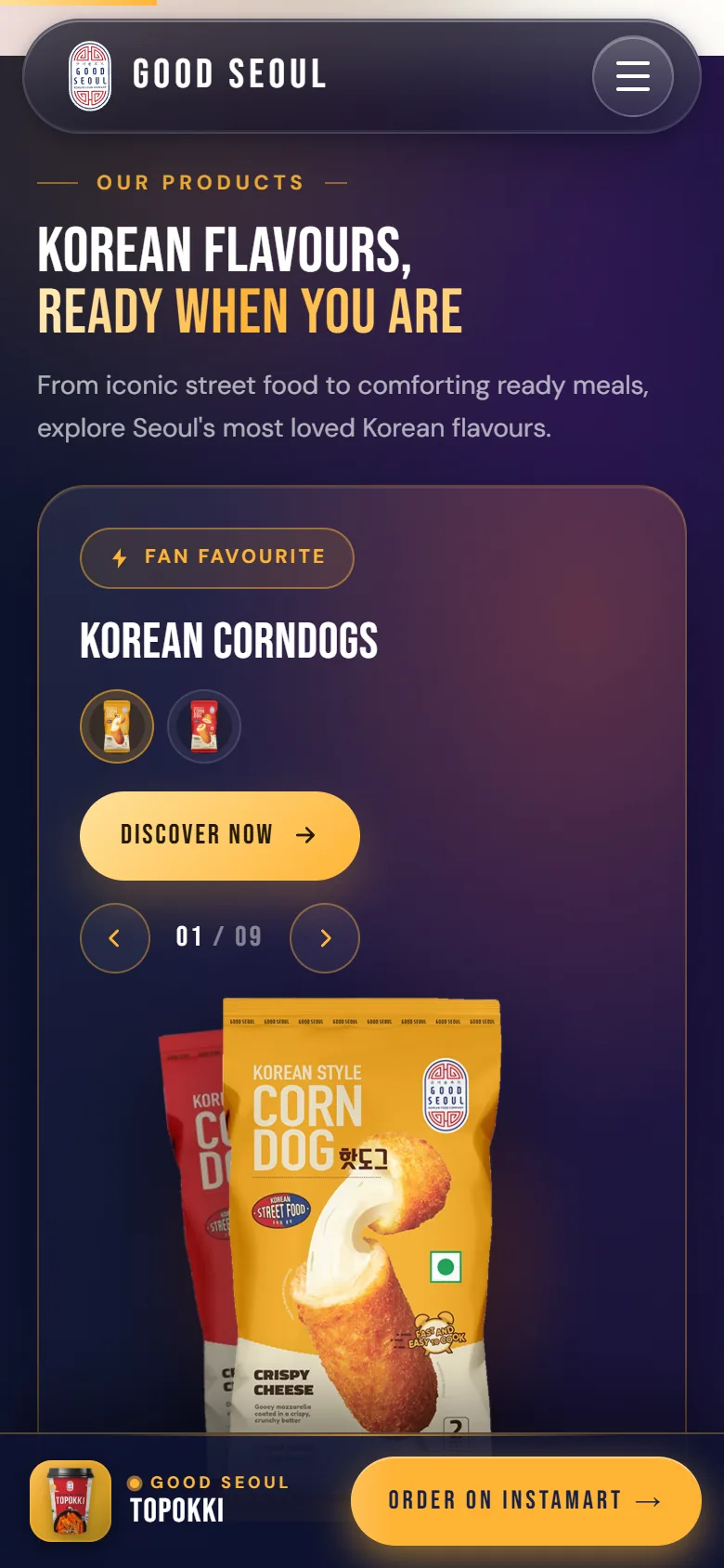
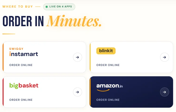
Where to buy carries a small Live on 4 apps badge and the headline ORDER IN Minutes., its last word in a gold italic serif. Below sit four cards dressed in each retailer's own colours: Swiggy Instamart, Blinkit, BigBasket, and Amazon in navy. Each one opens a Good Seoul search inside that app. Beside them, a phone mock-up shows the search already typed, with app tabs and a list of packs ready to add, while tilted app badges float around it. On a phone, a sticky bar keeps Order on Instamart under the thumb.
Nine lines on a navy shelf
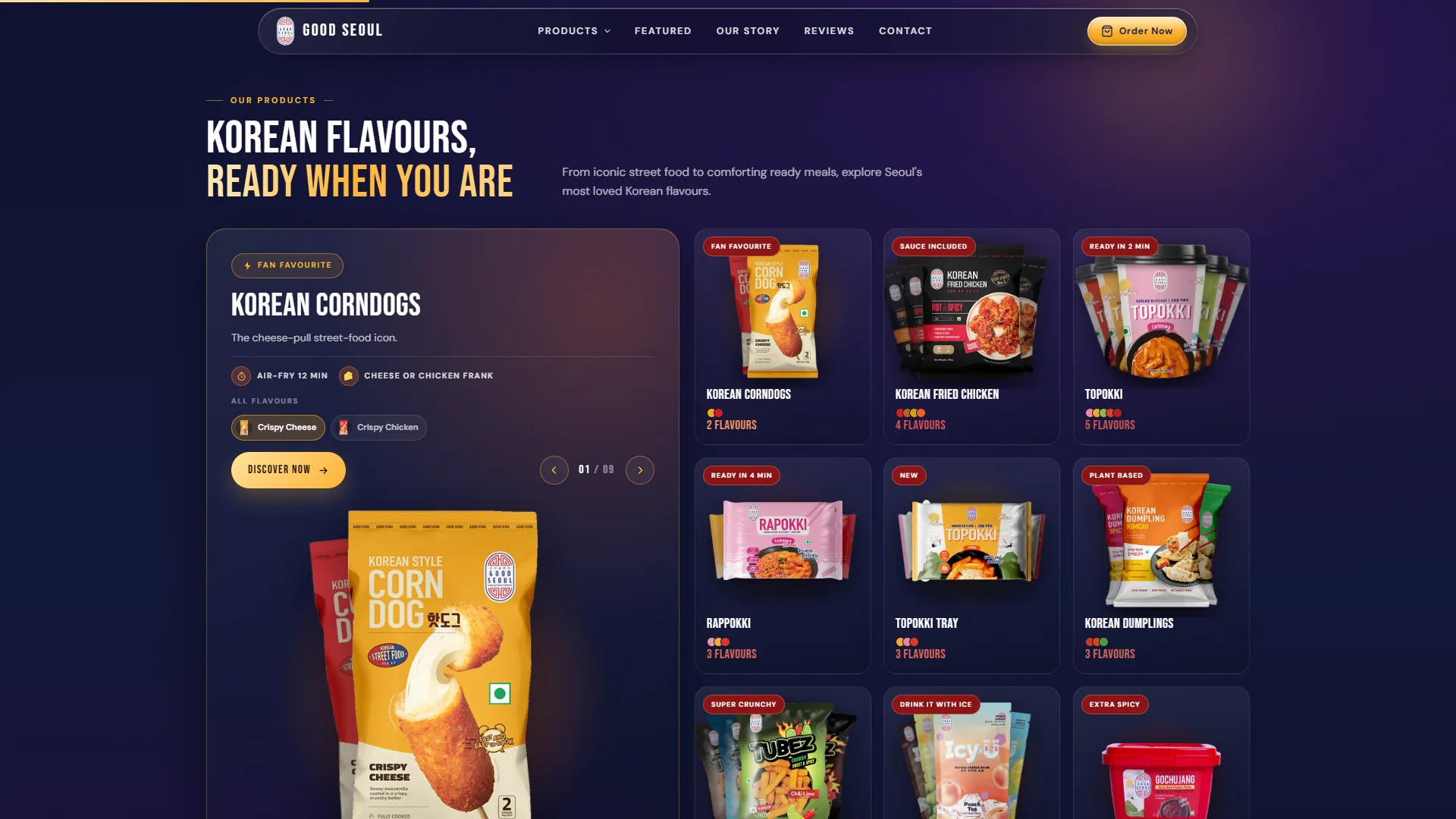
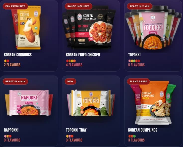
KOREAN FLAVOURS, READY WHEN YOU ARE switches the page to navy for the full range. A large feature card leads with Korean Corndogs: air-fry time, filling chips, flavour swatches and a 01 / 09 counter with arrows to step through every line. Beside it, a grid gives each product a card with a red badge, such as Sauce included, Plant based, Super crunchy or Drink it with ice, and a row of coloured dots for its flavours. Further down, CORNDOGS and FRIED CHICKEN are set as giant outlined words behind each featured pack.
Every pack gets a page
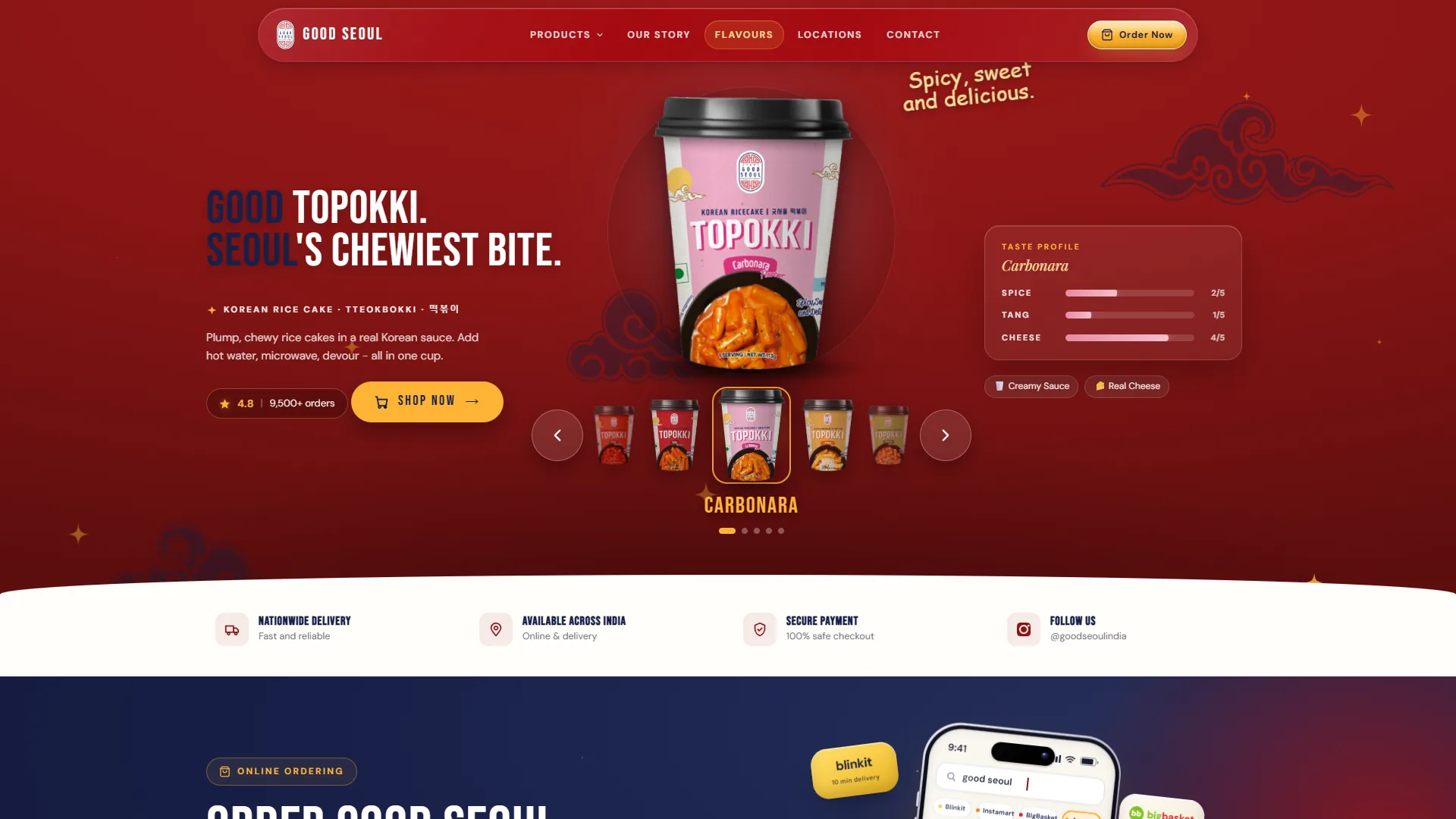
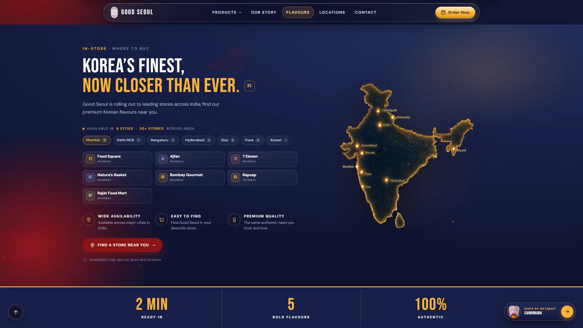
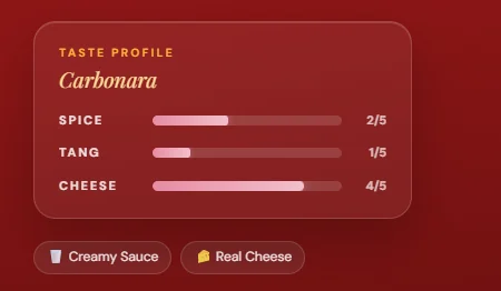
Each product line has a page of its own. Topokki opens on GOOD TOPOKKI. SEOUL'S CHEWIEST BITE., beside a carousel of five cups and a taste profile card that scores spice, tang and cheese for the flavour on show, with a handwritten Spicy, sweet and delicious. floating above. Further down come the four delivery apps, an in-store section with a glowing night map of India and city chips that list the stockists, a close-up gallery, the cooking steps and a set of questions that open on tap.
Post it to Seoul
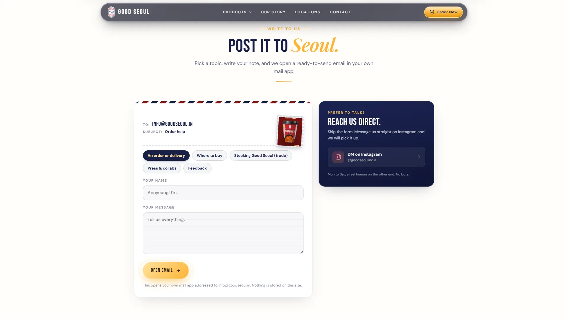
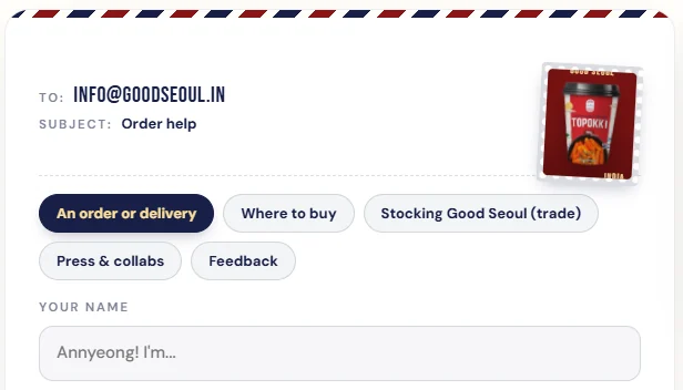
Contact is written as a letter. An airmail-edged card with a Topokki cup for a stamp carries the To and Subject lines. Topic chips such as Where to buy or Stocking Good Seoul (trade) set the subject, the name field greets you with Annyeong! I'm..., and Open Email hands the note to the visitor's own mail app, so nothing is stored on the site. A navy card offers Instagram instead. Underneath it all is a static Astro build on Hostinger, with Google Tag Manager, Meta Pixel and Microsoft Clarity tags.