Noora Lounge
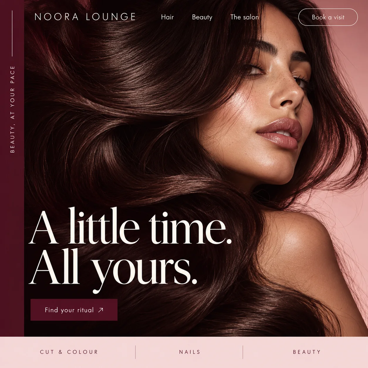
Selling an hour off rather than a list of services, with the hair filling the whole frame.
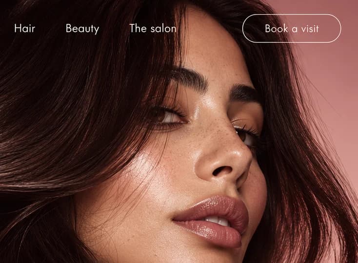
01 Outlined pill. Book a visit is drawn as an outline only, a quiet shortcut for regulars who already know their service.
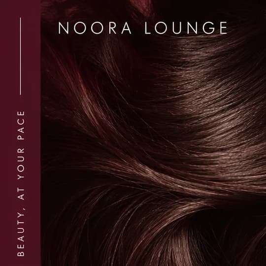
02 Magazine spine. BEAUTY, AT YOUR PACE runs sideways in spaced capitals down a slim wine rail, under a thin rule.
03 Close, warm portrait. The face is pushed to the top right, freckles and gloss left in, so the hair below takes the frame.
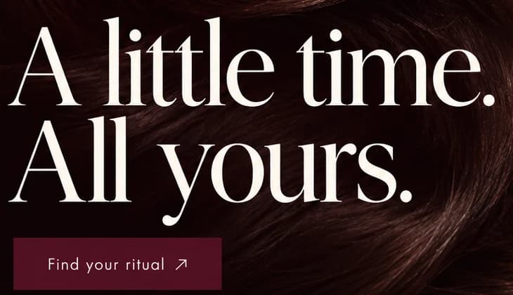
04 Hairline serif. Cream serif with hairline strokes as fine as the strands of hair behind it.
05 Find your ritual. The solid wine button is meant to open the service menu, so browsing comes before any booking form.
06 Blush menu strip. Cut & Colour, Nails and Beauty preview the menu in spaced capitals, split by fine vertical rules.
- Sector
- Beauty salon
- Year
- 2026
- Work
- Homepage design
- Black Cherry#1C0909 · Background
- Wine Rail#511223 · Surface
- Rose Blush#E4AEA9 · Accent
- Silk Cream#FDF9F2 · Type
- Cocoa Gloss#74463C · In the photo
About the project
The full write-up, if you want it. About 3 minutes.
01Brief and idea
The problem, and the one idea that answers it.1 min
The brief
Salons fill their week through Instagram and DMs, so the website is often an afterthought with a price list in a PDF. Someone trying a new salon wants to judge the standard of the work and know booking will be easy. So the page should look the way the salon feels, then get out of the way of the booking.
The idea
The headline promises time, not a list of services: a little time, all yours. Everything else stays quiet so that line lands. One portrait, cropped close so the hair does the selling, and one main button, Find your ritual, that opens the service menu rather than a cold booking form. The rail on the left reads like the spine of a magazine, which suits a brand that wants to be browsed before it is booked.
02The write-up
The design, decision by decision.4 chapters · 2 min
Instagram does the booking, for now
Plenty of salons fill their diary through posts and direct messages, and the website trails behind with a price list saved as a PDF. A first-time client still looks it up, and checks two things: is the work good, and will booking be painless. Noora Lounge answers the first with one photograph and the second with a short path to booking. There is no gallery grid, no promotions banner and no wall of product logos. The page has to feel like the salon, then step aside.
The hair gets the whole frame
The photograph is cropped so tightly that the face sits in the upper right and the rest is hair: long, glossy waves in dark wine and cocoa that fill more than half the screen and run underneath the headline. Hair is what the salon sells, so hair is what the page shows. A dusty pink backdrop shows only along the right edge, the skin is lit softly with its freckles left in, and every colour on the page, from the rail to the strip, is lifted from this one picture.
A spine down the left edge
A slim wine-red rail runs the height of the hero, with a thin vertical rule and BEAUTY, AT YOUR PACE set sideways in spaced capitals, the way a title runs down the spine of a magazine. It gives the brand a second line without laying anything over the picture. NOORA LOUNGE sits beside it in the same airy capitals. The headline then changes register completely: a fine, high-contrast serif in cream, so A little time. All yours. reads like a cover line, its thinnest strokes as fine as the strands behind it.
Find your ritual, then book it
Booking comes in two styles on purpose. Book a visit is an outlined pill in the top corner, a shortcut for regulars. Find your ritual is the solid wine button under the headline, and it is meant to open the service menu rather than a calendar, so a first-timer can browse before committing. The blush strip at the foot previews that menu in three entries: Cut & Colour, Nails, Beauty. Behind those buttons, the plan is to let clients book by service and stylist and pay into the salon's own account, let the team change prices itself, and gather every enquiry in one inbox.
03Type and voice
Type, colour, photography and the lines on the page.3 roles
- Display
- A fine, high-contrast serif in cream, large and closely leaded, with hairline serifs and a long, curling y.
- Labels
- A light geometric sans in widely tracked capitals, used for the wordmark, the sideways rail line and the menu strip.
- Supporting
- Navigation and buttons use the same light sans in sentence case, with a thin diagonal arrow after Find your ritual.
A fine, high-contrast serif for the headline, its hairlines echoing the strands of hair. A light geometric sans for the rest: widely spaced capitals in the logo, the rail and the menu strip, sentence case in the nav. Every colour comes from the photograph: deep wine, cocoa, warm rose skin and a pale blush for the menu strip. One subject, lit warm against a dusty pink backdrop, fills the hero.
A little time. All yours.
BEAUTY, AT YOUR PACE
Find your ritual
Book a visit
Unhurried and personal. It talks about time and about you, never about products or techniques; ritual stands in for appointment, and nothing on the page asks anyone to hurry.
04The plan
Grow: up to 6 pages, and what it includes.4 includes
Up to 6 pages, on Grow, AED 4,999 one time. What it includes:
- Online booking by service and stylist, paid into the salon's own account
- A service menu and prices the team edits itself
- Every enquiry in one inbox instead of scattered DMs
- An Arabic version as an extra
A site like this sits on Grow. AED 4,999 one time, with a fixed quote in writing.
WhatsApp us