Run It
A plant protein shop site for everyday runners, fronted by a lime rabbit in full race kit.
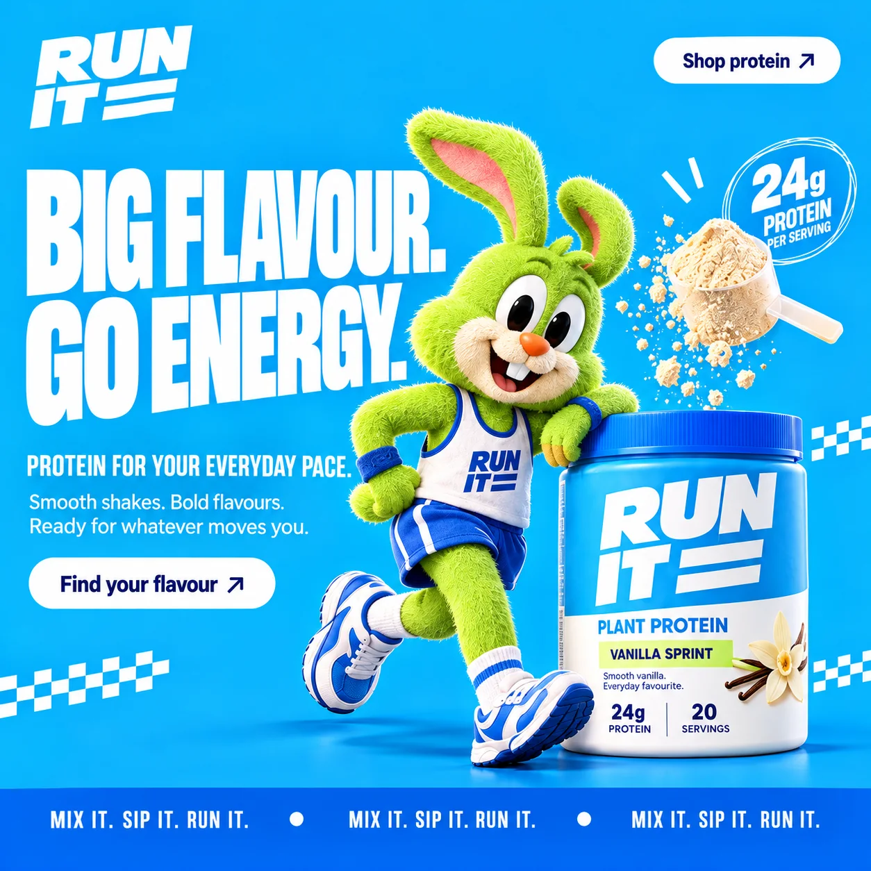
01 Forward-leaning wordmark. RUN IT stacks in heavy italic capitals, finished with two speed stripes that read as motion even at rest.
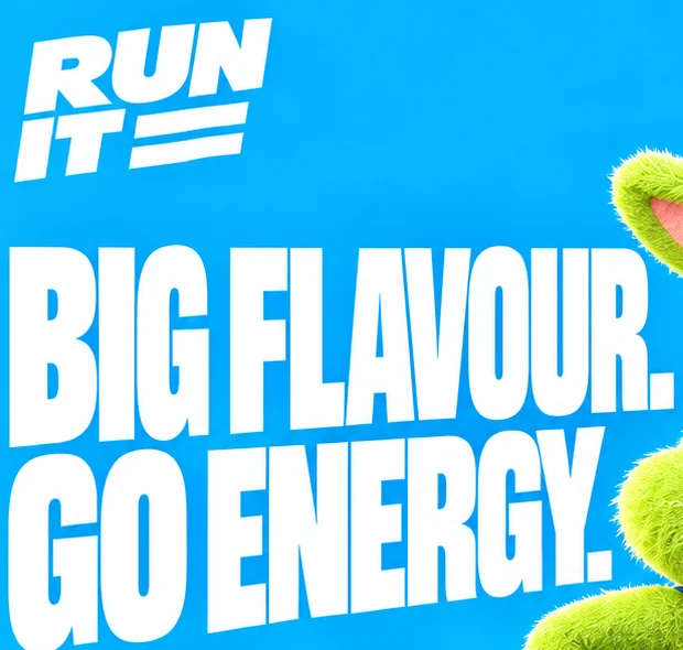
02 Race-number headline. Condensed white capitals set so tight they feel like a number pinned to a running vest.
03 The lime teammate. Fuzzy, grinning and dressed for race day, he gives the shop a face instead of a spec sheet.
04 Find your flavour. A white pill with an arrow sends people straight down to the three-tub lineup.
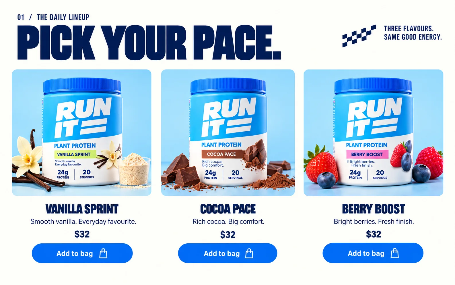
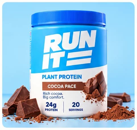
05 Colour-coded flavour band. Lime marks Vanilla Sprint on the tub; cocoa and berry get brown and pink bands further down.
06 Brand ticker. MIX IT. SIP IT. RUN IT. repeats along an electric blue band that closes the hero.
- Sector
- Sports protein shop
- Year
- 2026
- Work
- Website design
- Screens
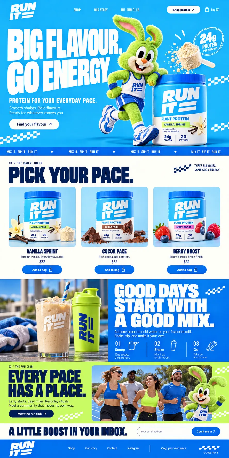
- One desktop screen and the full homepage
- Track Sky#08B3FC · Background
- Lane Navy#011C54 · Type
- Sprint Blue#0060E9 · Accent
- Finish Lime#C9FB65 · Accent
- Chalk Line#FEFEF9 · Surface
About the project
The full write-up, if you want it. About 4 minutes.
01Brief and idea
The problem, and the one idea that answers it.1 min
The brief
Design a shop homepage for a plant protein brand aimed at everyday runners. It needed the energy of a race start without the intimidation of hardcore supplements. Three flavours had to be buyable from the first scroll, and the page had to give people a reason to come back that is not a discount.
The idea
Give the brand a teammate. A fuzzy lime rabbit in a vest, shorts and trainers carries the hero, leans on the tub and comes back near the end beside the run club, so the shop has a personality rather than a spec sheet. Around it, everything borrows from race day: a chequered flag pattern, a ticker that reads mix it, sip it, run it, and flavours named in running language.
02The write-up
The design, decision by decision.6 chapters · 3 min
The brief
Run It is imagined as a plant protein brand, and this is its shop homepage design. The audience is the person who runs before work, not the one who lifts for a living, so the page had to carry the buzz of a start line without the menace of the supplement aisle. Three flavours had to be buyable within the first scroll. The shop also needed a reason for people to come back that was not a discount code, and that reason became the run club.
Give the shop a teammate
Supplement sites usually sell with numbers and muscle. This one sells with a character. A fuzzy lime rabbit in a white vest, blue shorts and wristbands leans on the Vanilla Sprint tub with one trainer kicked back, as if waiting for the gun. His fur is the same sharp lime that later fills the run club band and the shaker bottle, so the mascot and the palette are one decision rather than two. He comes back near the foot of the page, waving from the edge of the run club photo, and the shop starts to feel like a club with a counter.
A first screen pinned on like a bib
The wordmark leans forward, RUN IT stacked in heavy italic capitals and finished with two speed stripes. Below it, BIG FLAVOUR. GO ENERGY. fills half the sky blue frame in condensed white capitals, close-set like a race number. A smaller line, PROTEIN FOR YOUR EVERYDAY PACE., brings the claim back down to earth. Two white pills do the selling: Shop protein in the corner and Find your flavour under the copy. A scoop spills powder over the tub, and fragments of chequered flag sit at the edges.
Flavours named like race splits
The lineup opens on a cream ground with a small label, 01 / THE DAILY LINEUP, and a navy headline that reads PICK YOUR PACE. Vanilla Sprint, Cocoa Pace and Berry Boost each sit on a pale blue card, dressed with what they taste of: vanilla pods and a cup of powder, broken chocolate and cocoa dust, strawberries and blueberries. Colour-coded bands on the tubs, lime, brown and pink, tell them apart at a glance. Under each card come the name, one two-beat line such as Rich cocoa. Big comfort., and a blue Add to bag pill.
Blue, cream, blue, lime
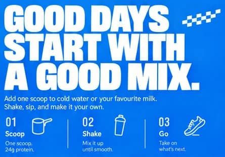
The homepage changes colour at the pace of a split time. Sky blue hero, cream lineup, then an electric blue panel where GOOD DAYS START WITH A GOOD MIX. sits beside a shake and a lime bottle. Three numbered steps with line icons, 01 Scoop, 02 Shake and 03 Go, explain the product in three words. Lime takes over for the run club, cream returns for A LITTLE BOOST IN YOUR INBOX. and its Count me in button, and the footer signs off in italics: Keep your own pace.
Checkout, club and stand-ins
The Add to bag buttons are meant to lead to a checkout paid into the brand's own account, and the run club form to send sign-ups to one inbox. Some things in these images are stand-ins by design. The prices are shown in dollars and would be reset for the UAE. The protein and serving figures on the tubs would need checking against a real label, and the runners in the club photo are generated stand-ins for the club's real members.
03Type and voice
Type, colour, photography and the lines on the page.3 roles
- Display
- Heavy condensed sans in capitals, tightly spaced and tall, used for every headline and the flavour names.
- Labels
- Narrow capitals at small size with generous spacing, used for section numbers, the ticker and side notes.
- Body
- Plain, rounded sans in sentence case, written in short two-beat lines that end on full stops.
Headlines are set in a heavy condensed sans in capitals, tight and tall like race numbers, and the wordmark leans forward with two speed stripes. Body copy is a plain sans. The palette is sky blue for the hero, a deeper electric blue for buttons and bands, navy for type on light grounds and a sharp lime that matches the rabbit. Product shots sit on pale blue cards; lifestyle shots are bright and outdoors. Sections alternate blue, cream and lime blocks at a quick pace.
BIG FLAVOUR. GO ENERGY.
MIX IT. SIP IT. RUN IT.
Early starts. Easy miles. Rest-day rituals.
EVERY PACE HAS A PLACE.
Keep your own pace.
Short, chanted and friendly, like a coach at the side of the track. Lines come in twos and threes with hard full stops, and never ask anyone to go faster than they want to.
04The plan
Grow: up to 6 pages, and what it includes.4 includes
Up to 6 pages, on Grow, AED 4,999 one time. What it includes:
- Customers order online, paid into your own account
- Run club sign-ups and enquiries land in one inbox
- Edit your own text, prices and photos without a developer
- Arabic version available as an extra
A site like this sits on Grow. AED 4,999 one time, with a fixed quote in writing.
WhatsApp us